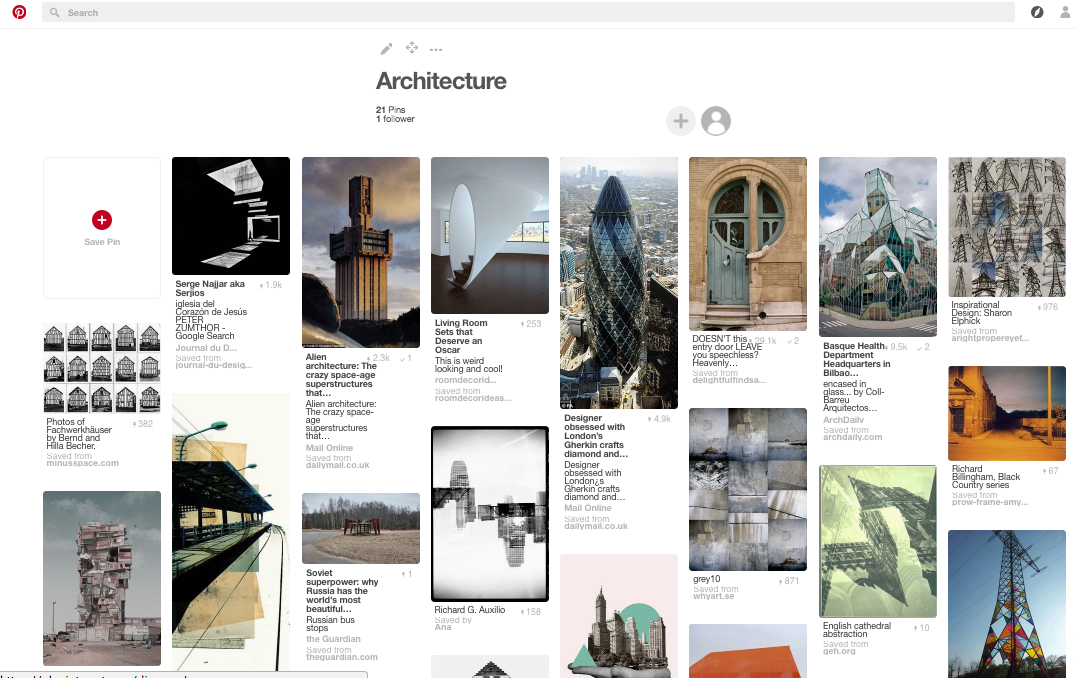
Component 2: Architecture
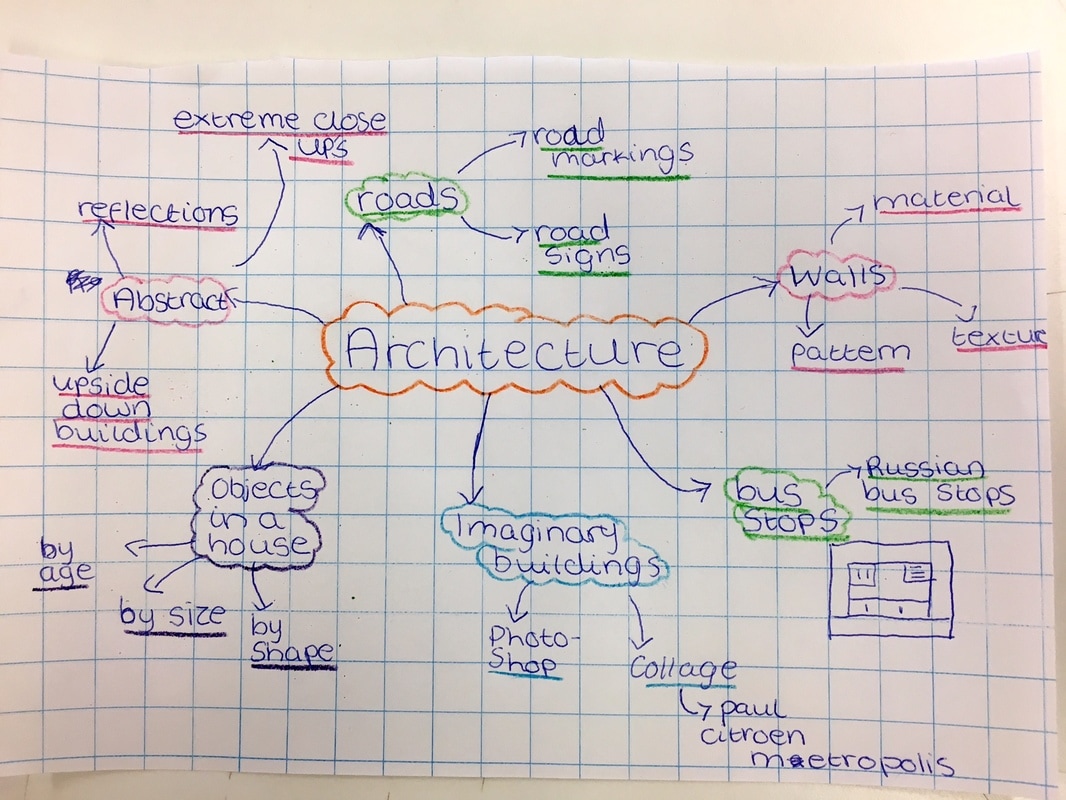
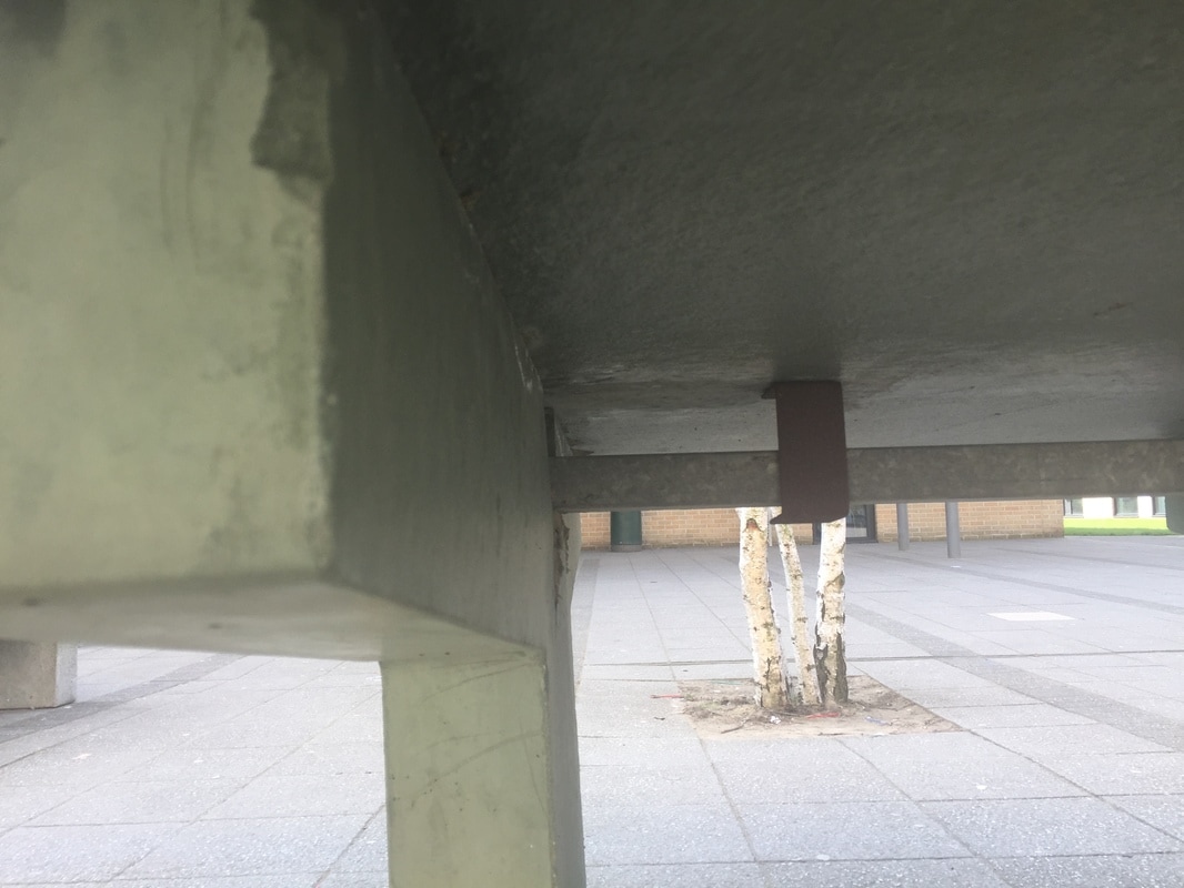
I chose the theme the theme of Architecture because I can explore a lot of subject matter. I live in a large city with hundreds of different types of buildings. I study in a school which was rebuilt 4 years ago and is a modern structure. It will also give me lots of opportunities to explore a range of building materials, shapes, textures, patterns and colours etc. My flat is in a 10 storey building, surrounded by other blocks of flats, housing and open areas. It is on a hill which means that from the top of my building I can see a long way across the city. I am excited about starting this project and I haven't really explored this theme before in much detail.
Margaret Stratton
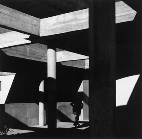
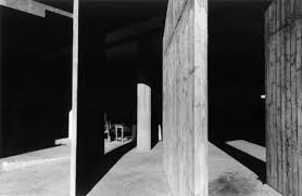
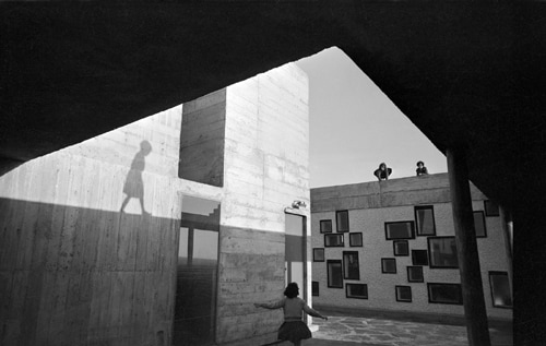
Margaret Stratton is an american photographer and video artist who was born in 1953. Her photographs are based on how an image might tell a story about the use of a building in the past. Most of her photographs are black and white. Her photography work has been exhibited at the Smithsonian Institution.
Some of her photos:
Some of her photos:
I chose this artist because her work is inspiring and is not what I thought architecture was about, she's taught me that me that there can be different types of photographs and they still link to architecture it doesn't just have to be buildings.
Comparing photographs
|
|
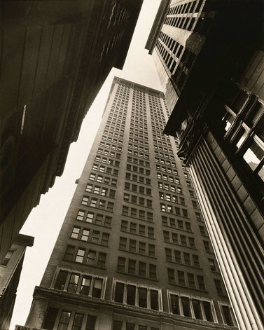
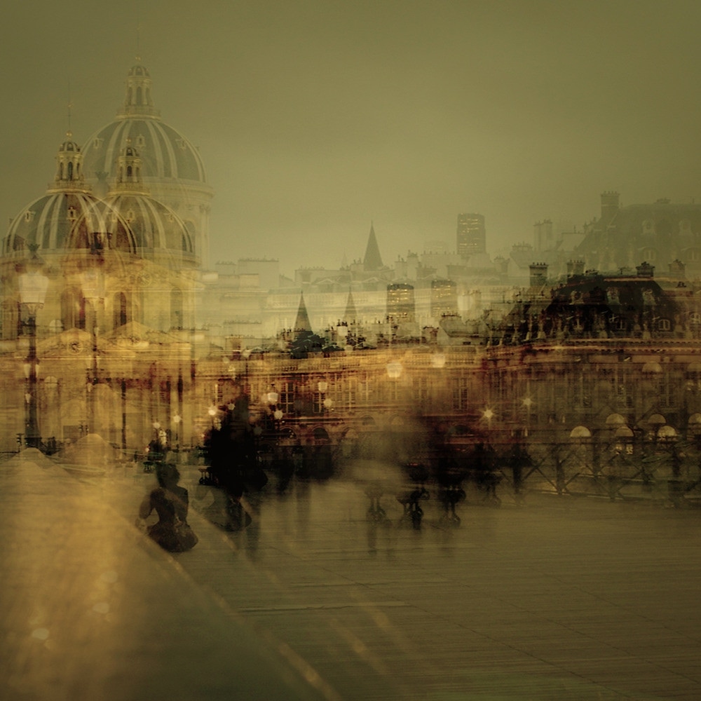
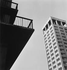
In Jung's photograph I see buildings and people taking pictures of them I can also see street lights and other building's connected to it. In Abbott's photograph I can see 3 similar building's which have been shit from a low angle. Jung's photograph is a lot more vibrant whereas Abbott's is more dull both photograph's are of city life and buildings. Abbott used a camera to make her photograph. I think Jung's picture has been made by using different photos on top or by moving the camera. Jung's photo shows a more dynamic side of city life. In Jung's picture the lines aren't as focused. In Abbott's photograph the lines are sharp and clear which makes the photo seem more planned out.
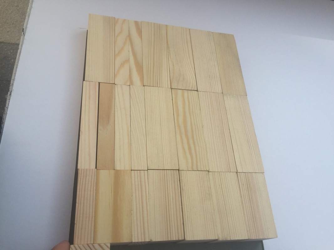
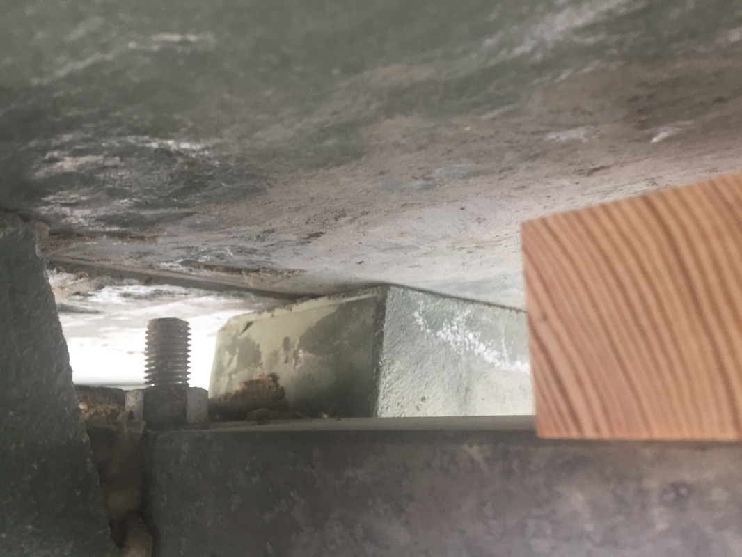
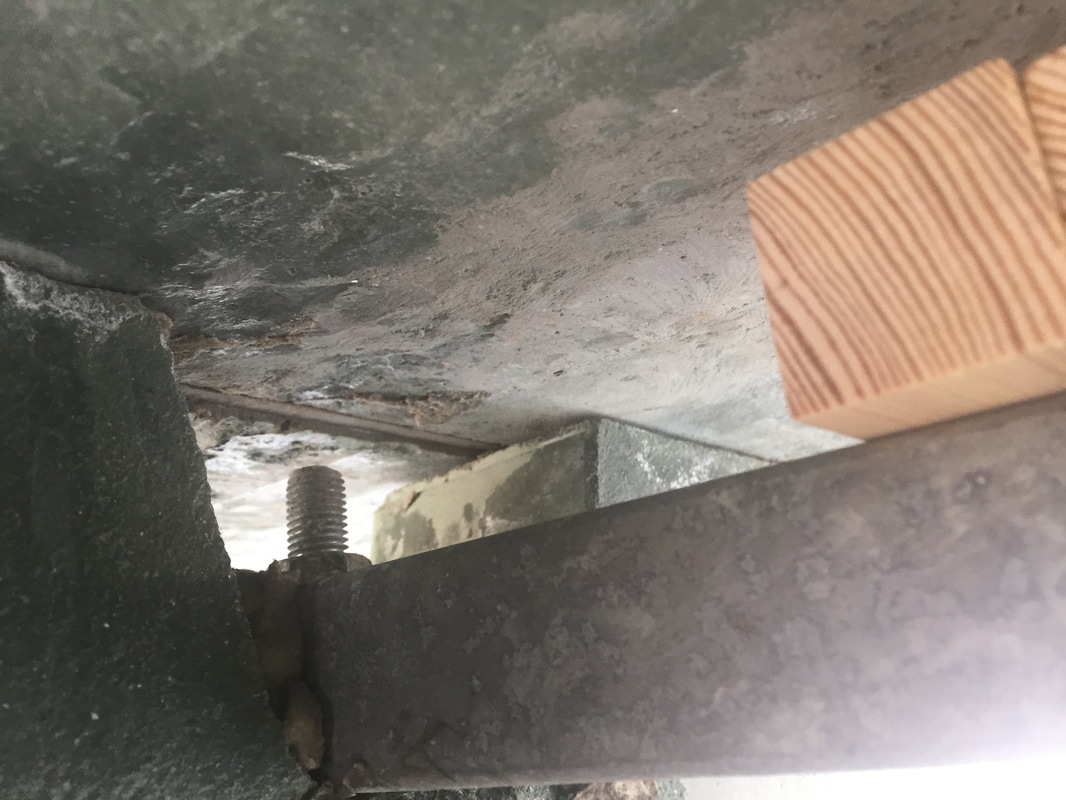
Roads,Signs and Buildings
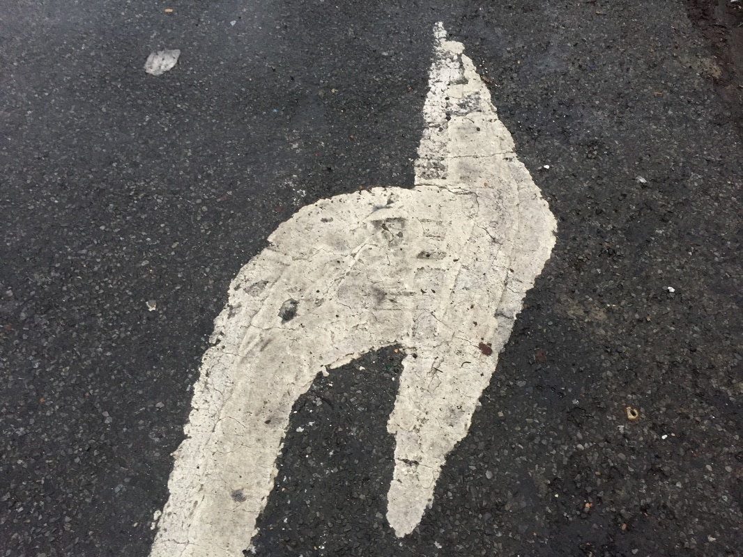
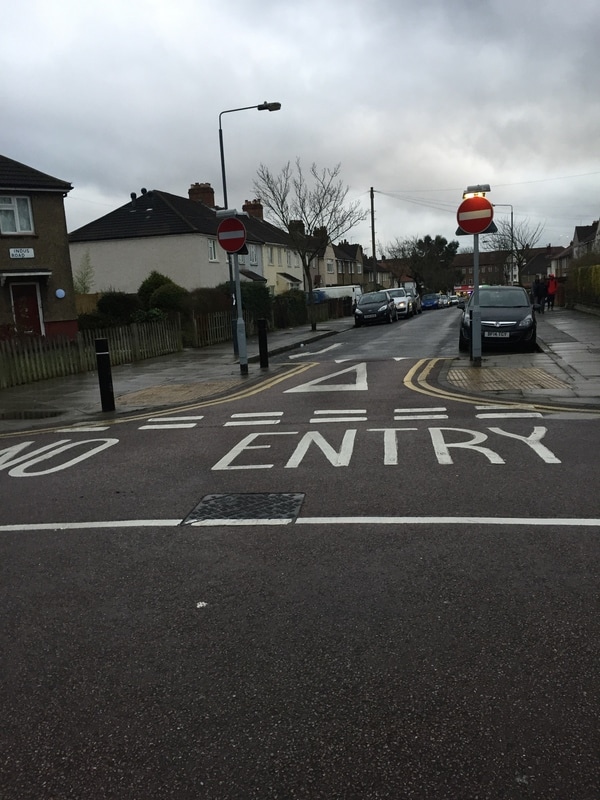
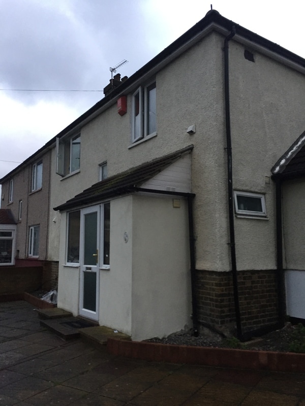
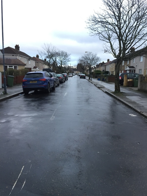
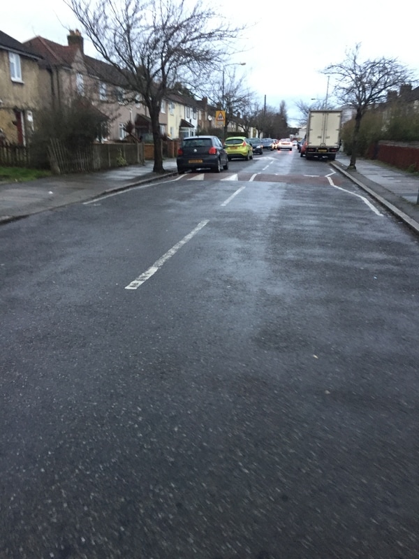
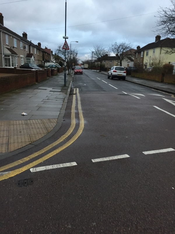
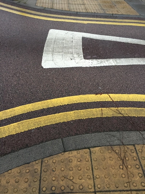
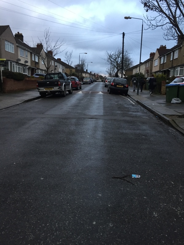
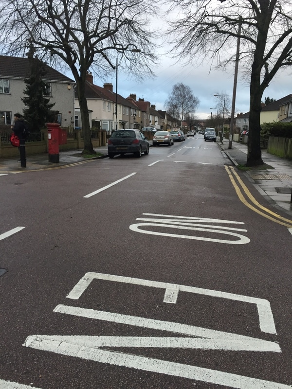
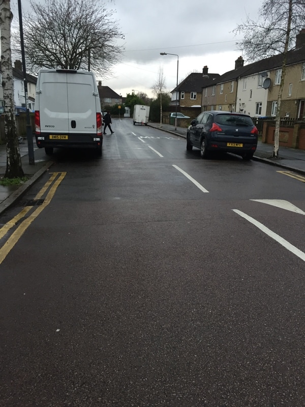
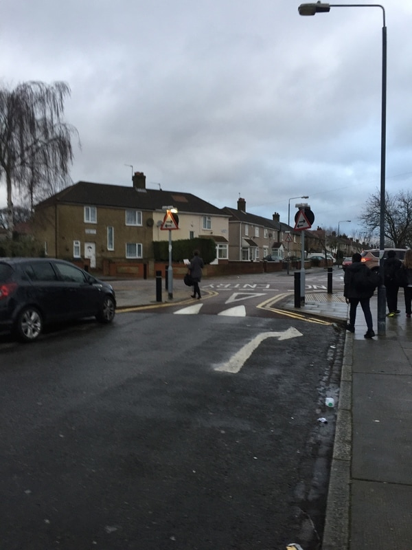
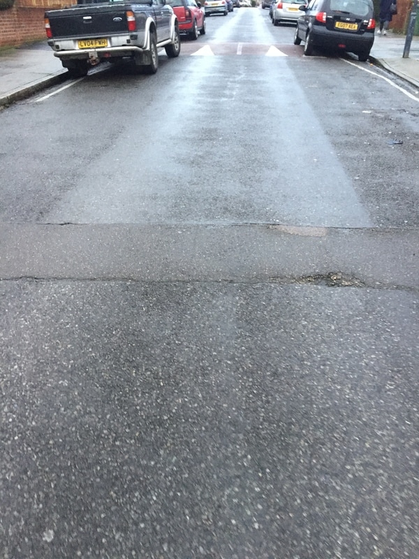
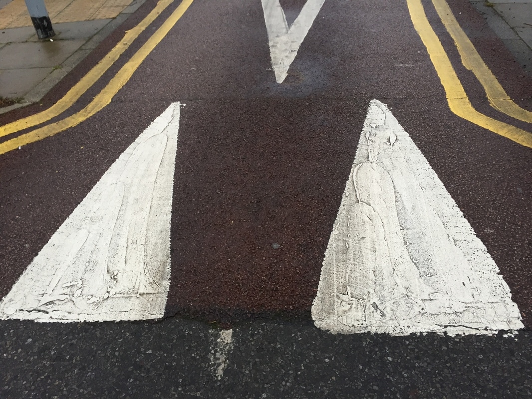
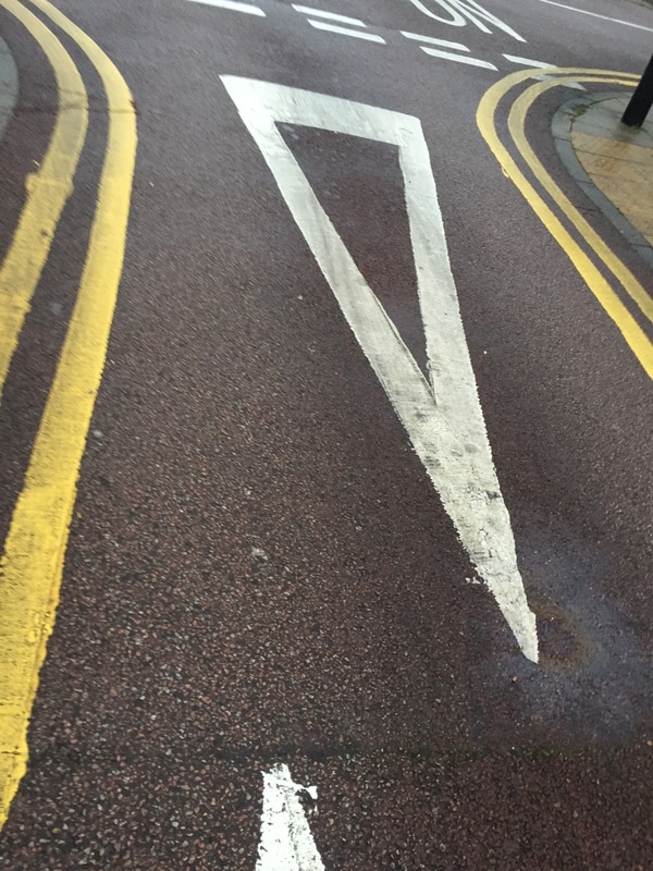
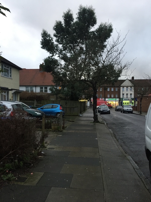
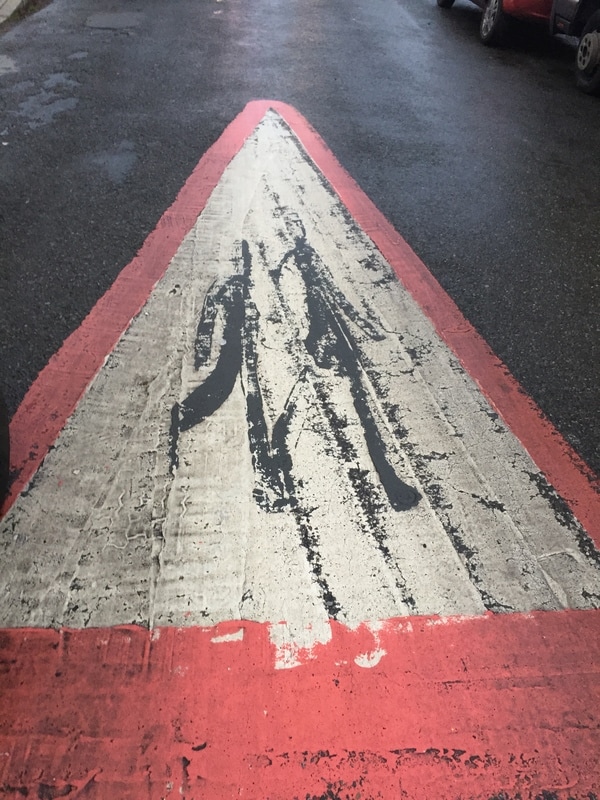
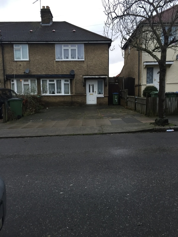
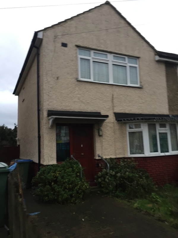
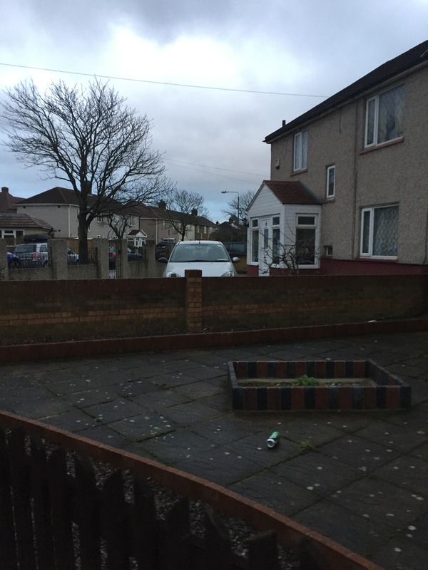
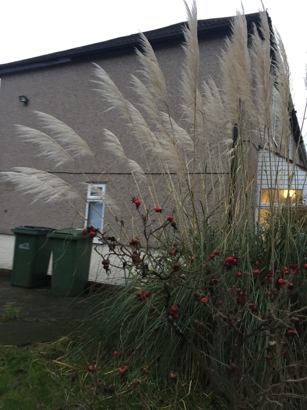
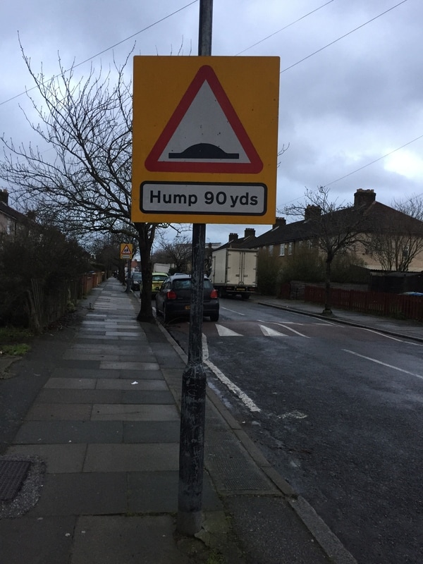
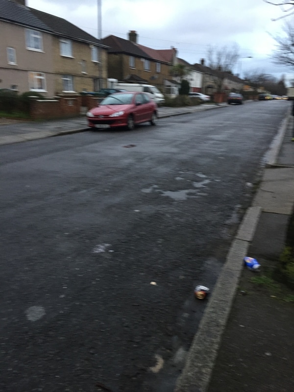
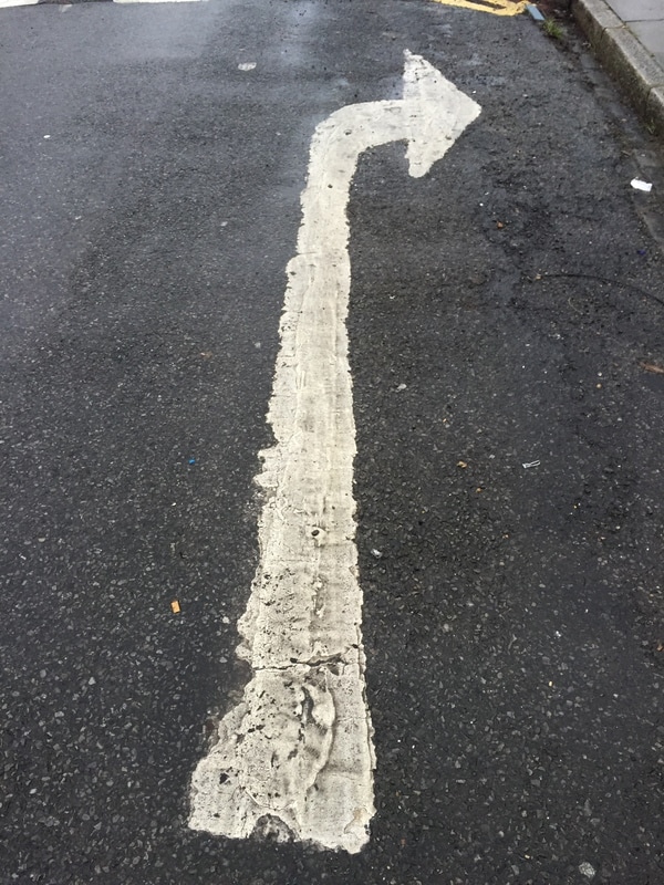
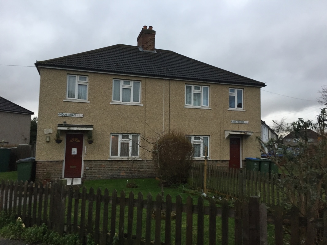
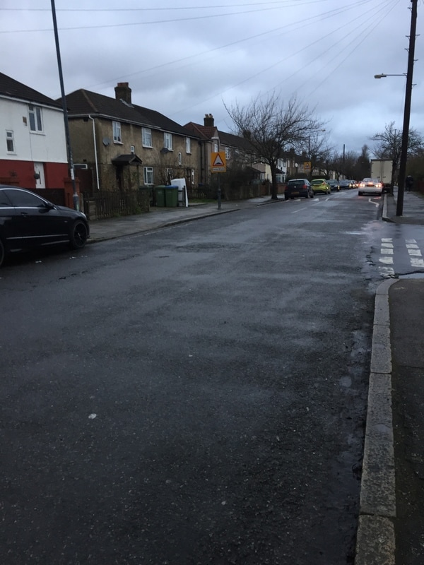
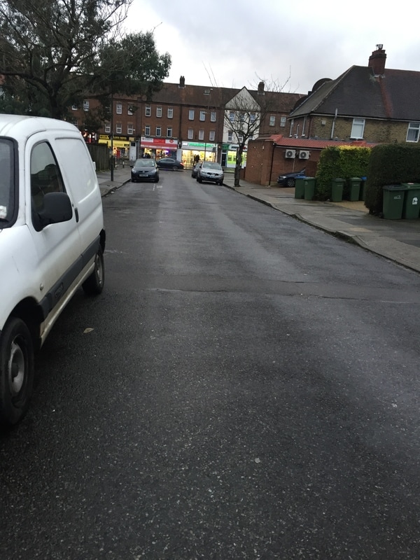
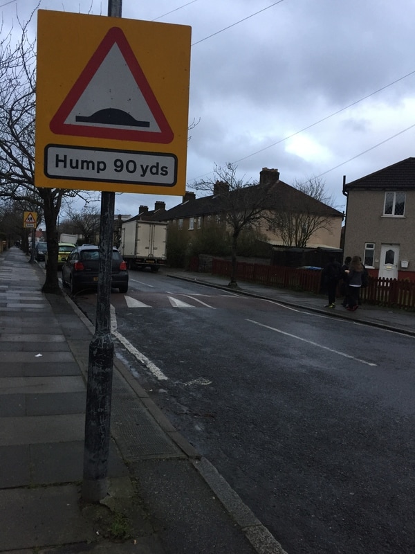
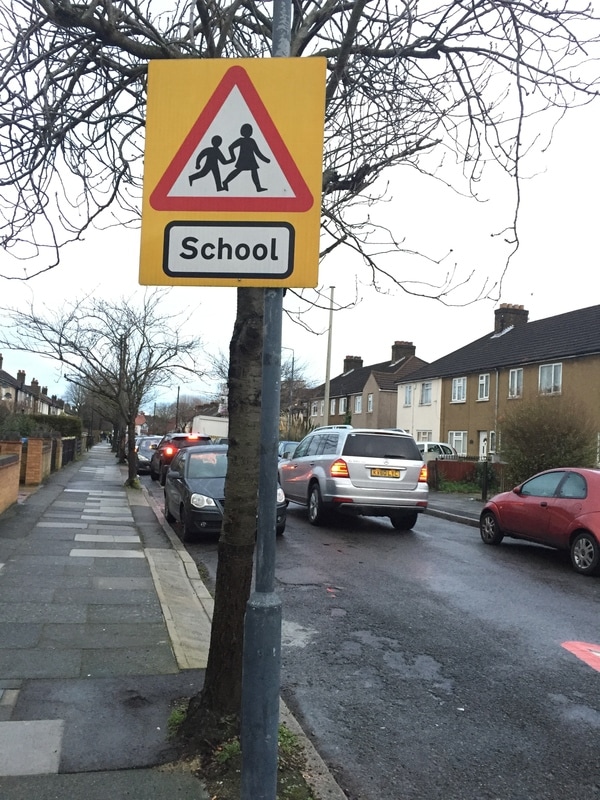
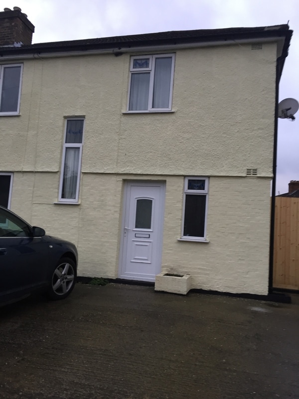
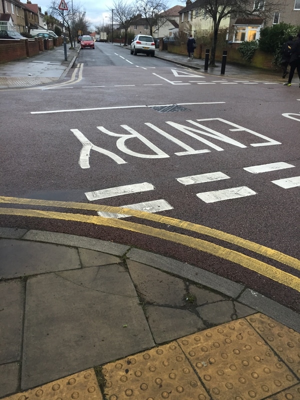
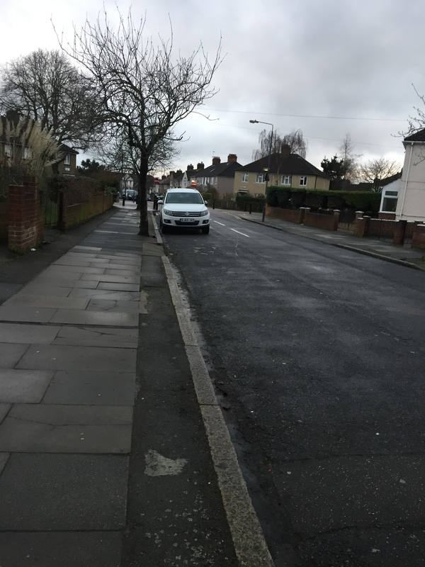
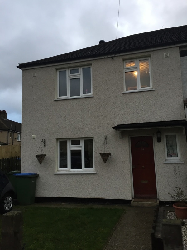
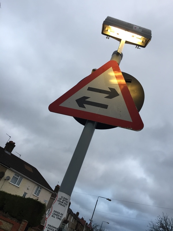
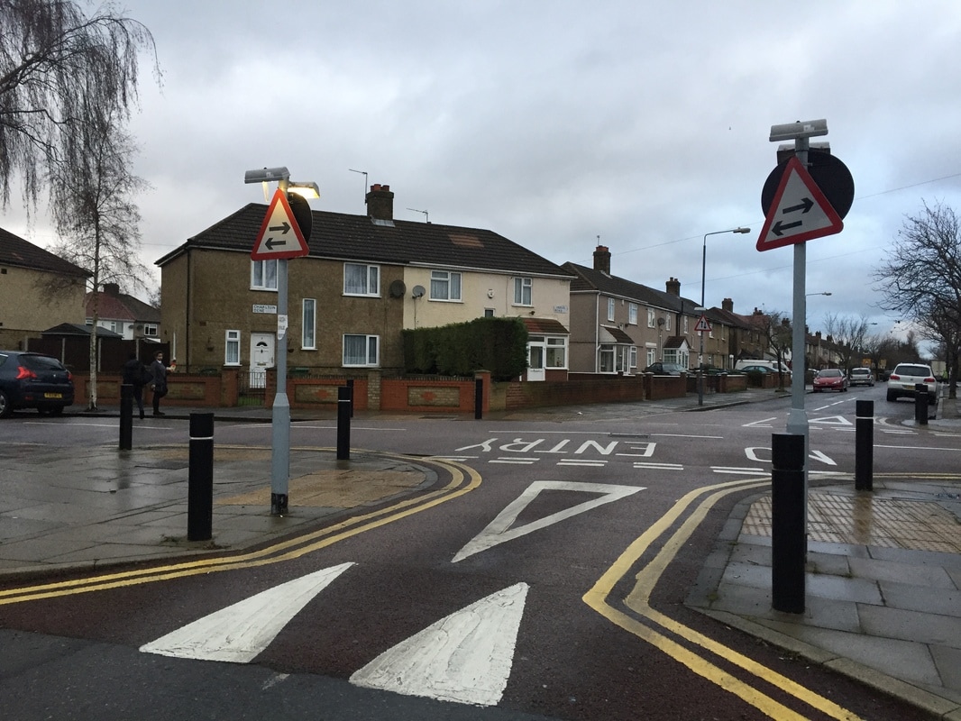
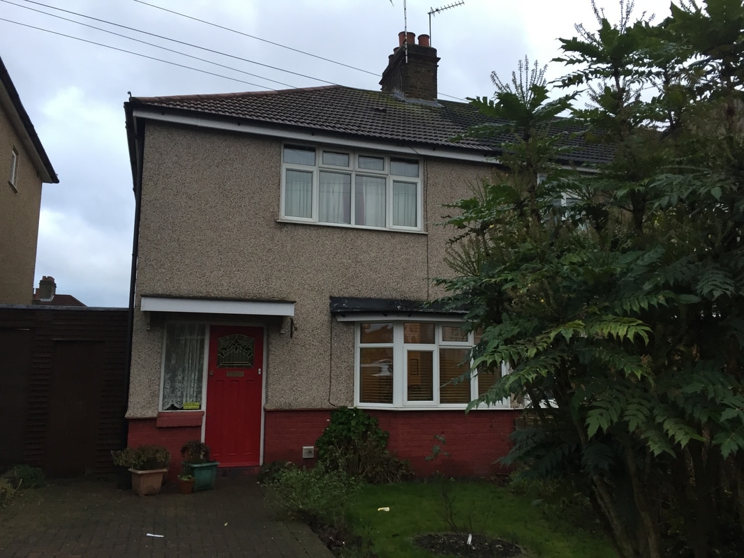
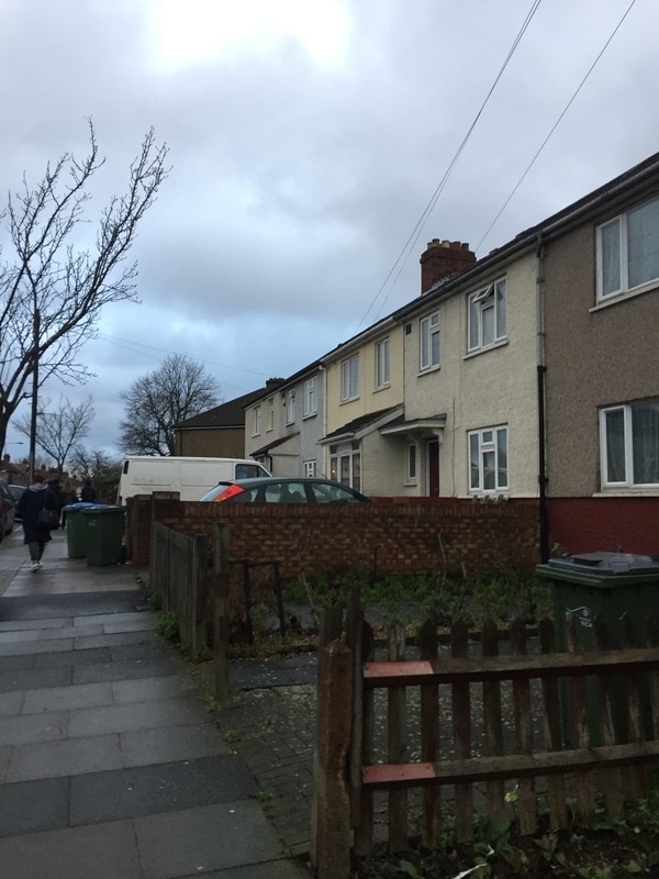
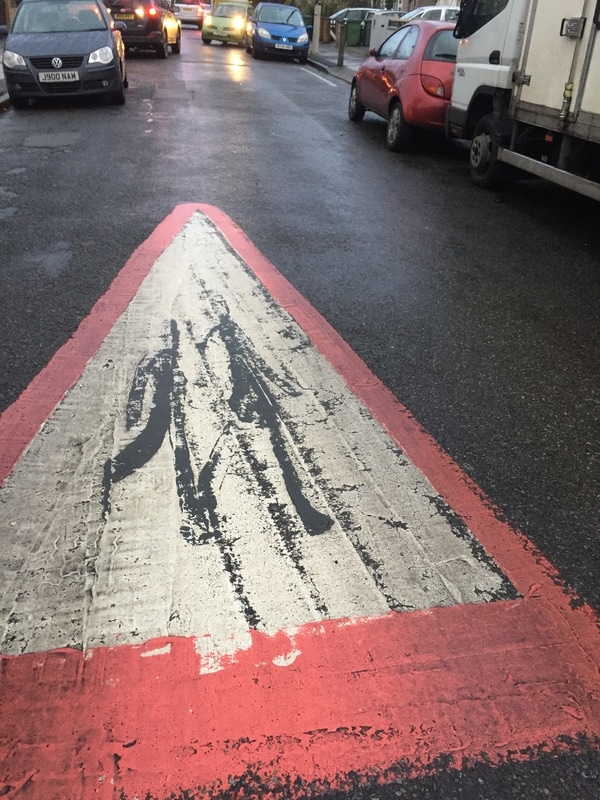
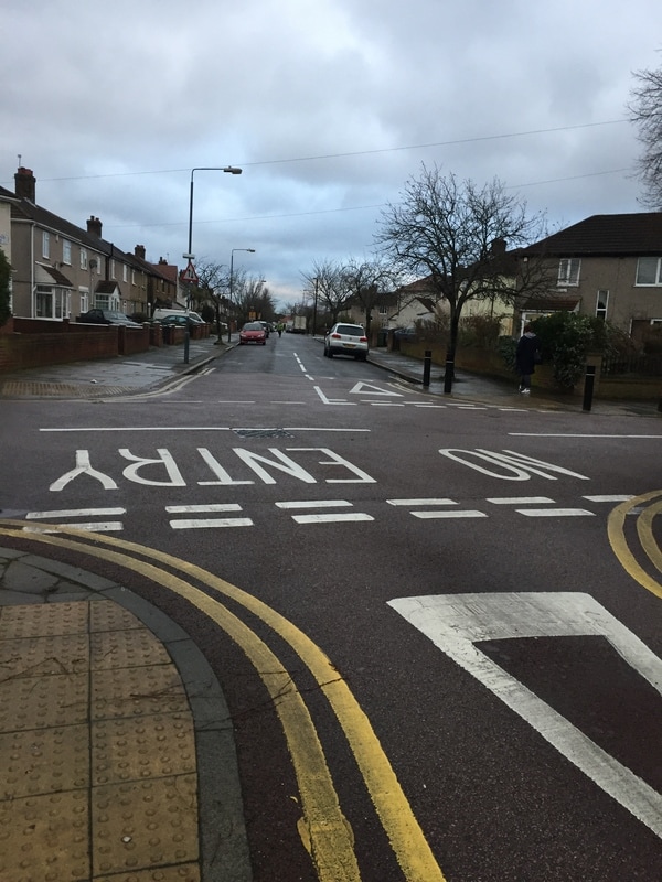
Most of these photos are of roads, signs and houses. I think the pictures link to architecture because architecture is about buildings and designs.My mind map for architecture inspired me to take these.Over all I think these photos went well and I could develop them in photoshop or the dark room.
Photo fanzines
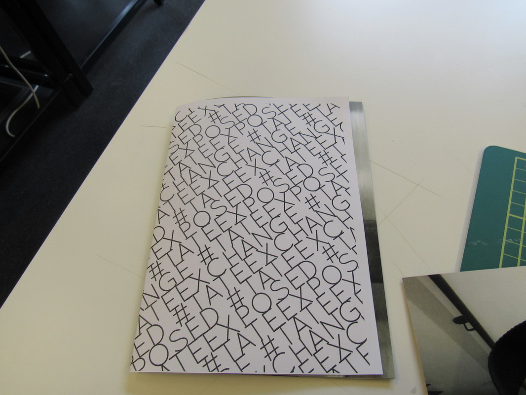
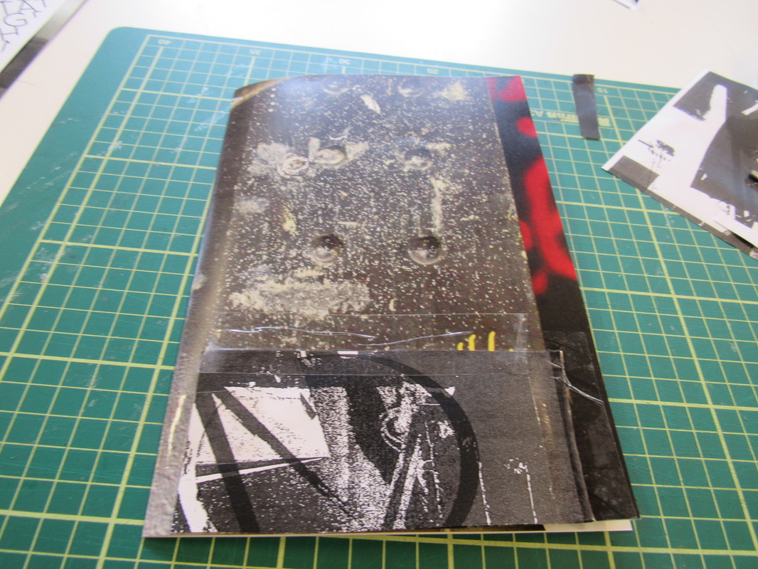
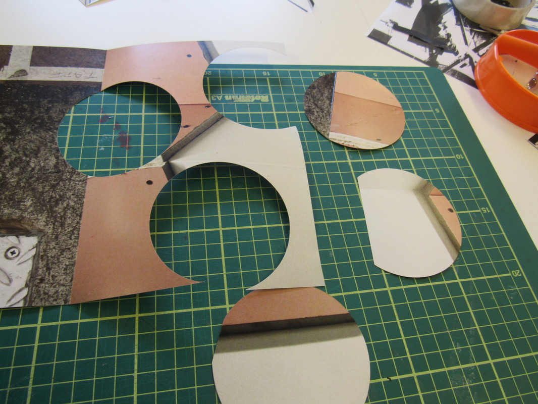
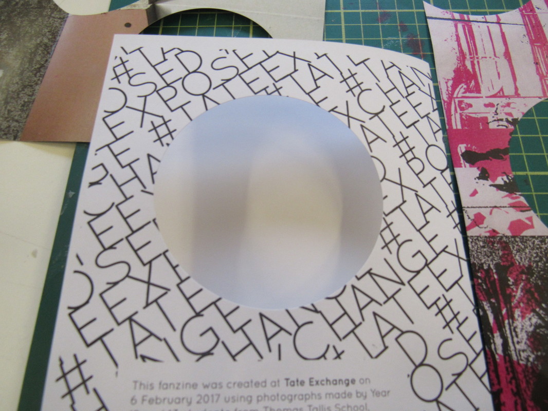
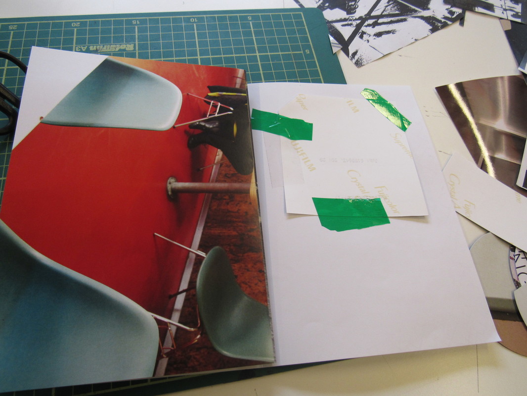
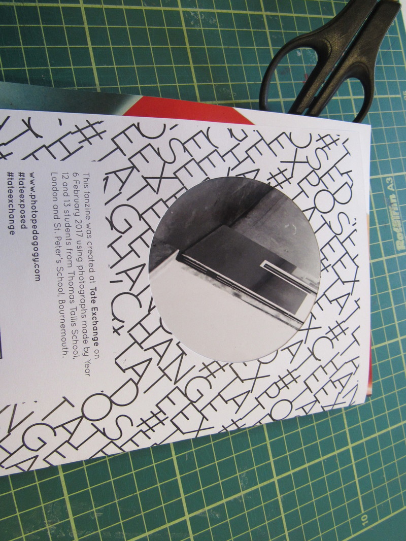
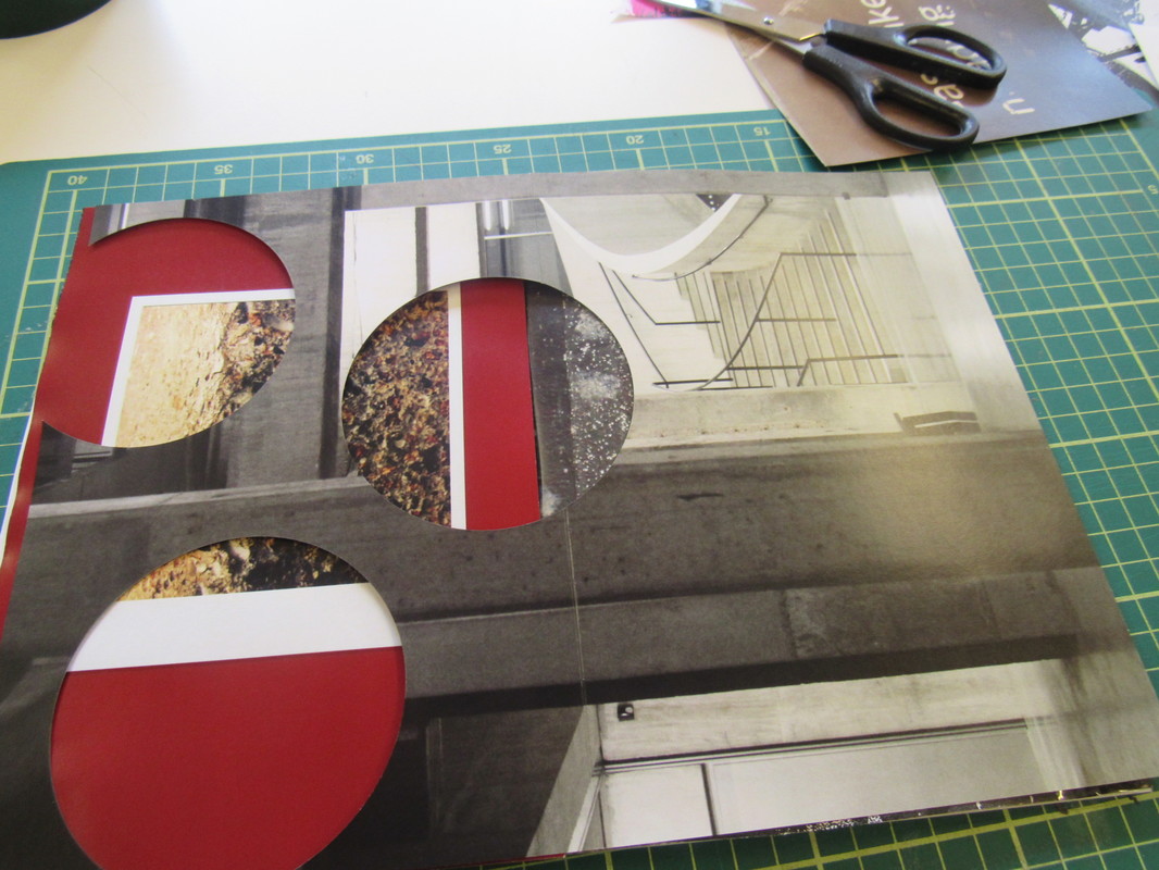
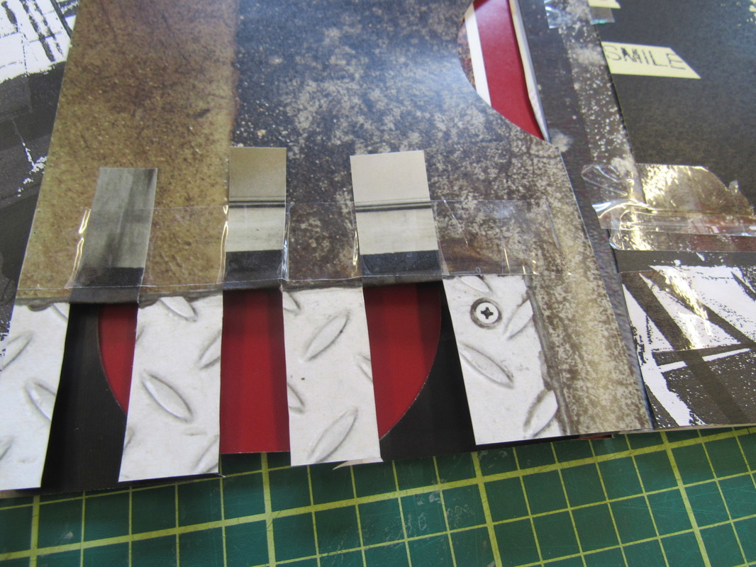
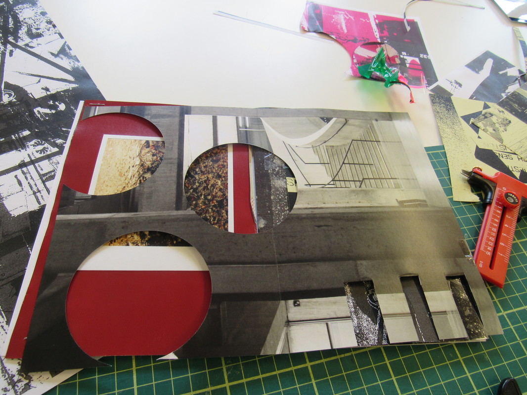
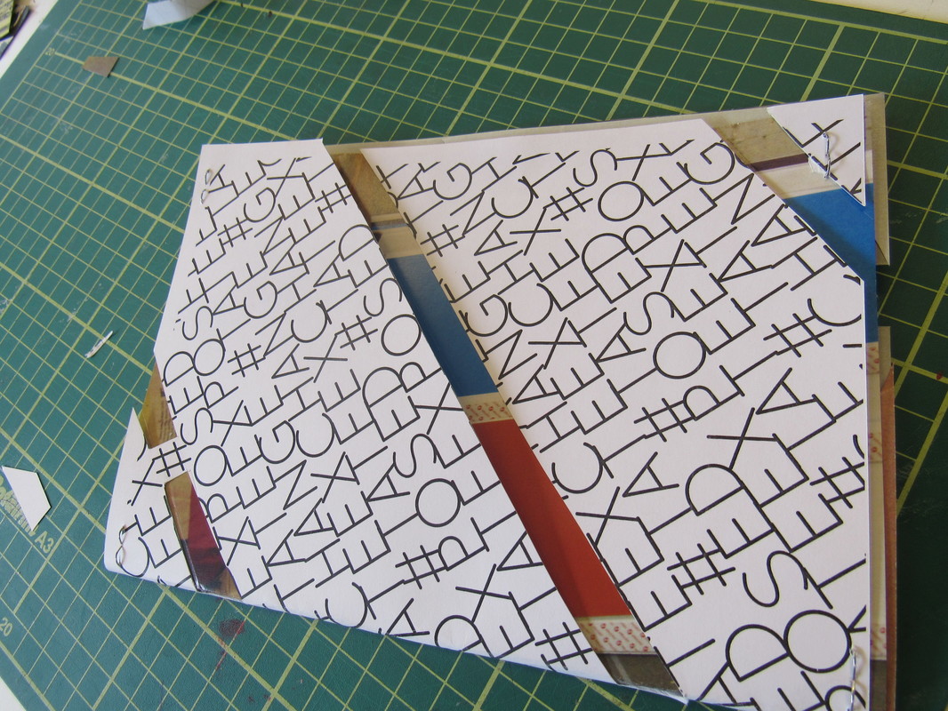
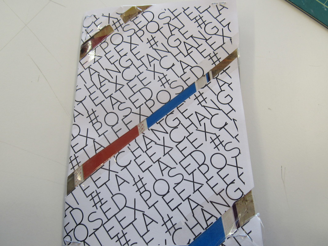
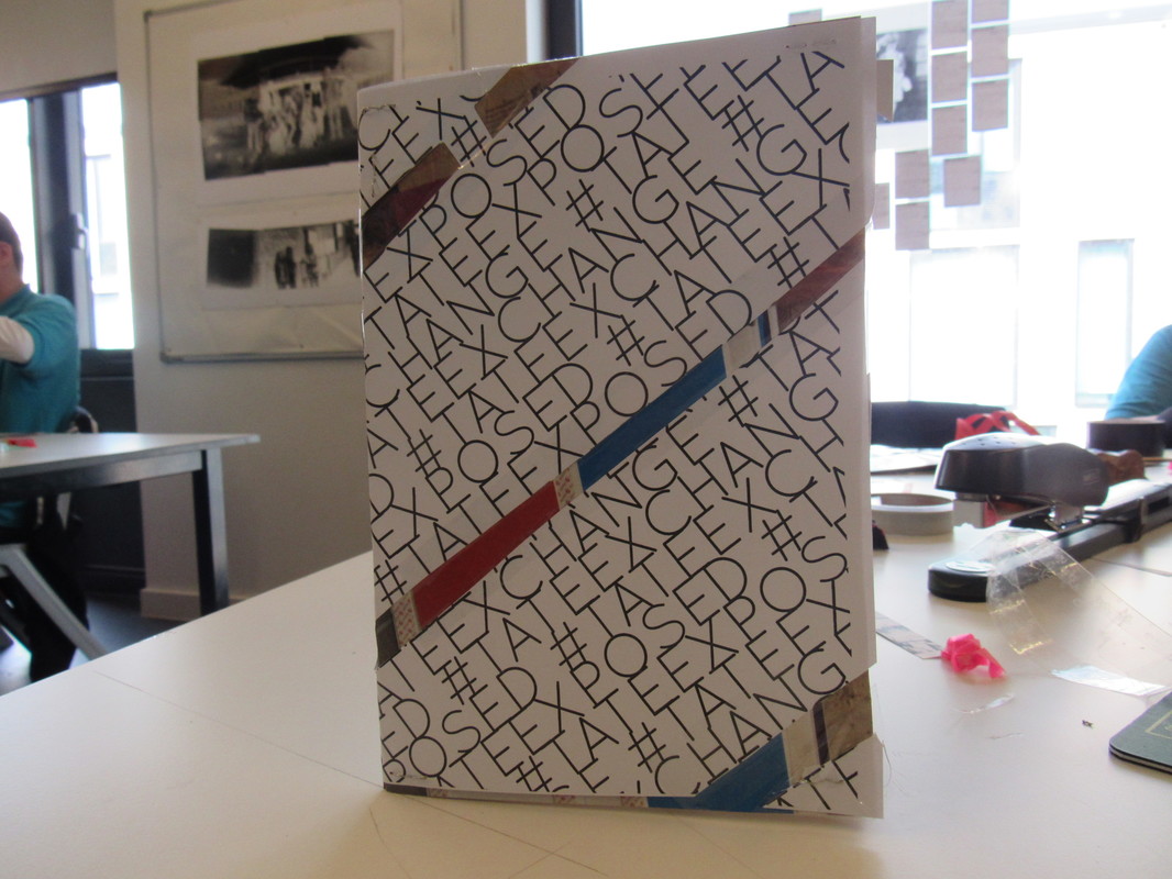
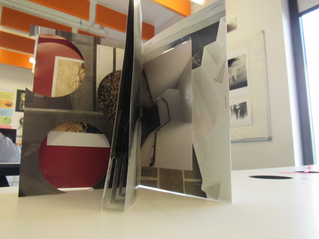
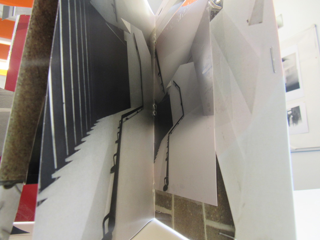
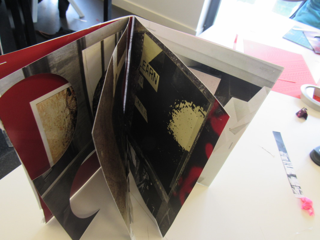
During this mini project of making a magazine/booklet I got a good photo fanzine which related to my theme.To make the photo fanzine I found images I liked a crated my mini book. I really enjoyed doing this. To improve I could have added more pages and taken some of the photographs myself as most of the photos were from magazines and postcards.
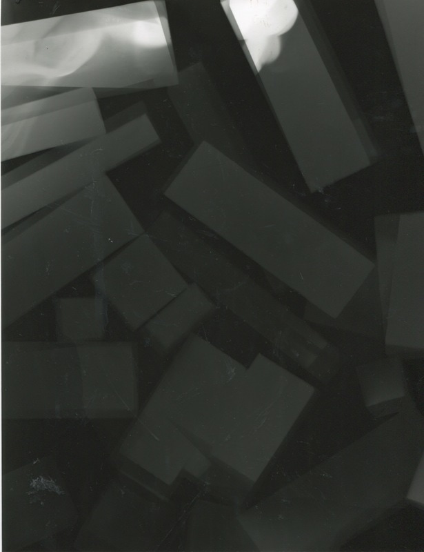
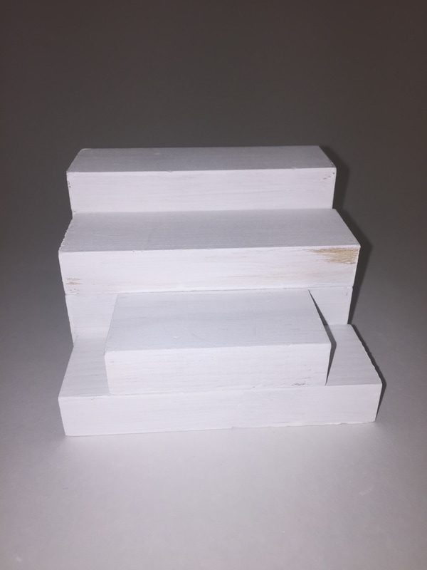
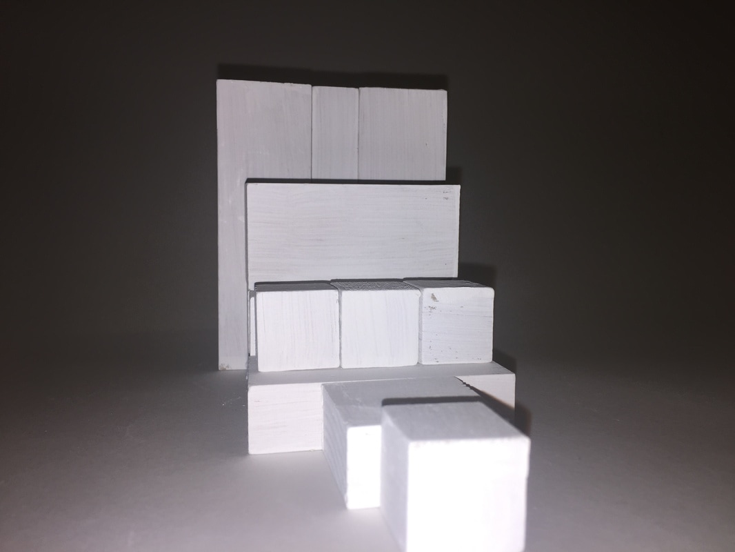
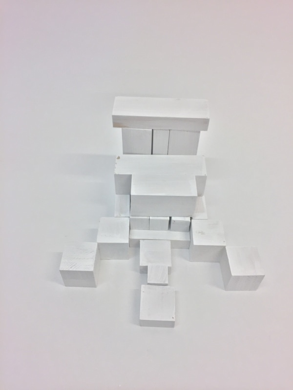
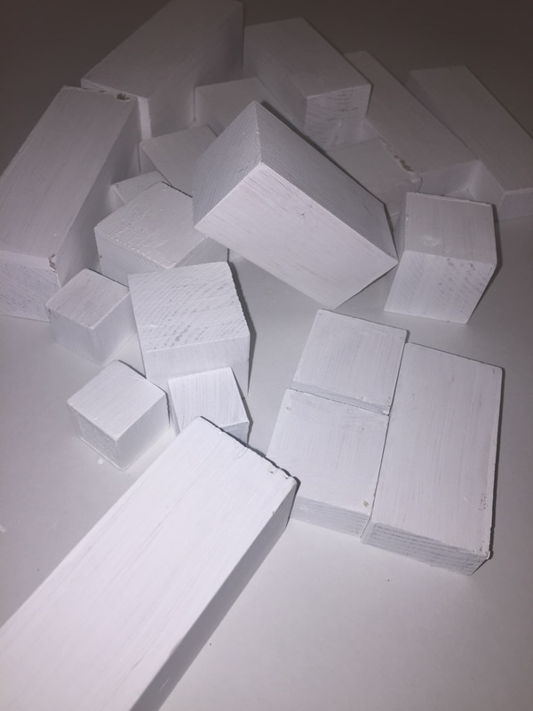
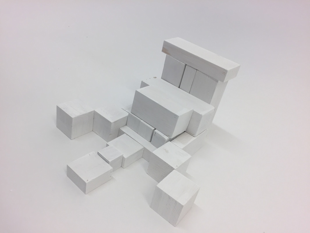
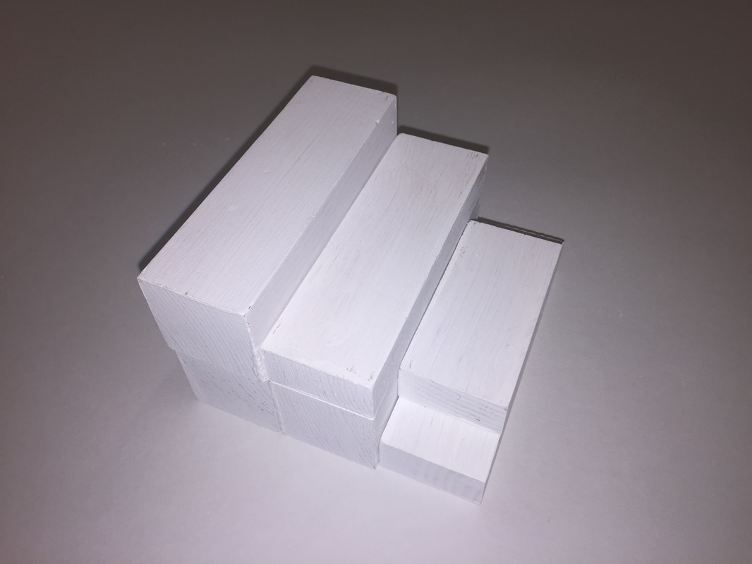
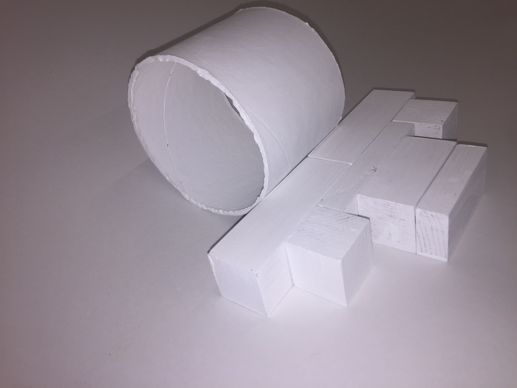
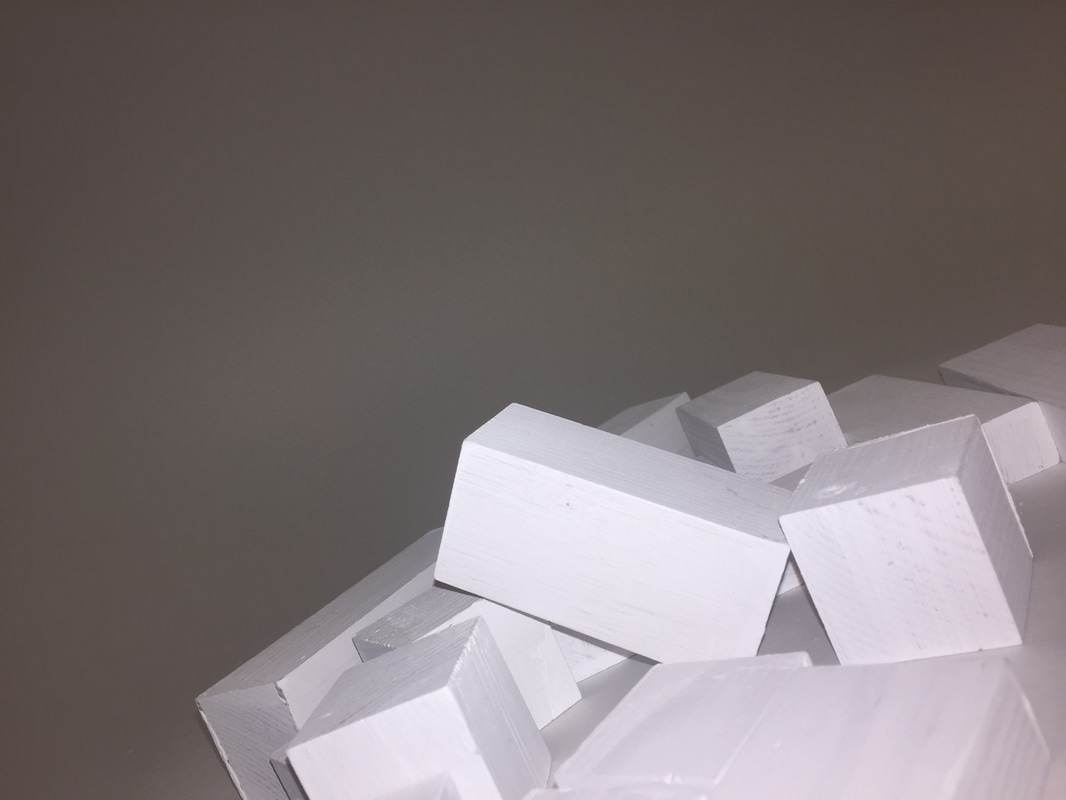
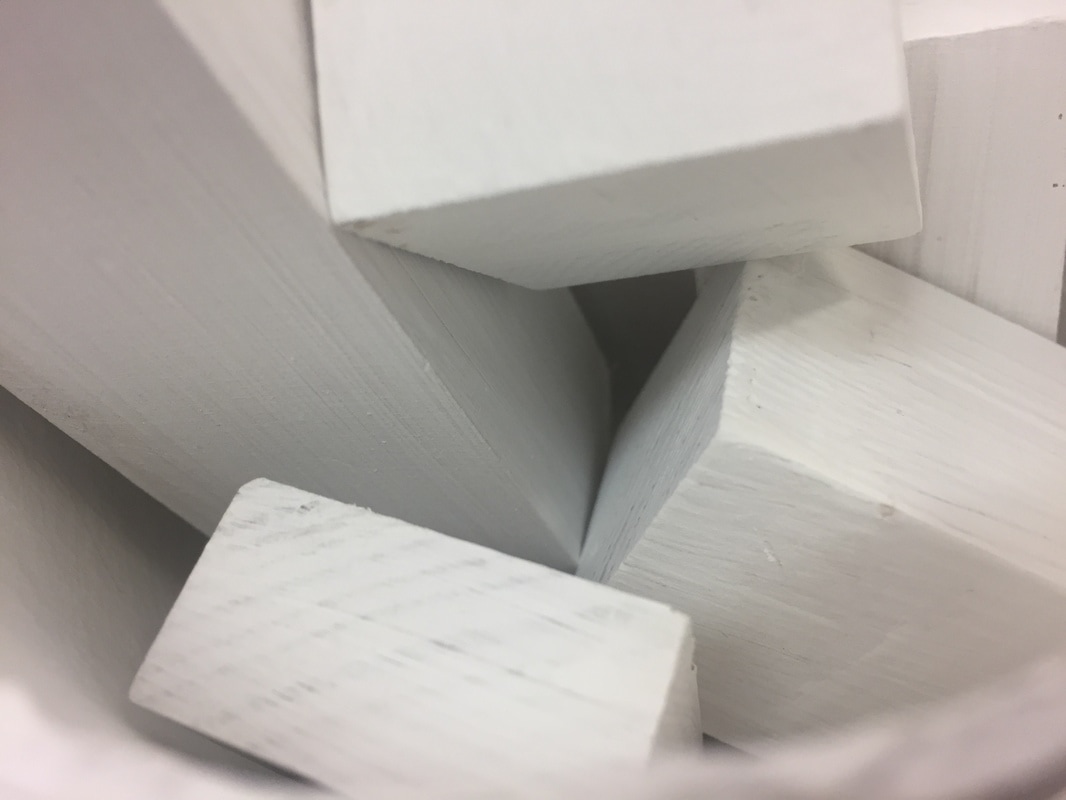
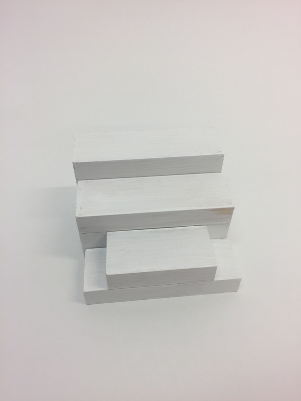
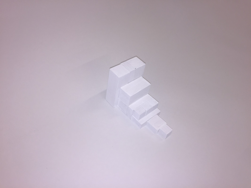
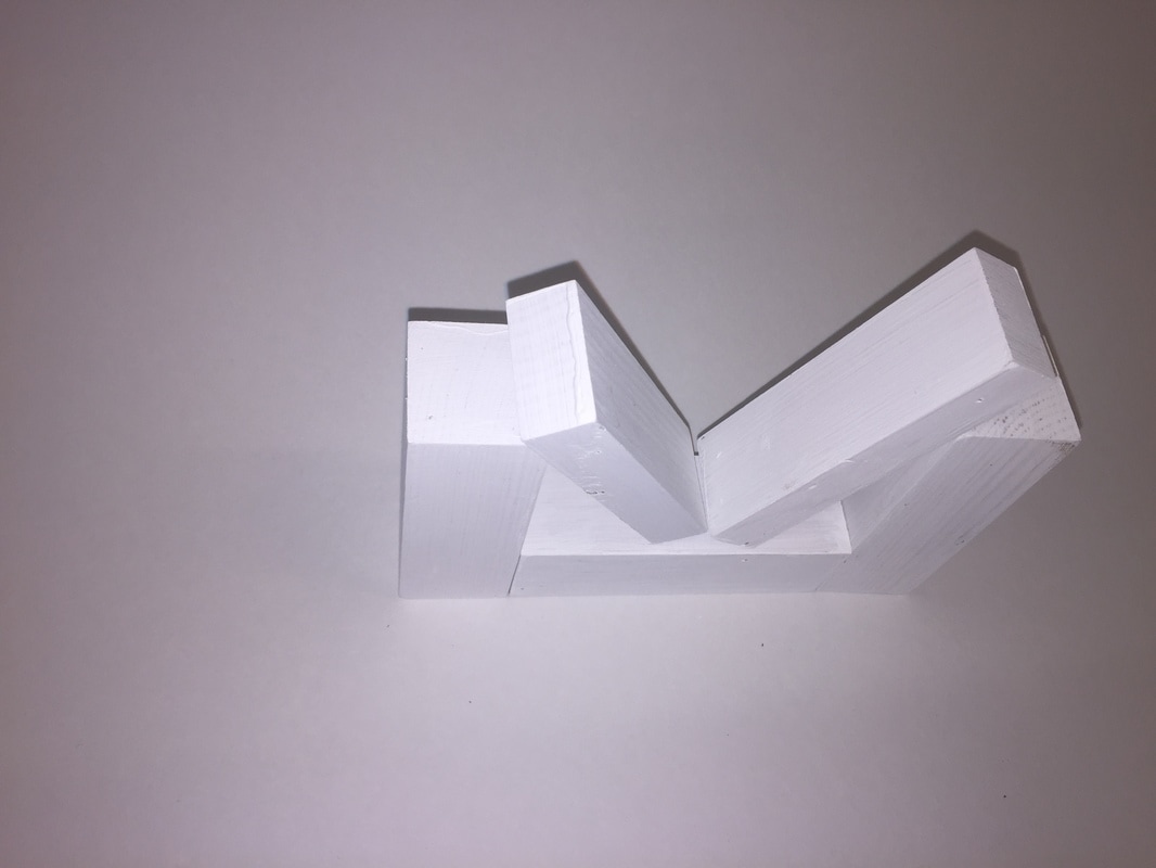
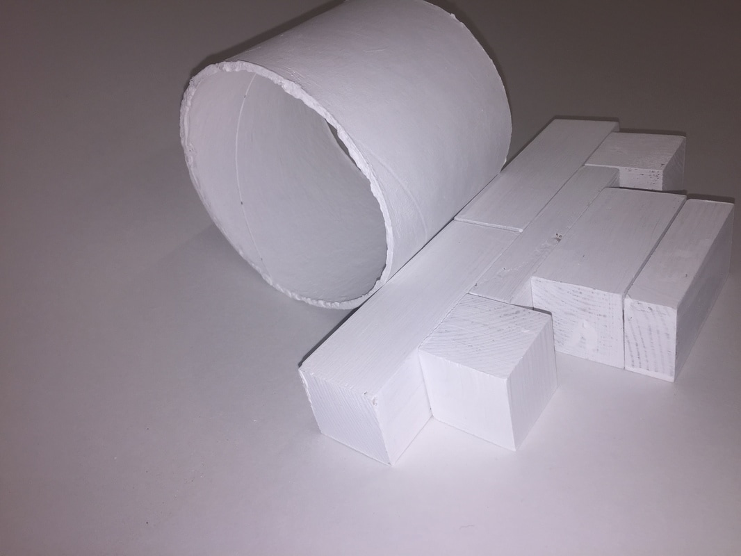
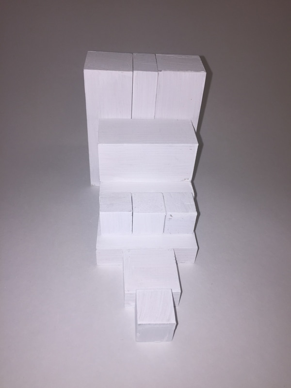
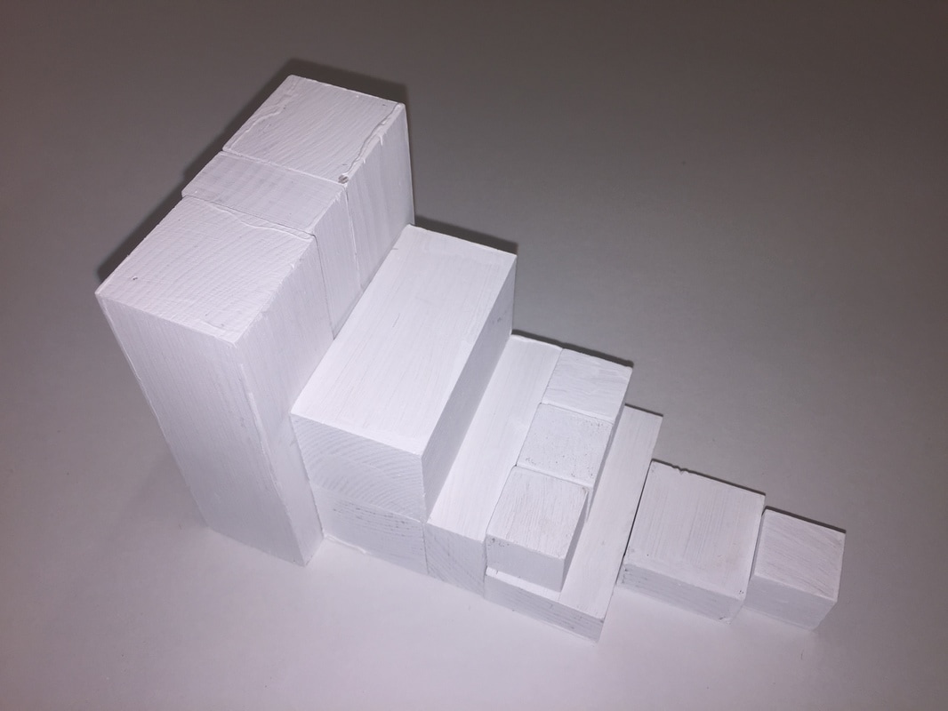
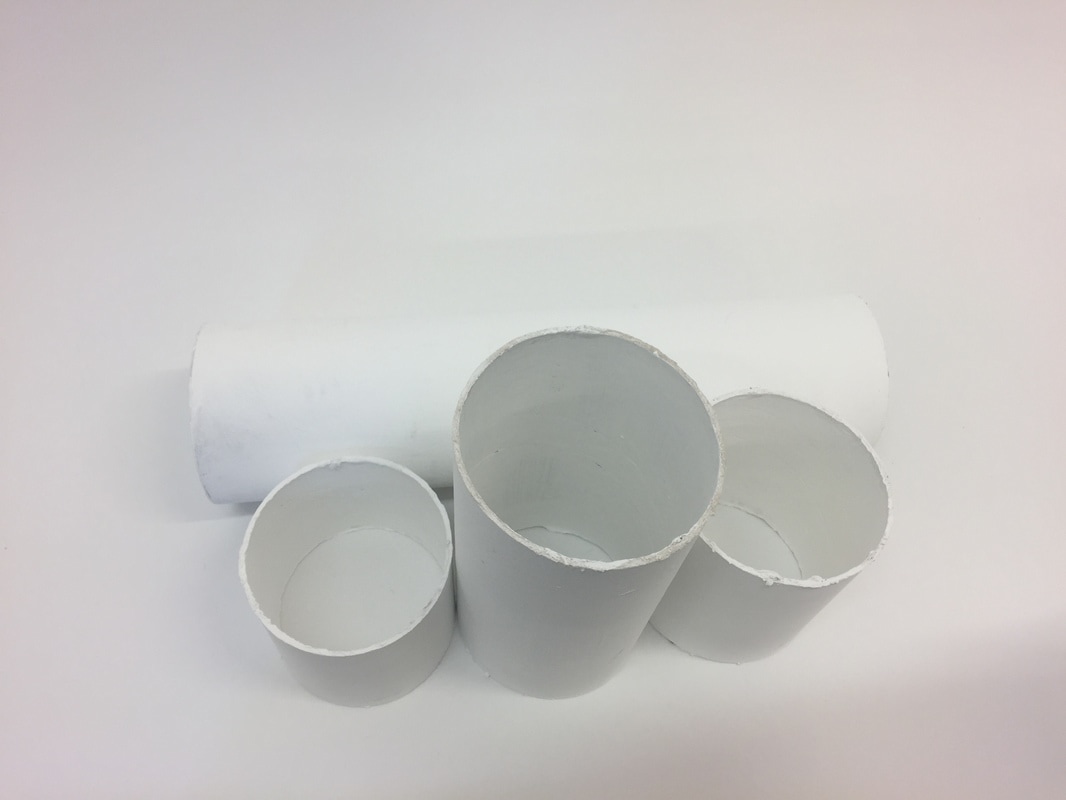
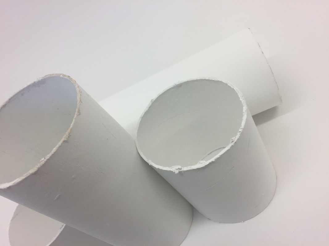
Bricks project
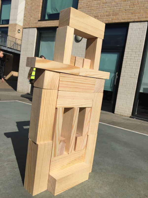
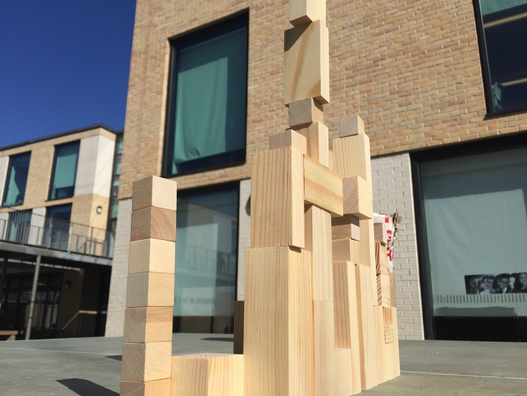
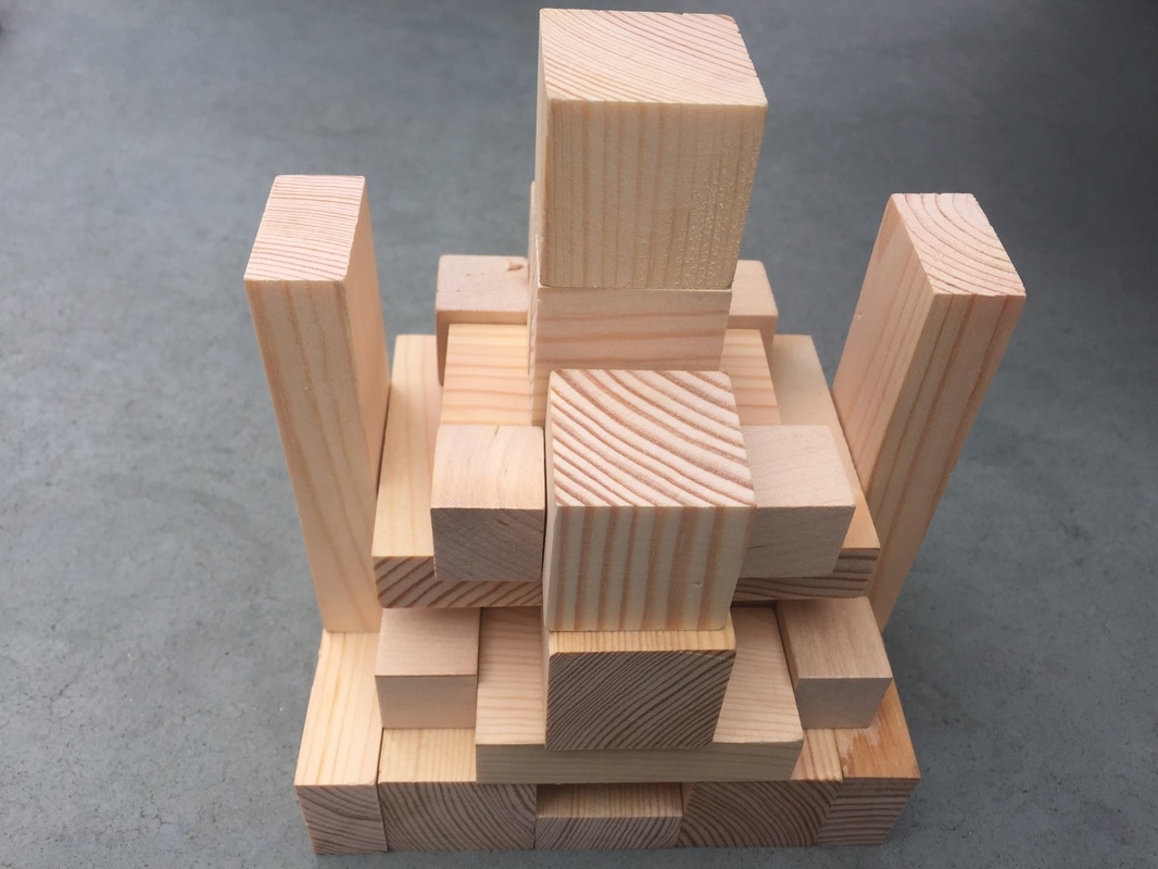
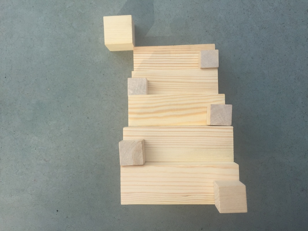
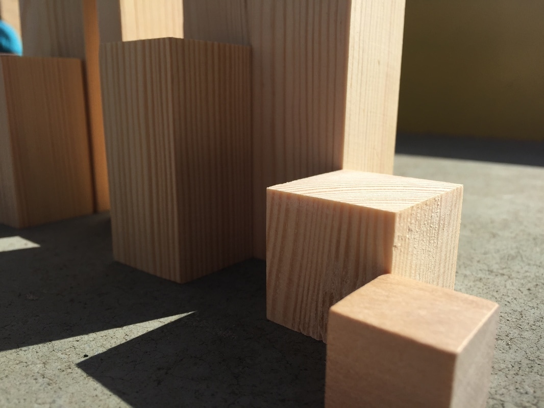
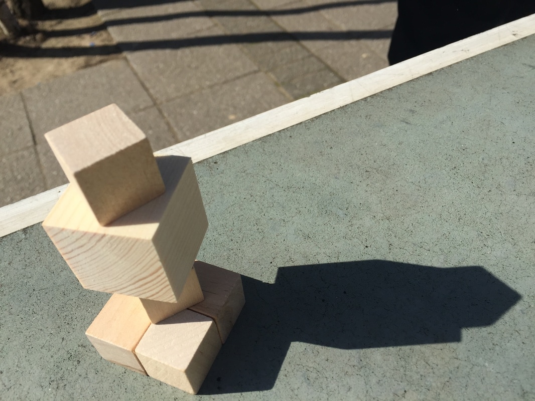
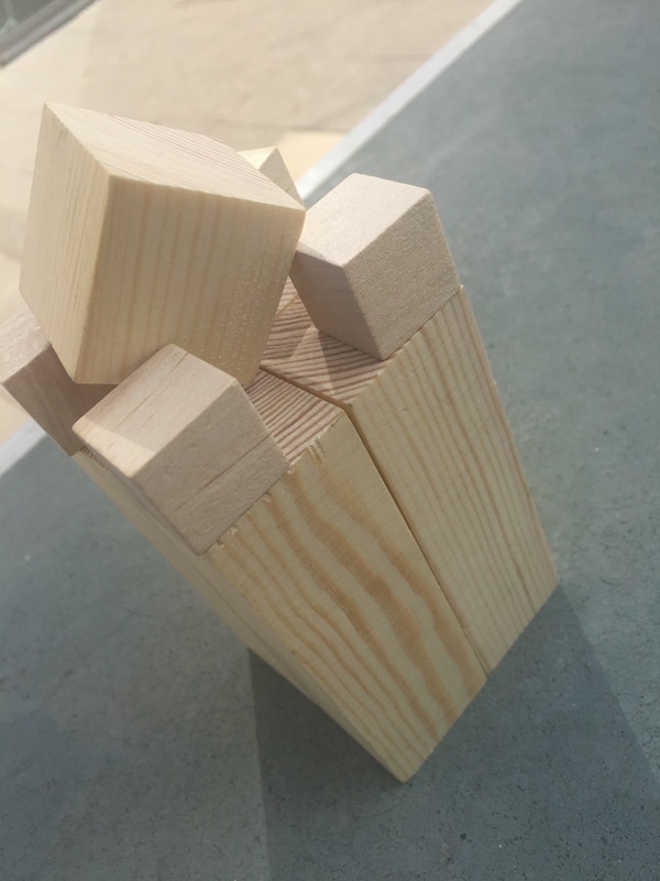
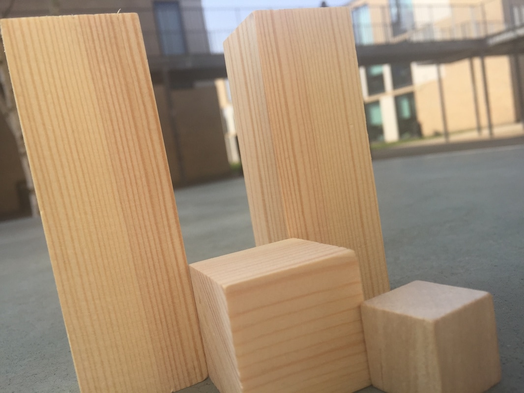
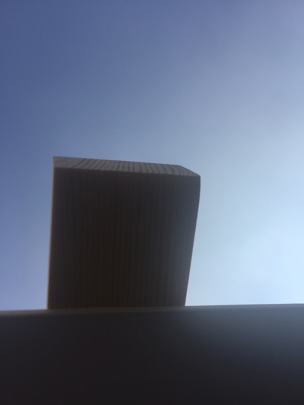
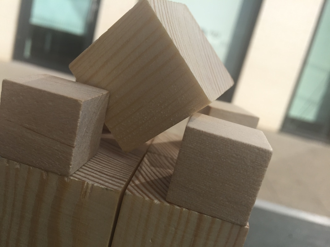
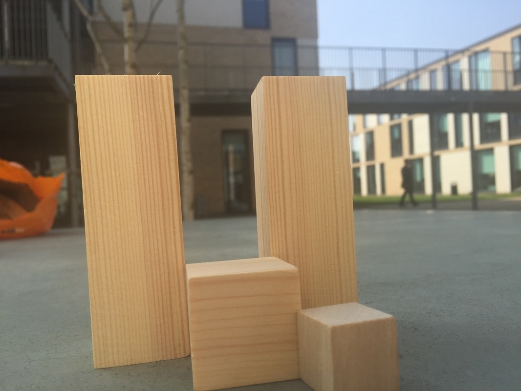
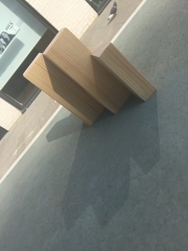
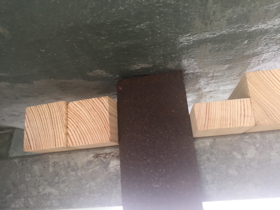
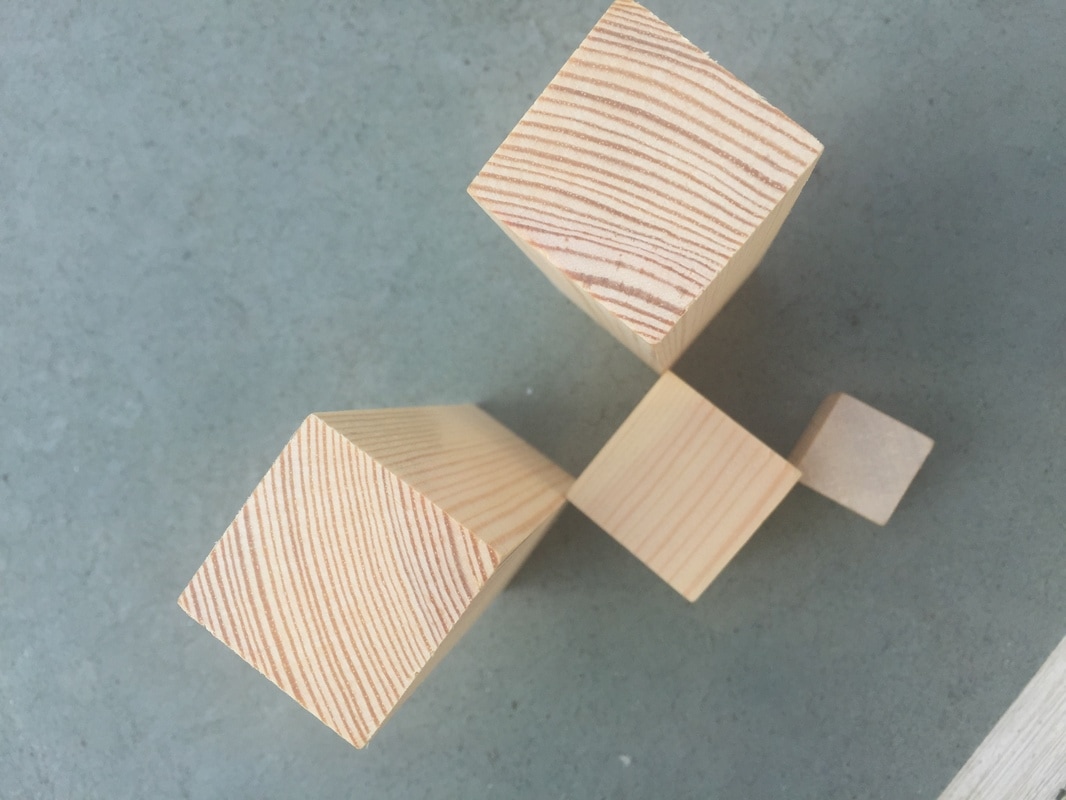
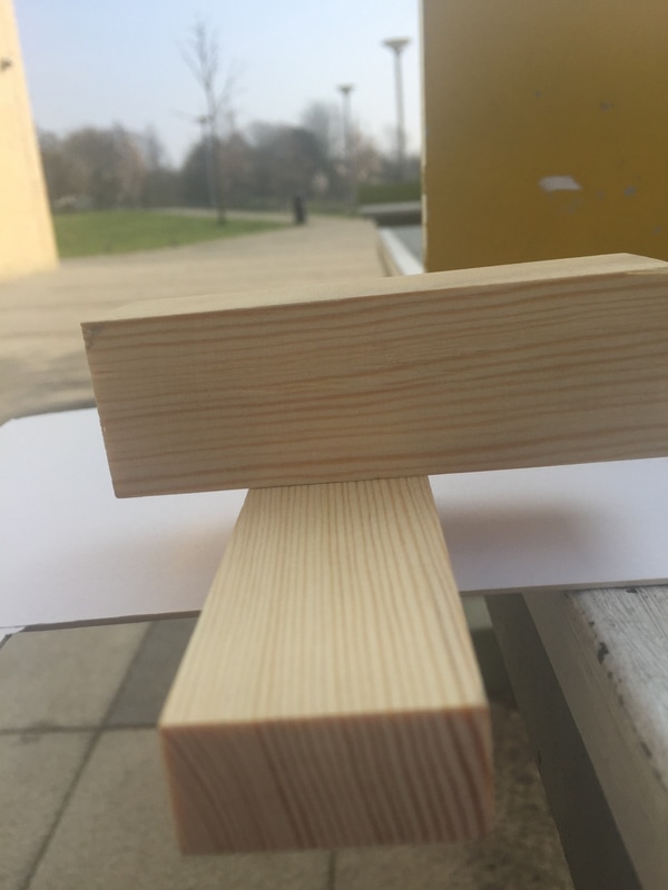
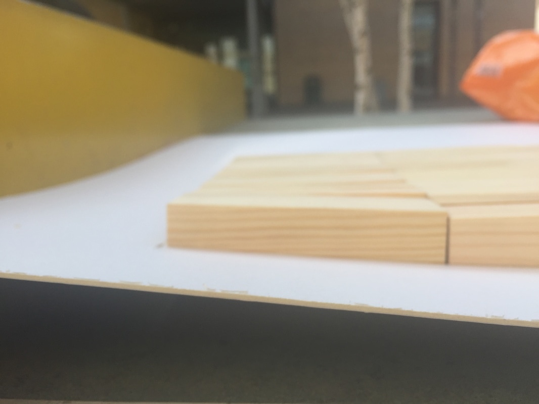
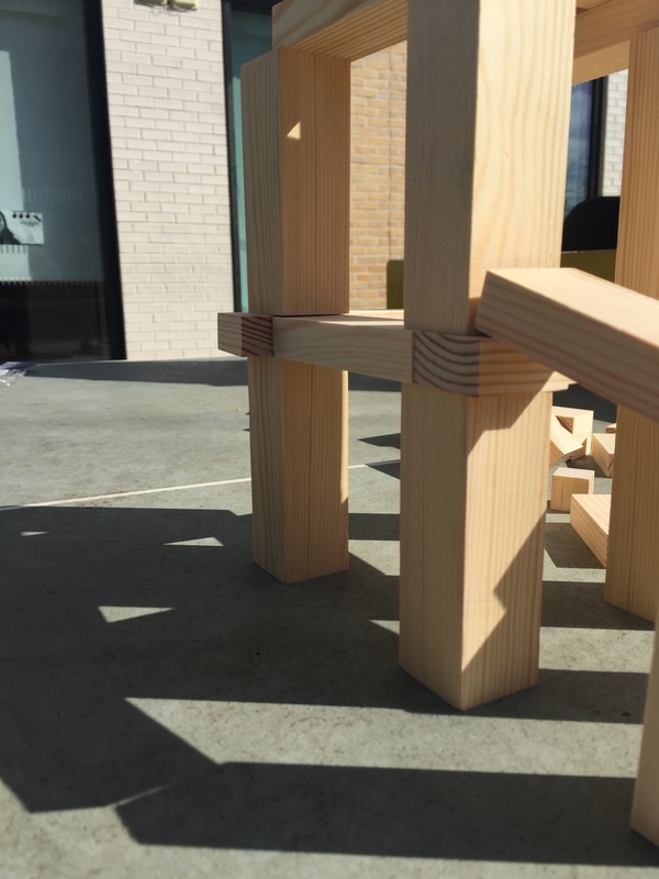
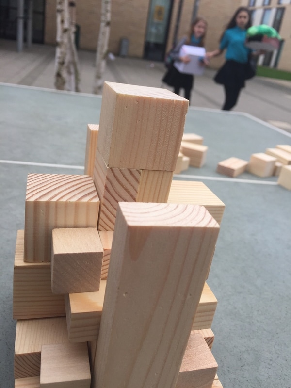
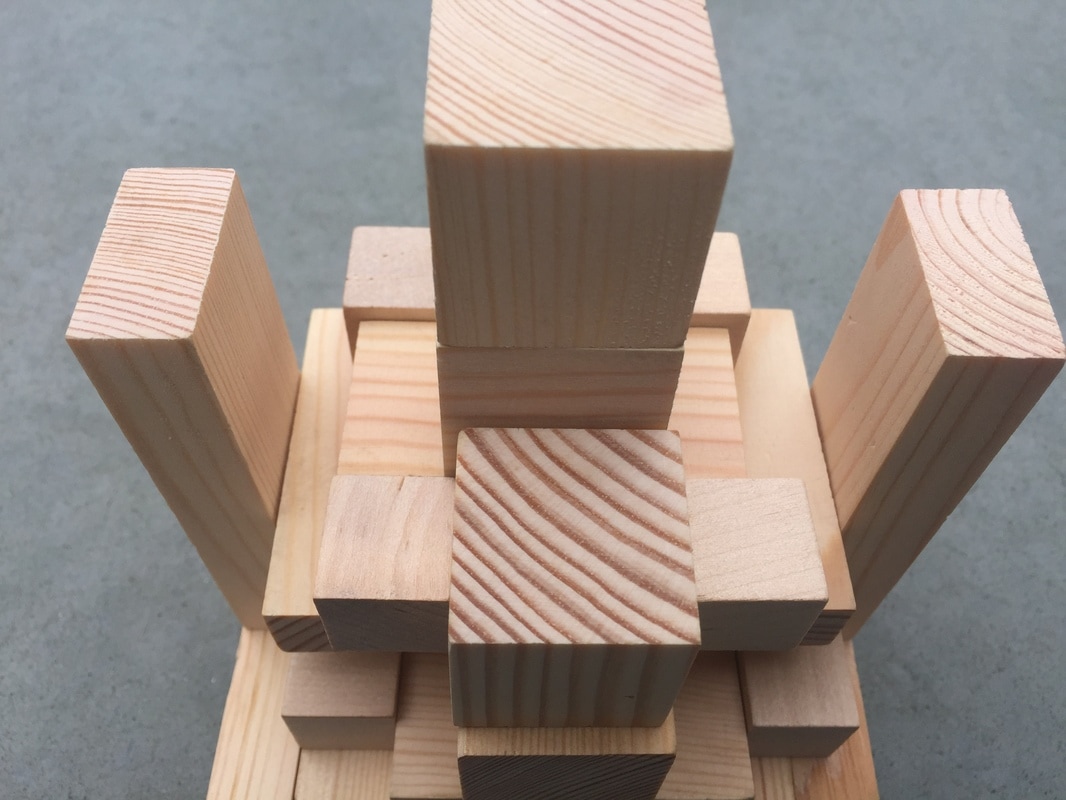
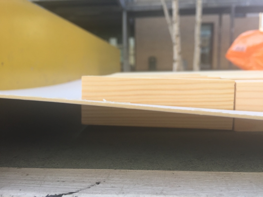
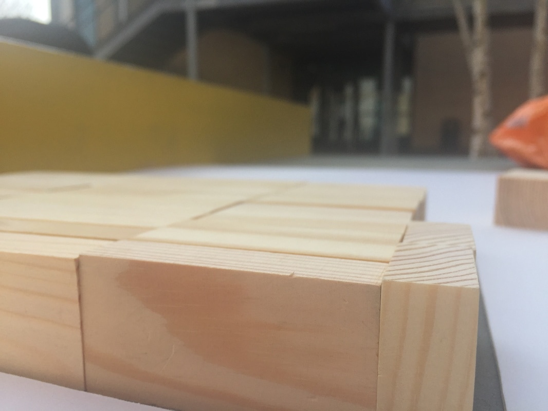
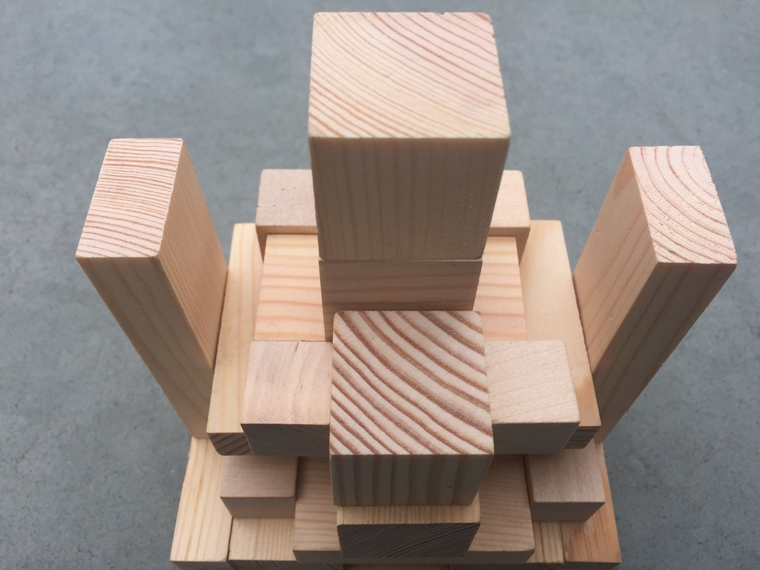
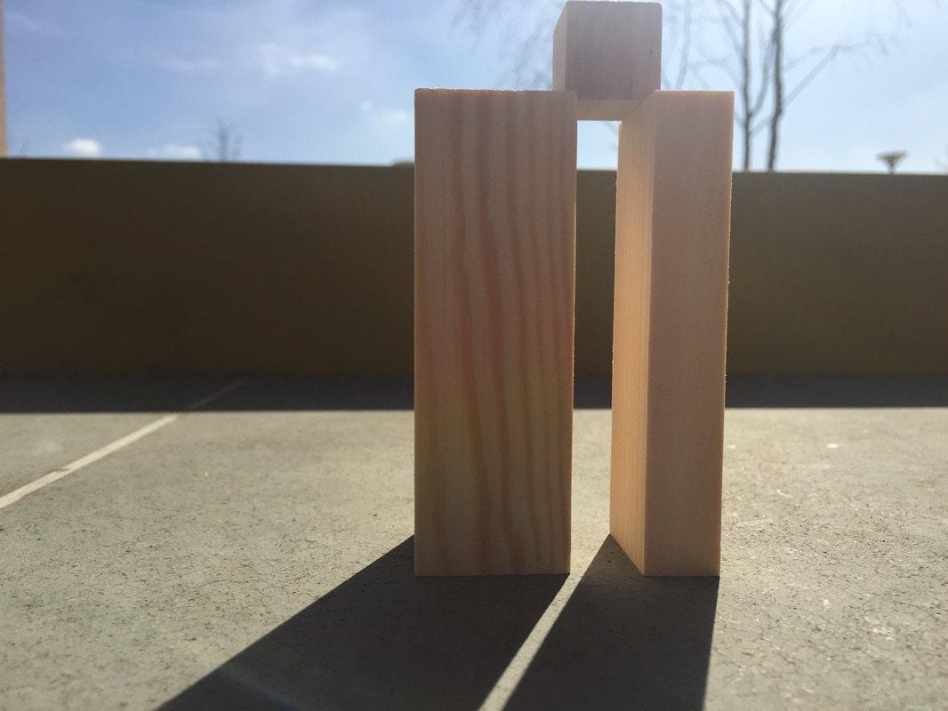
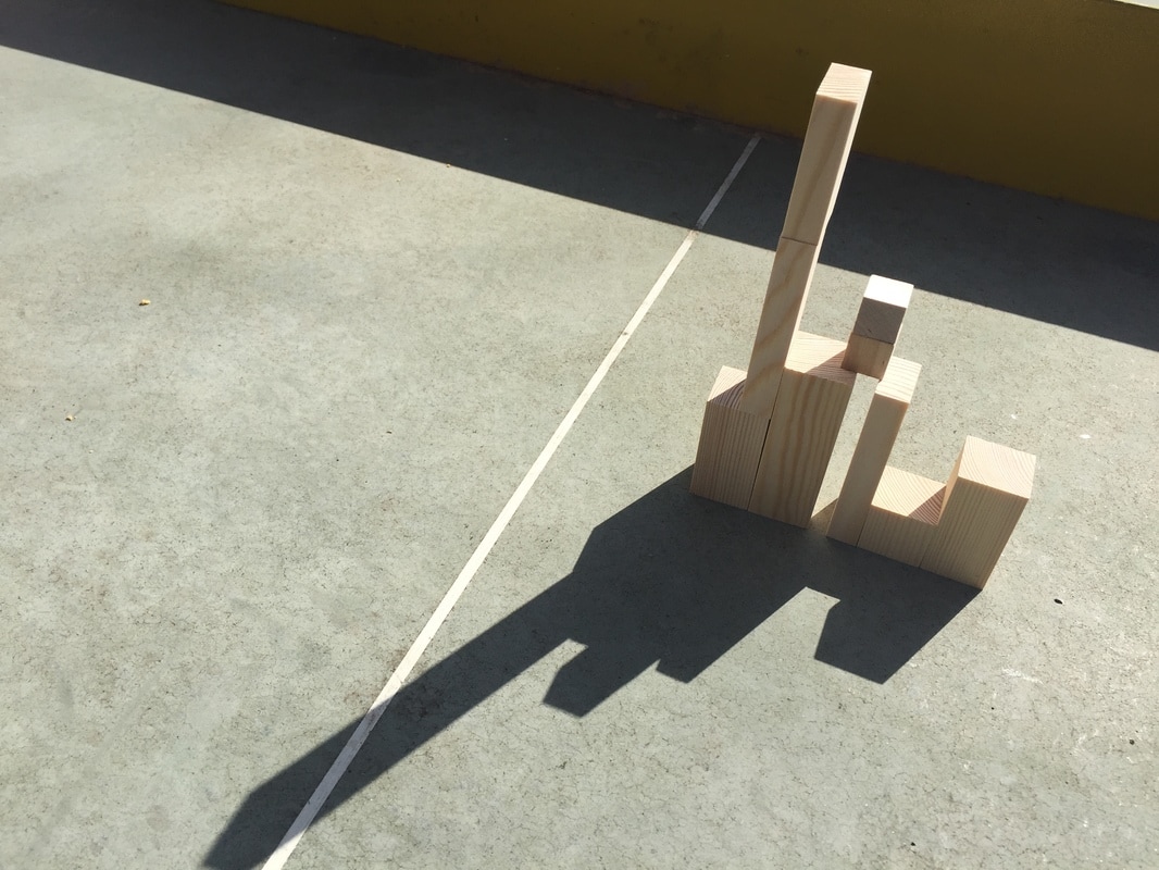
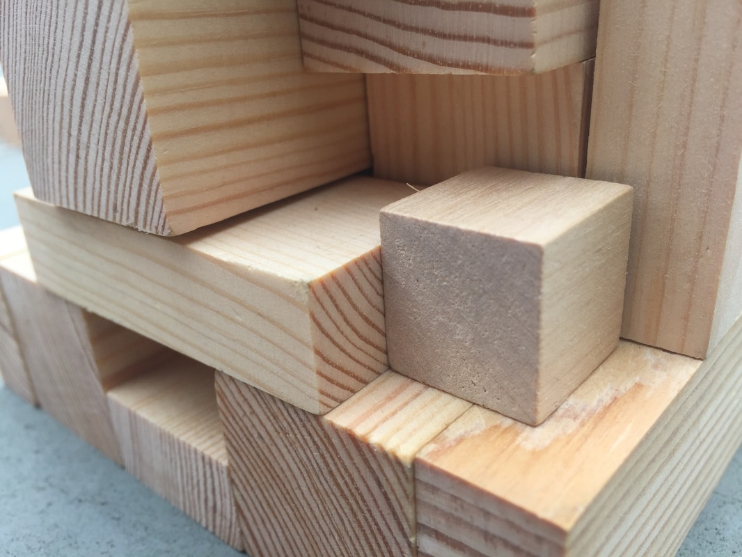
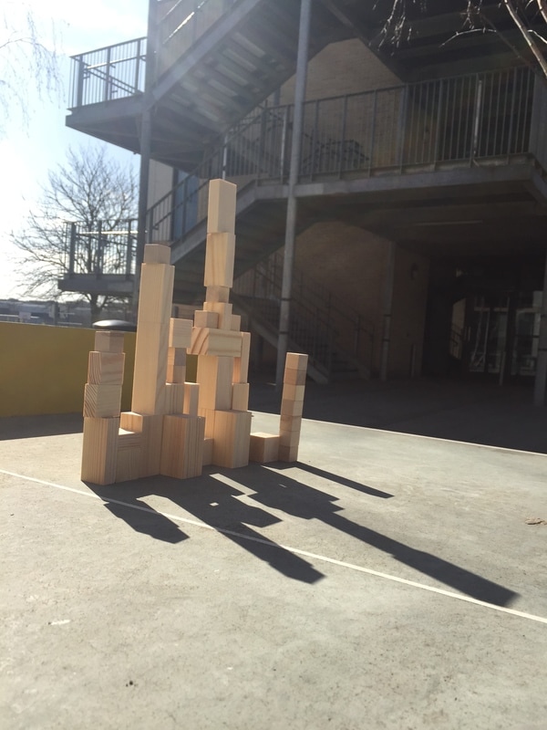
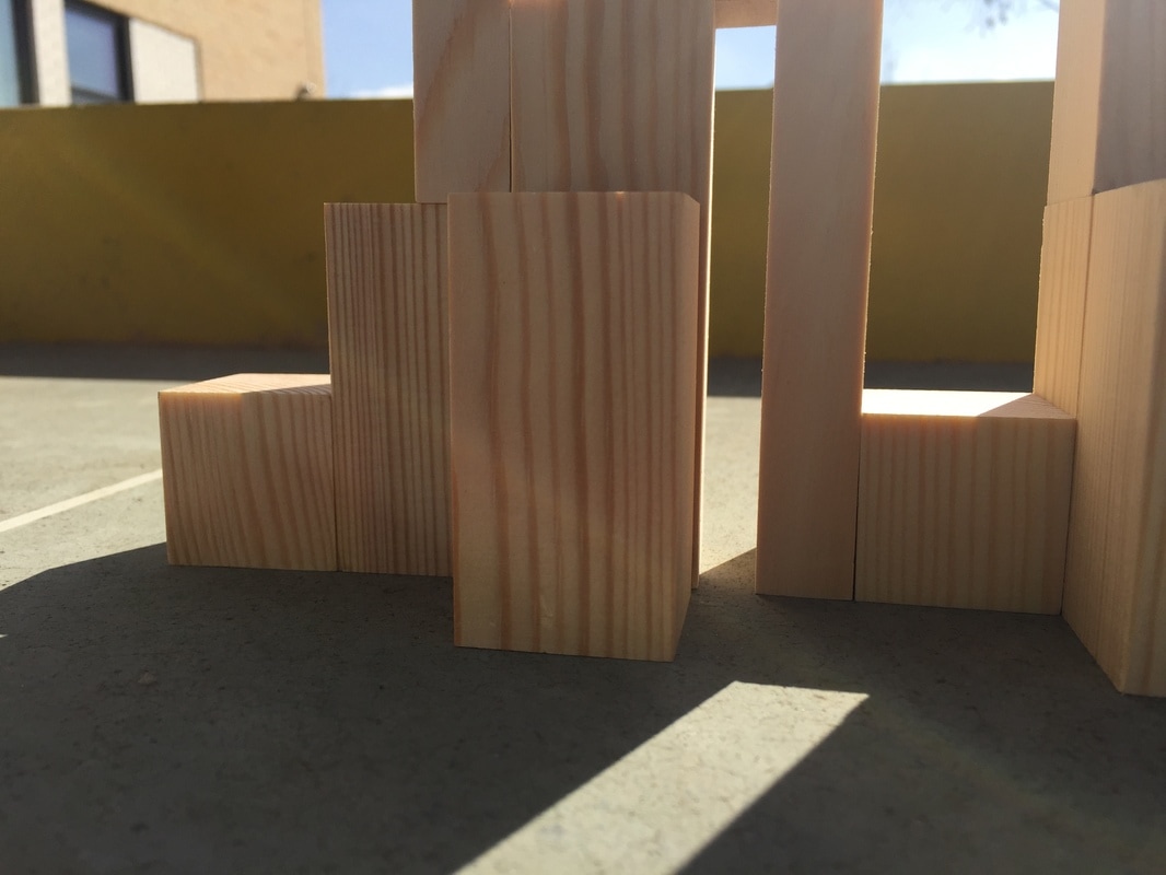
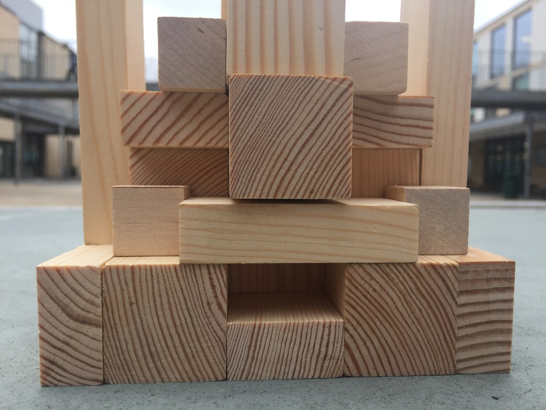
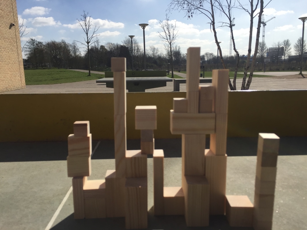
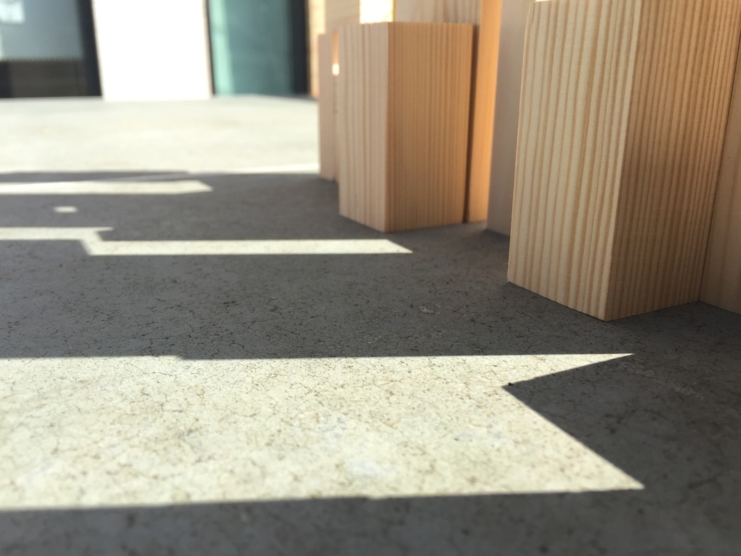

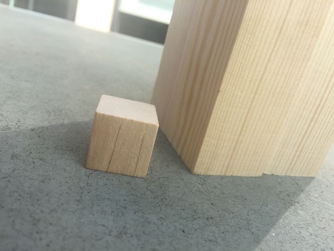
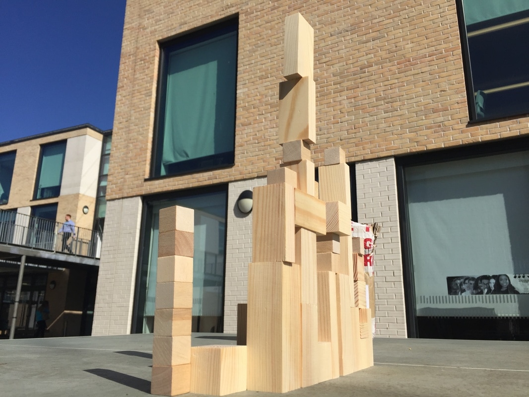
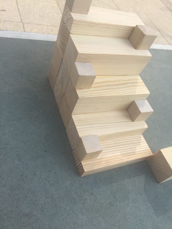
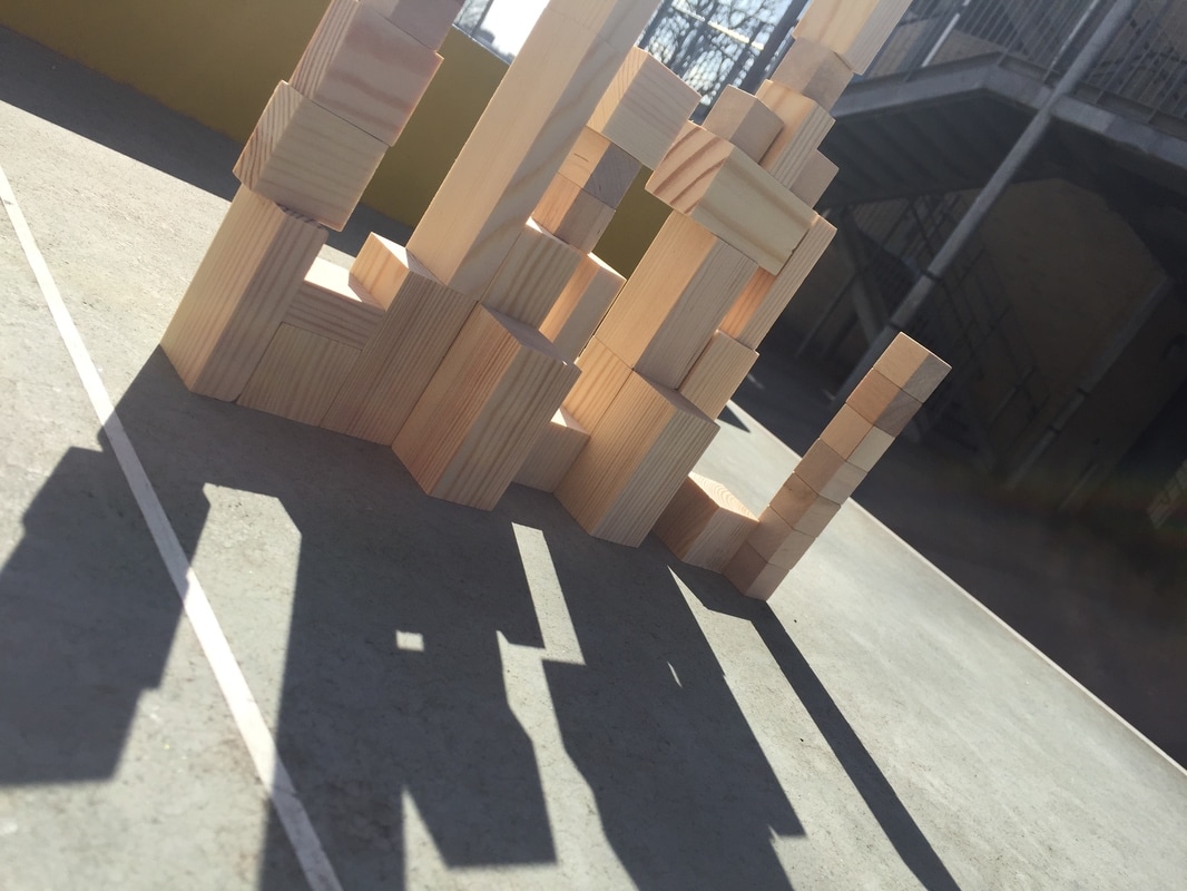
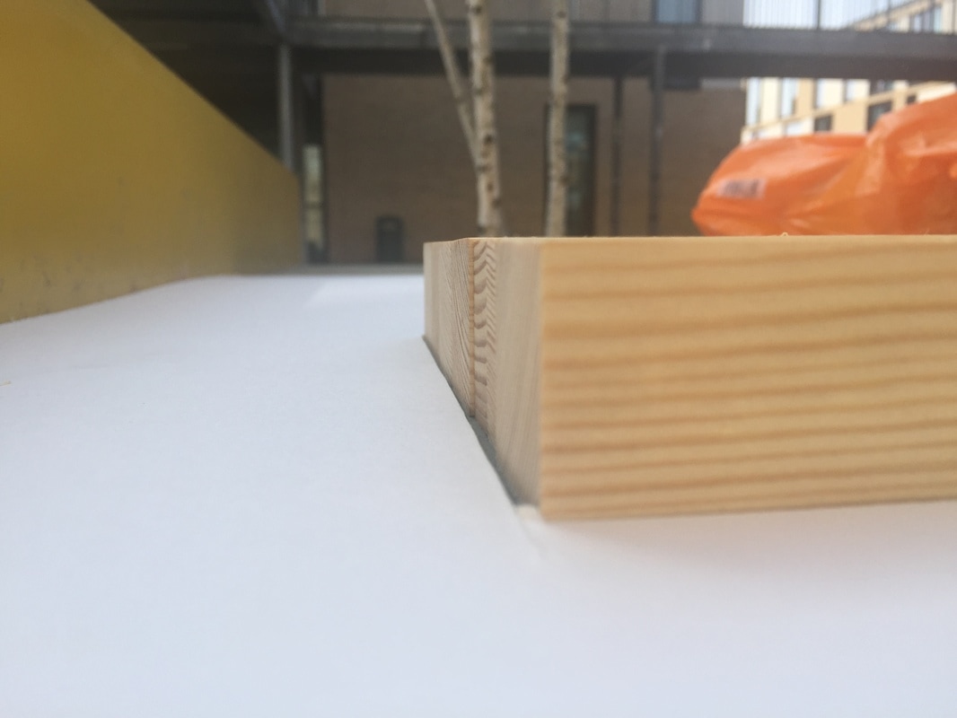
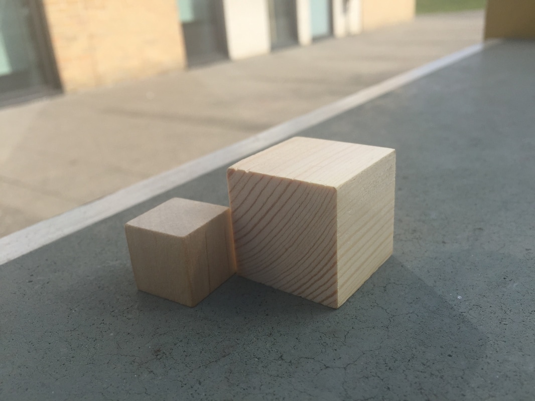
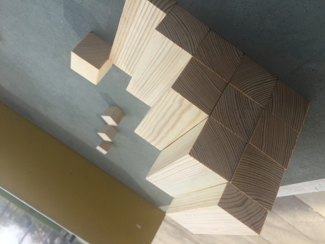
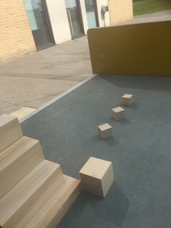
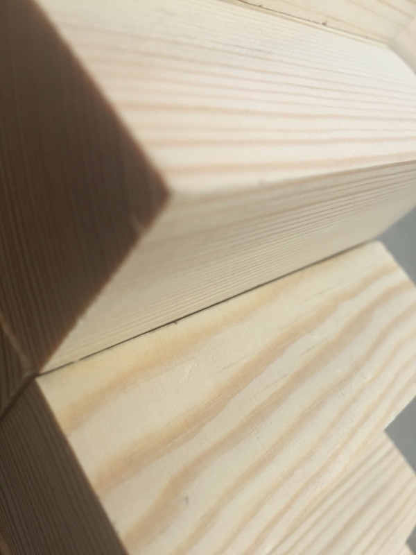
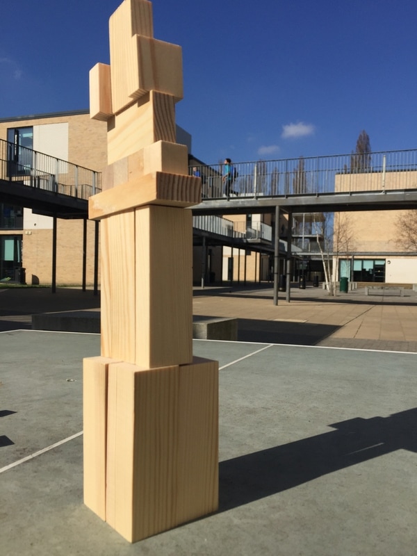
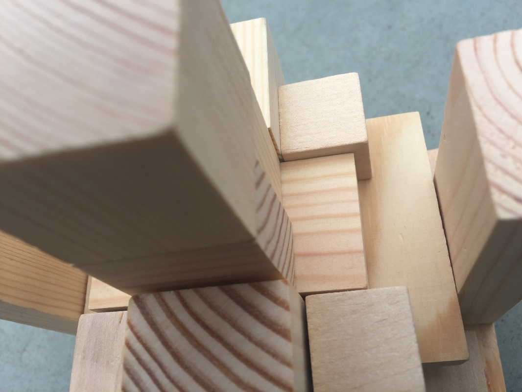
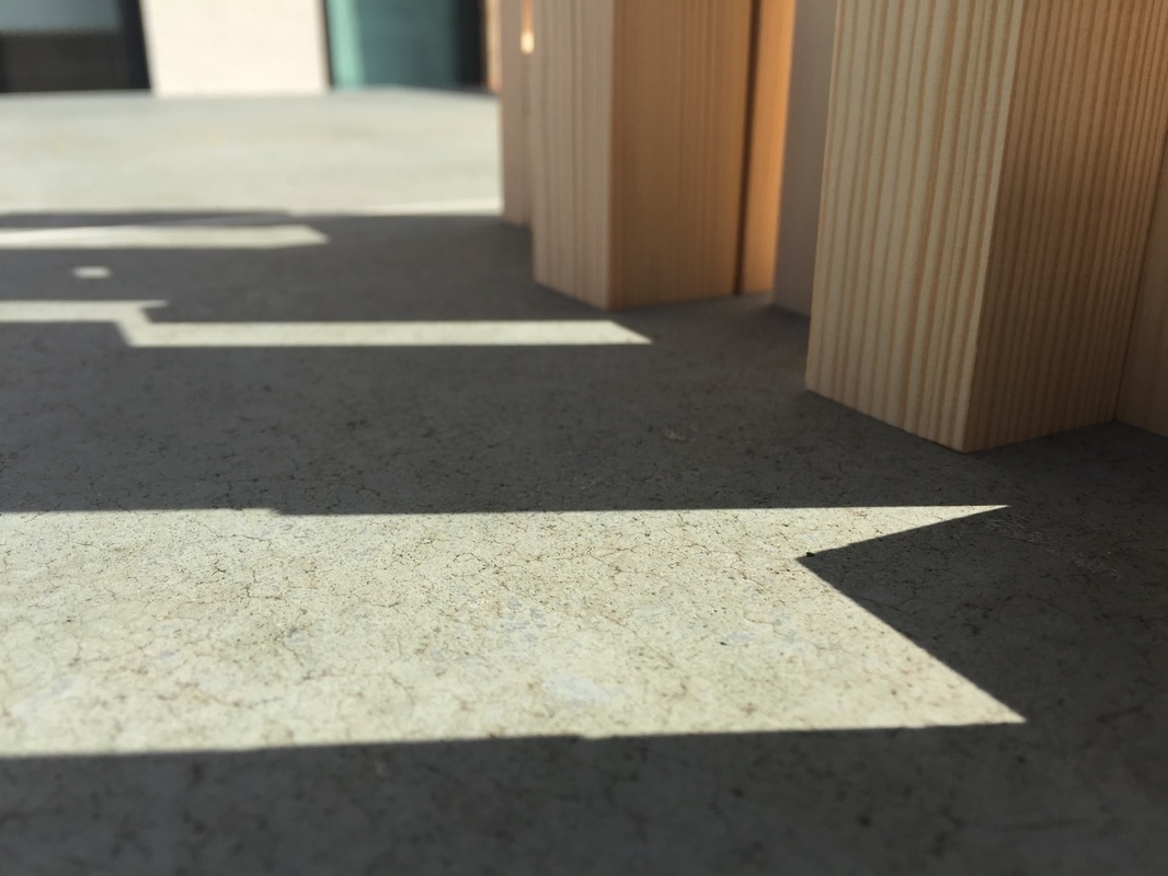
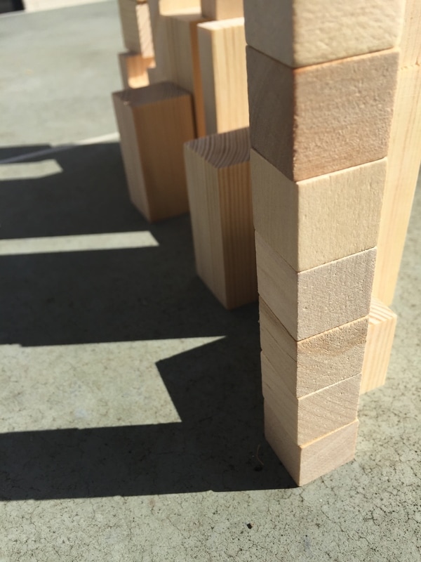
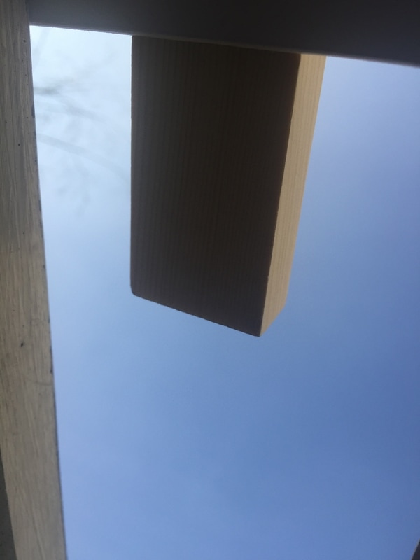
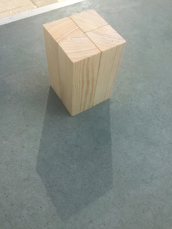
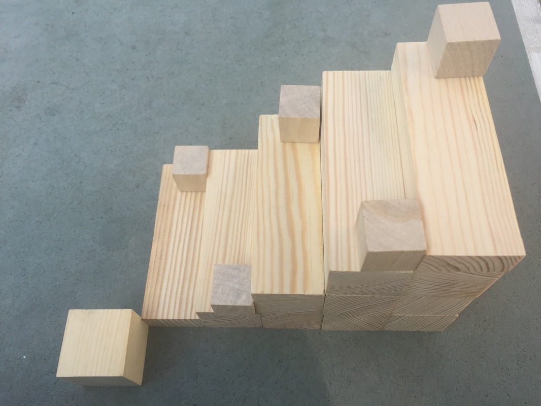
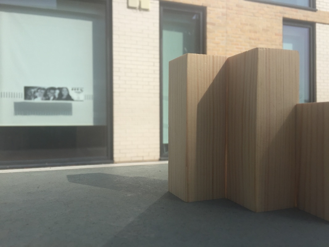
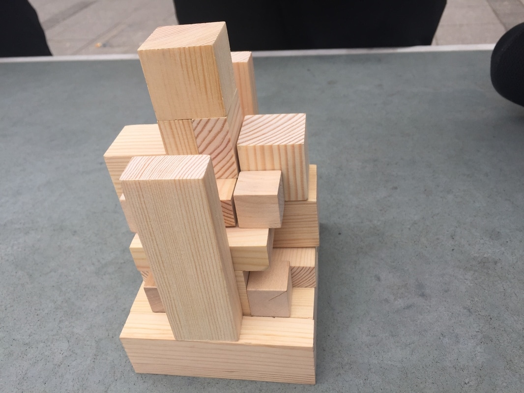
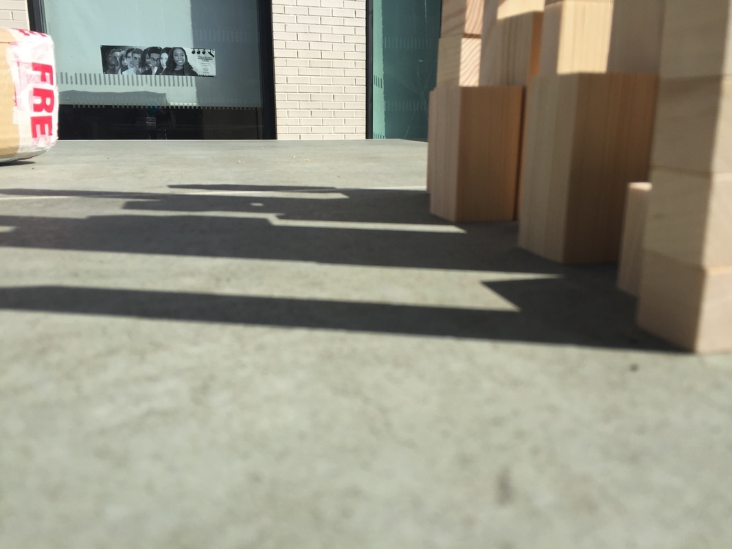
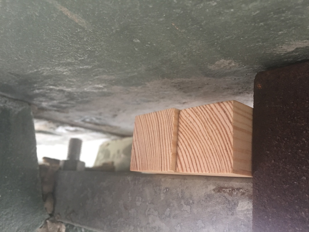
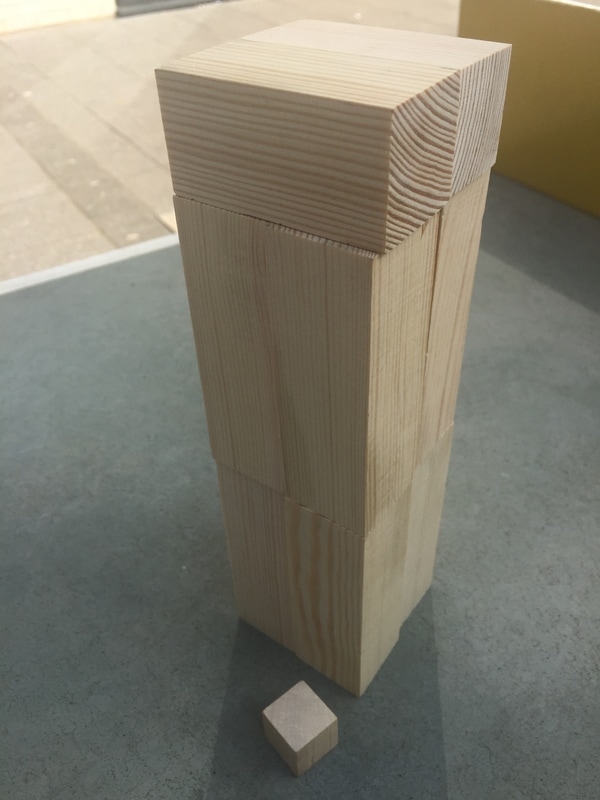
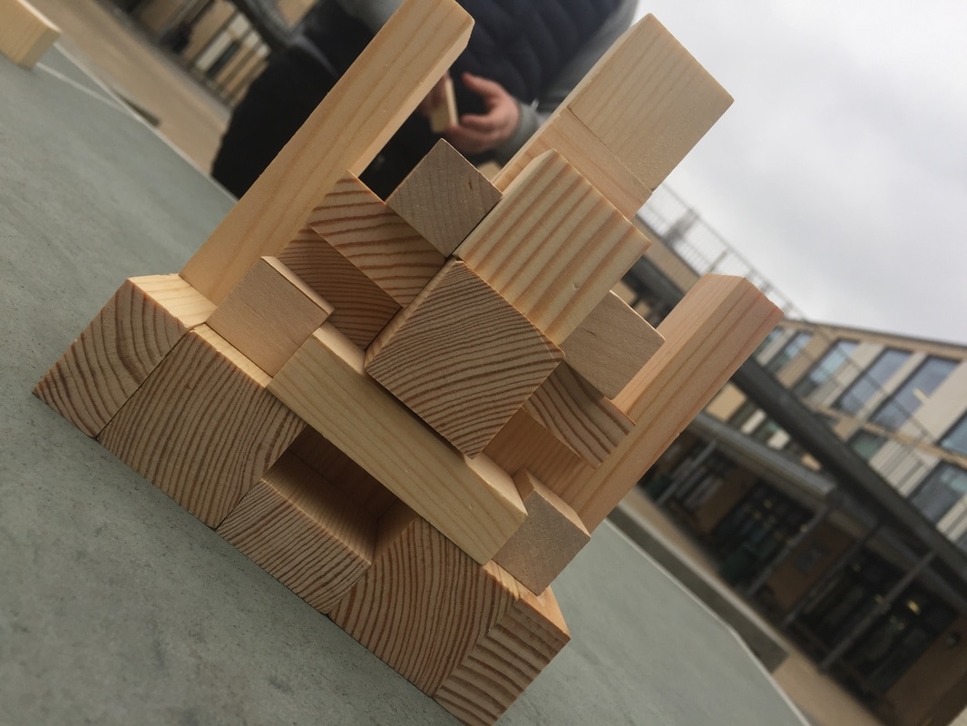
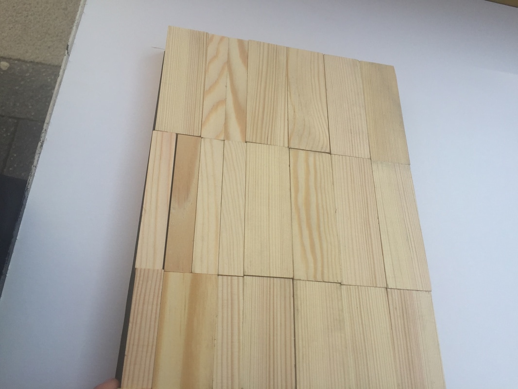
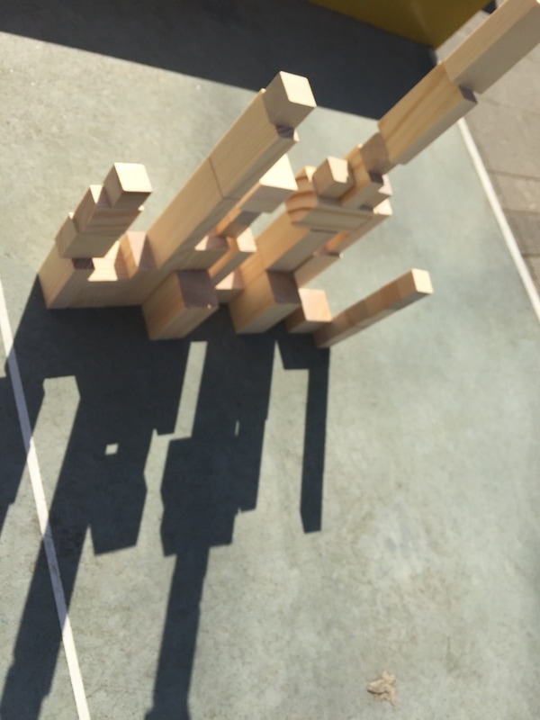
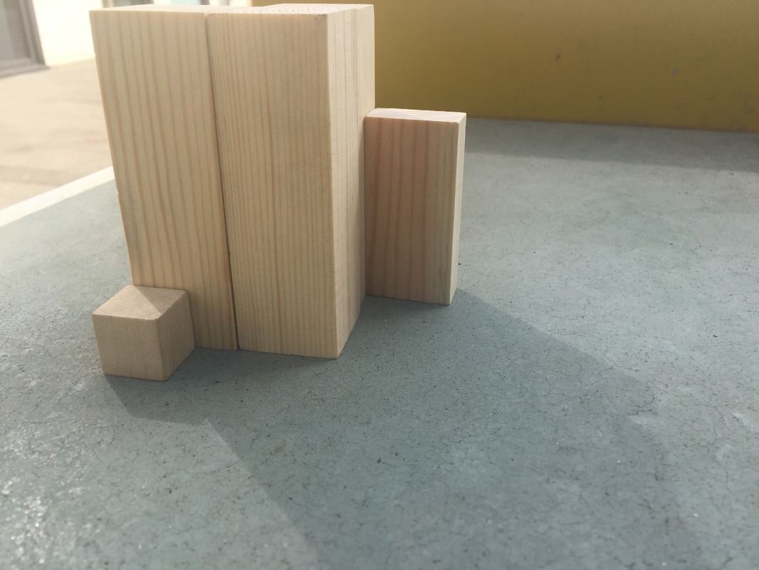
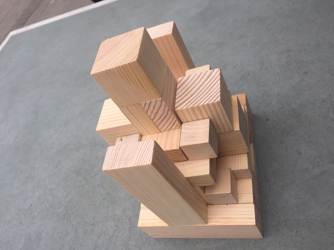
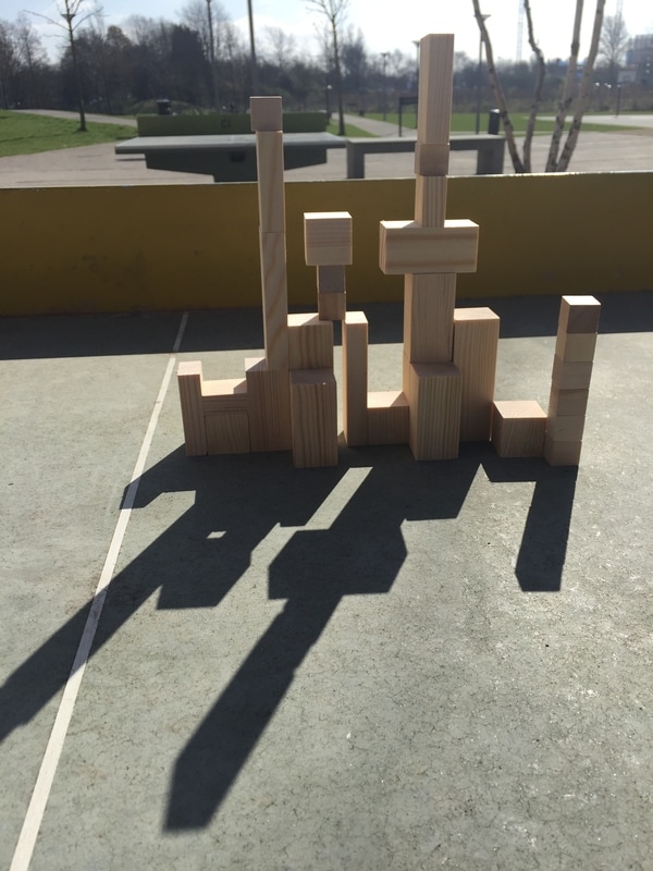
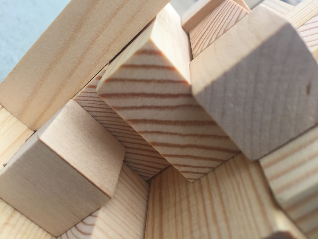
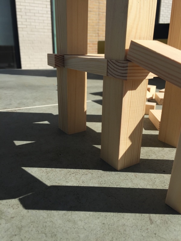
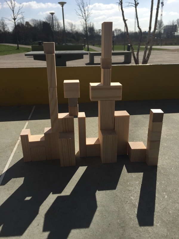
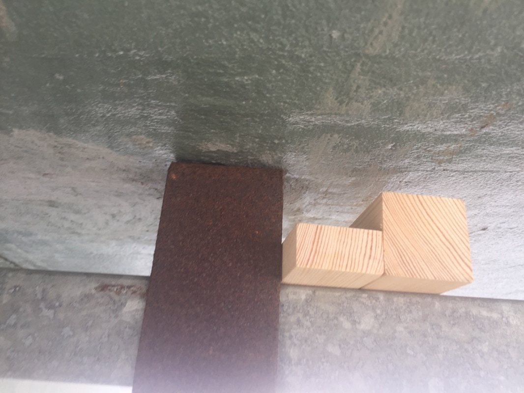
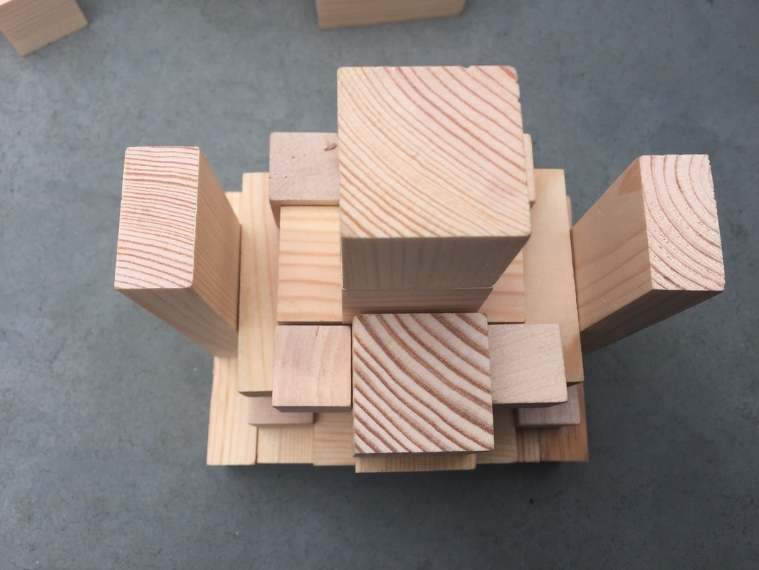
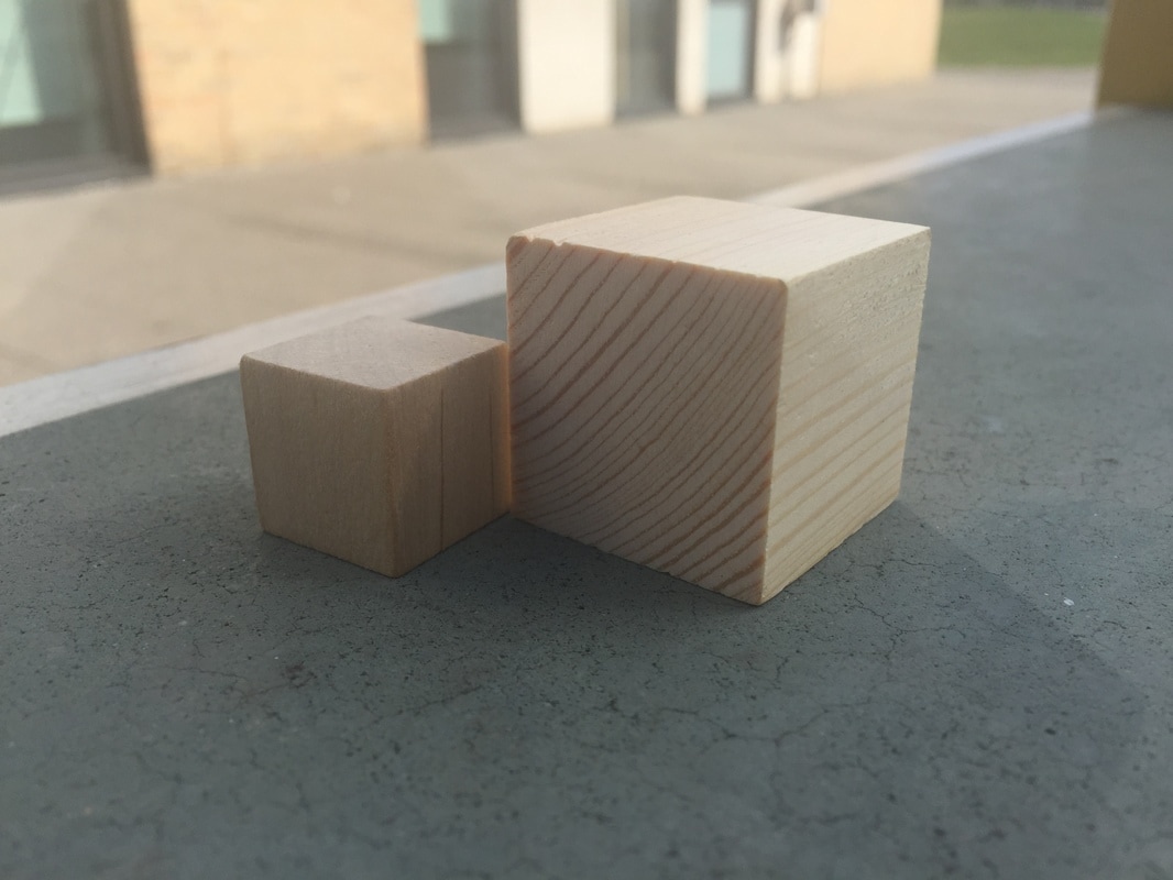
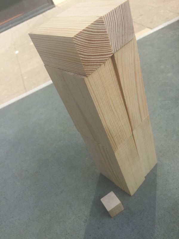
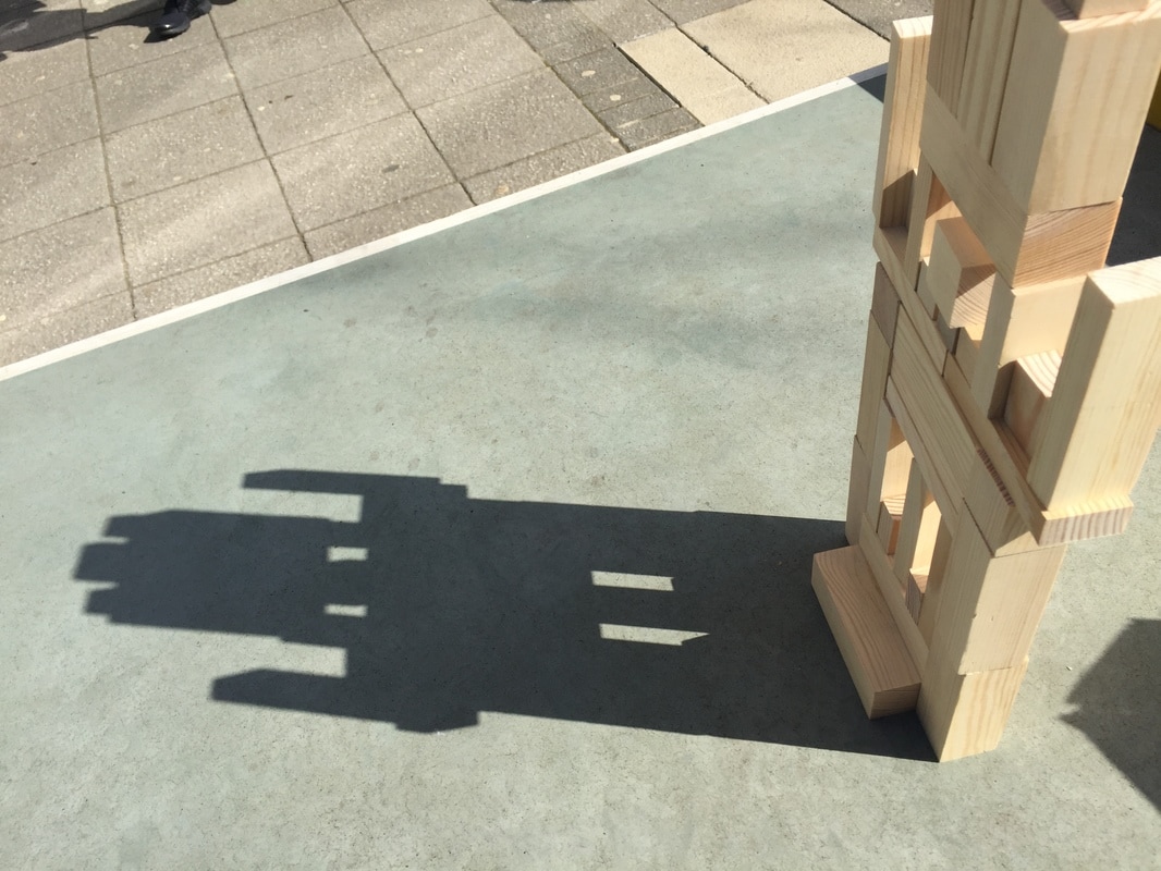
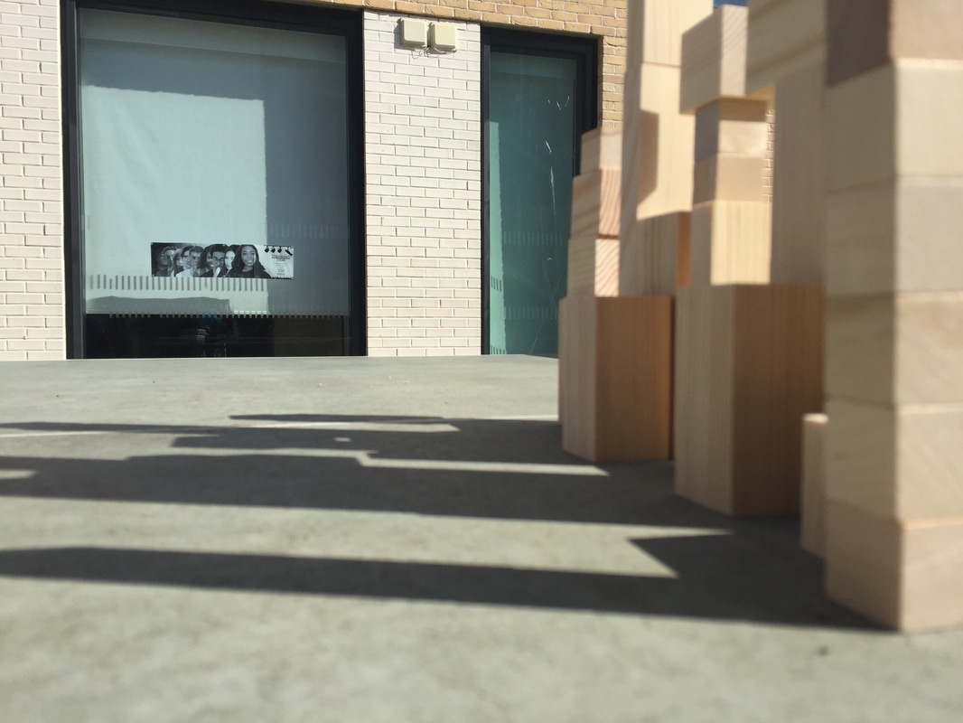
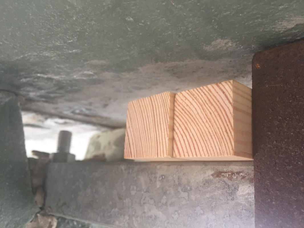
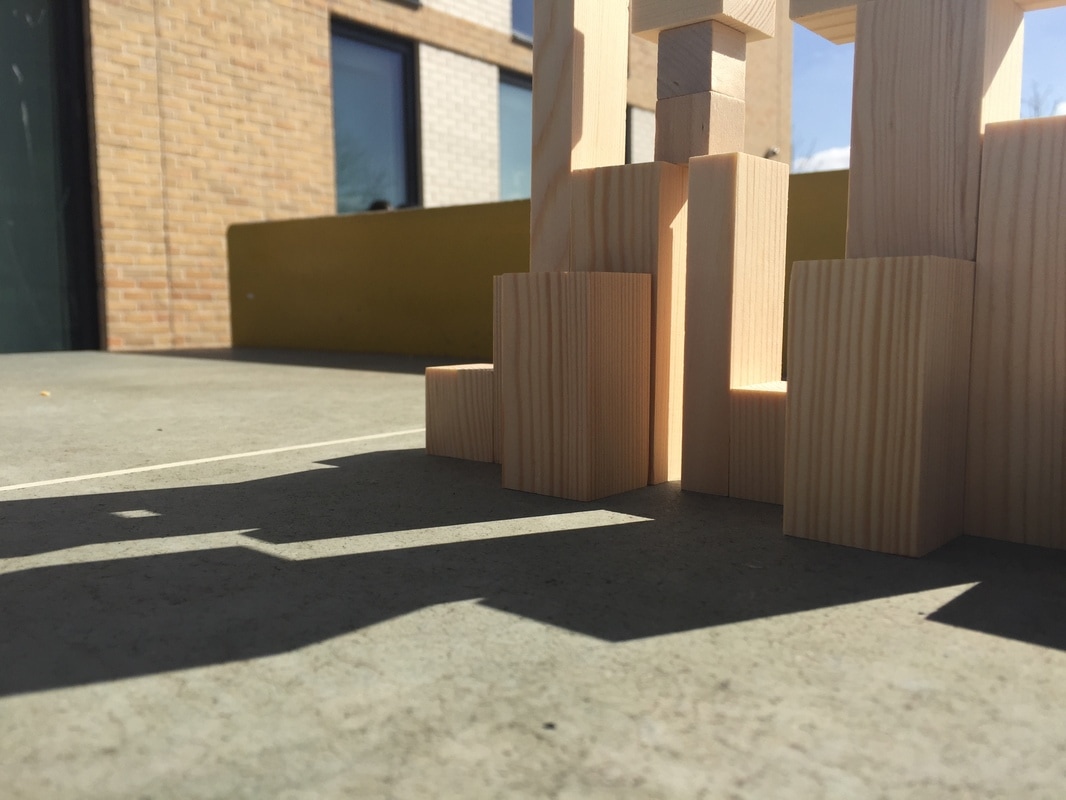
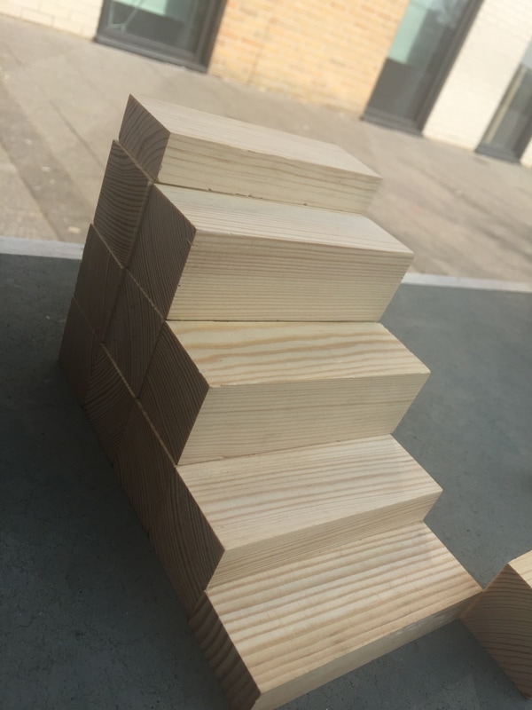
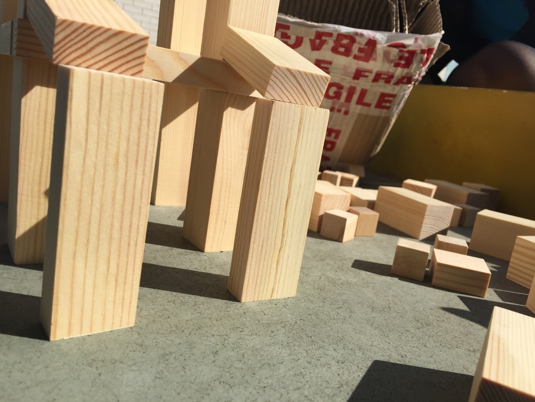
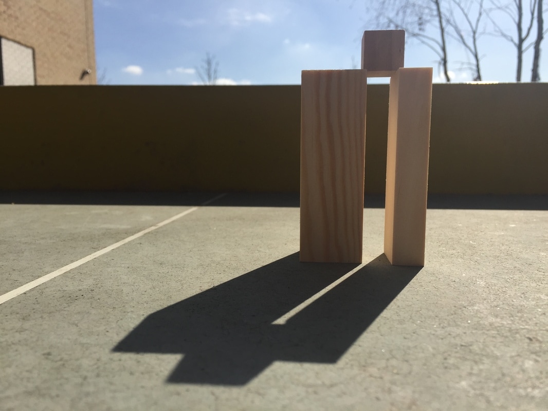
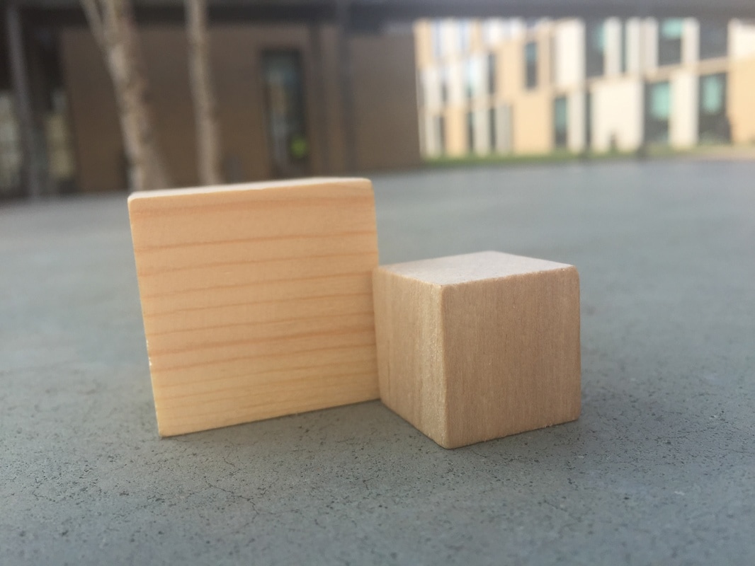
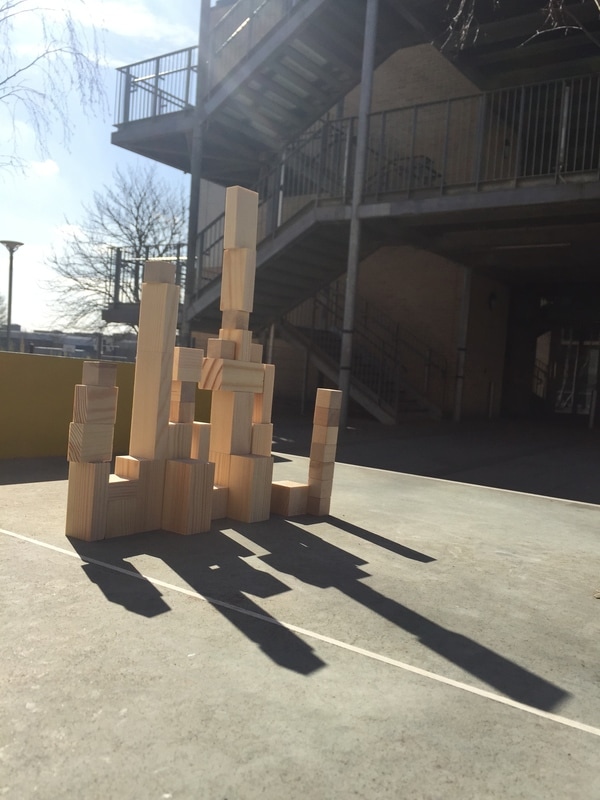
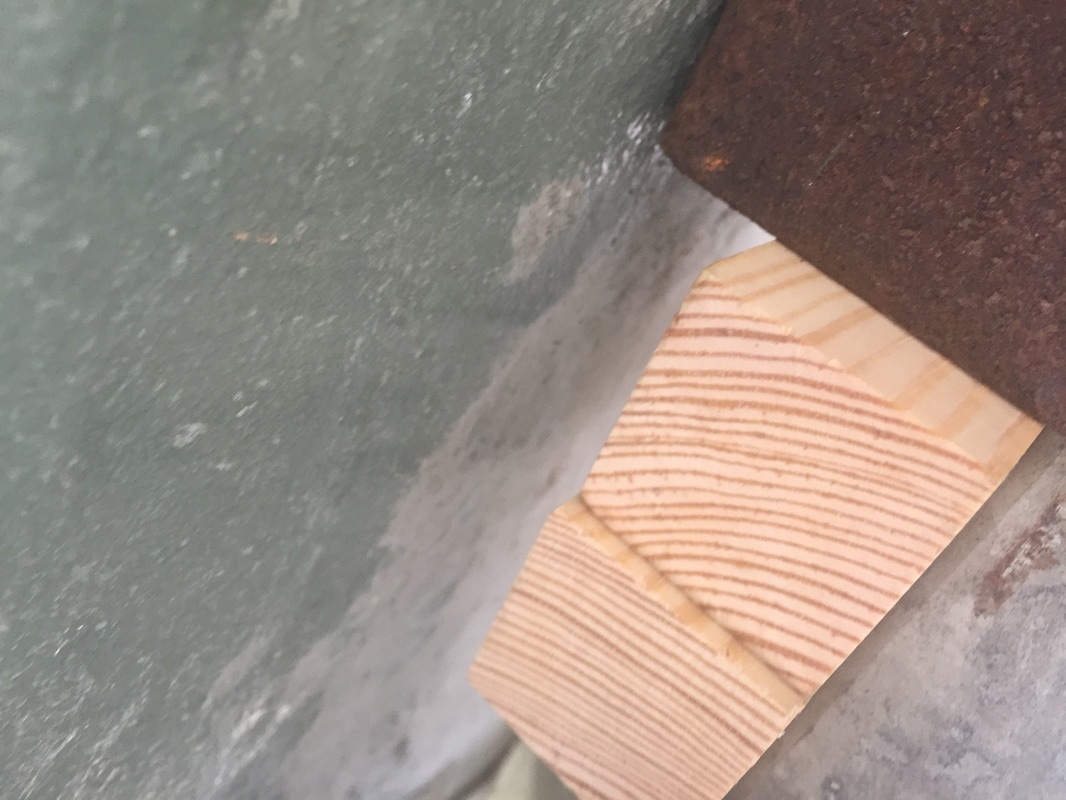
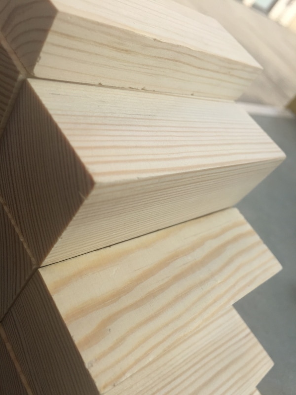
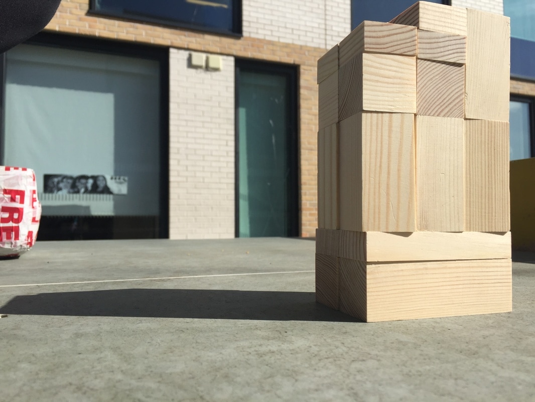
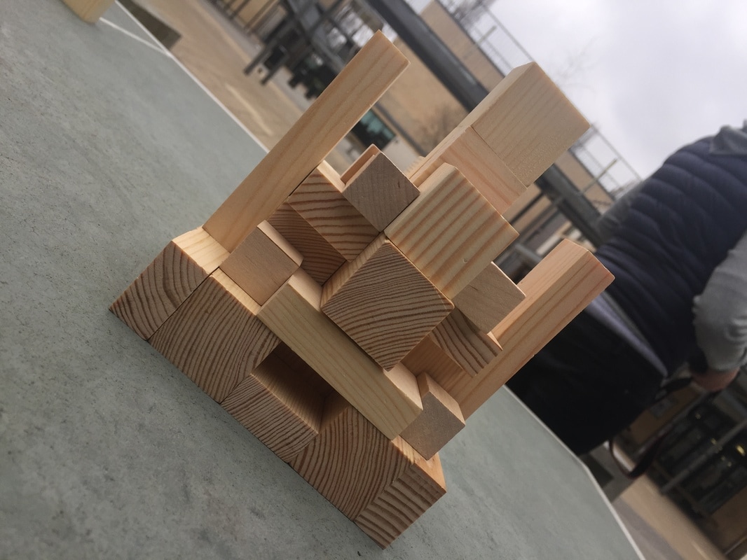
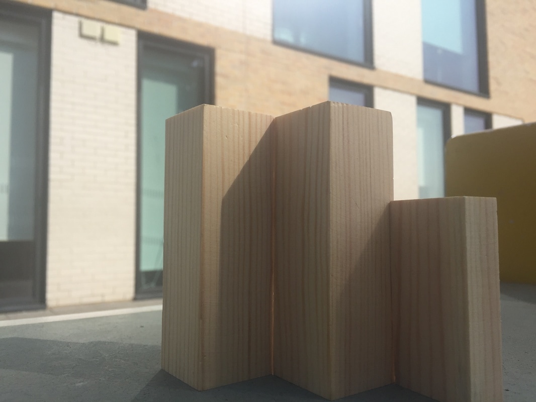
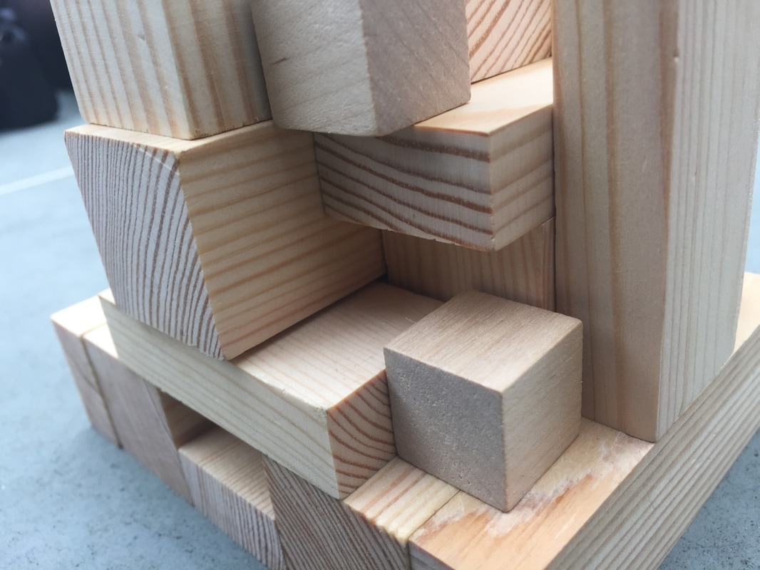
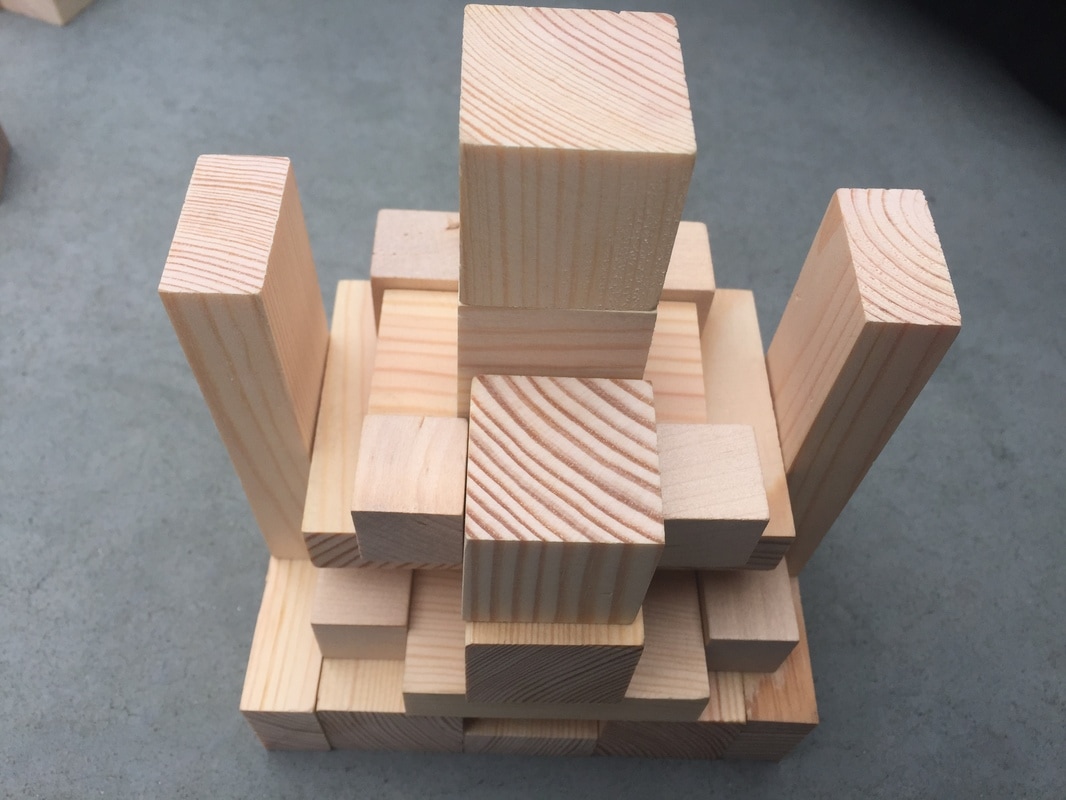
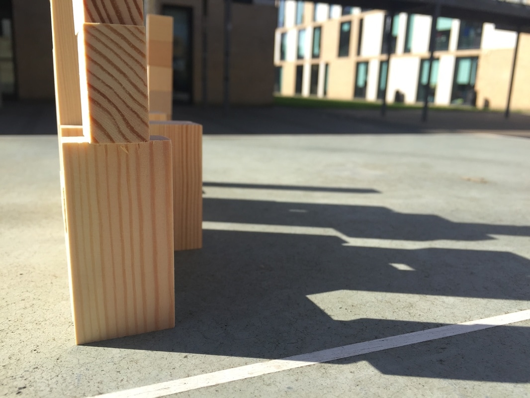
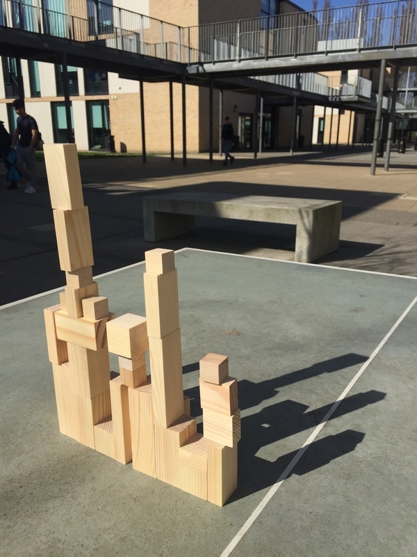
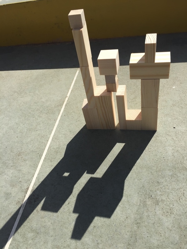
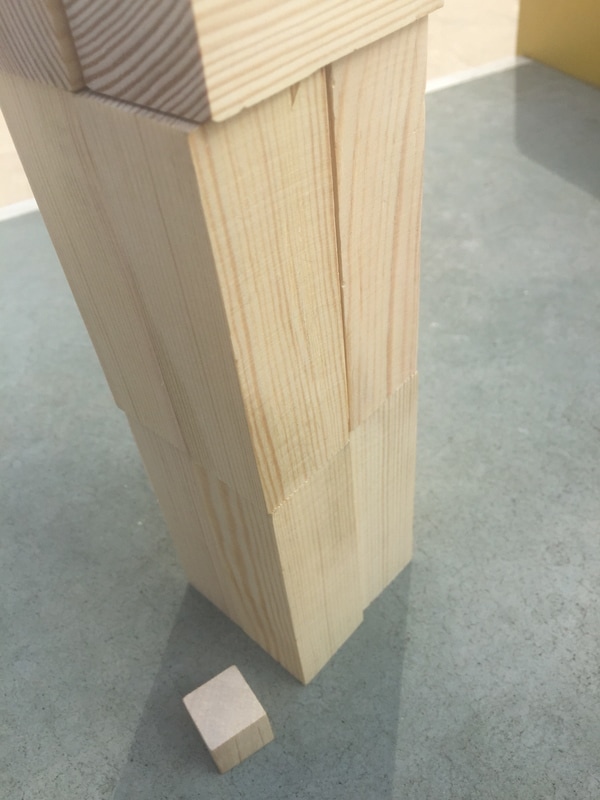
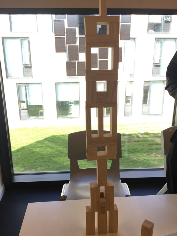
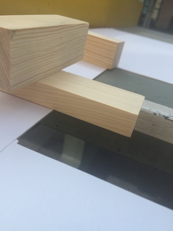
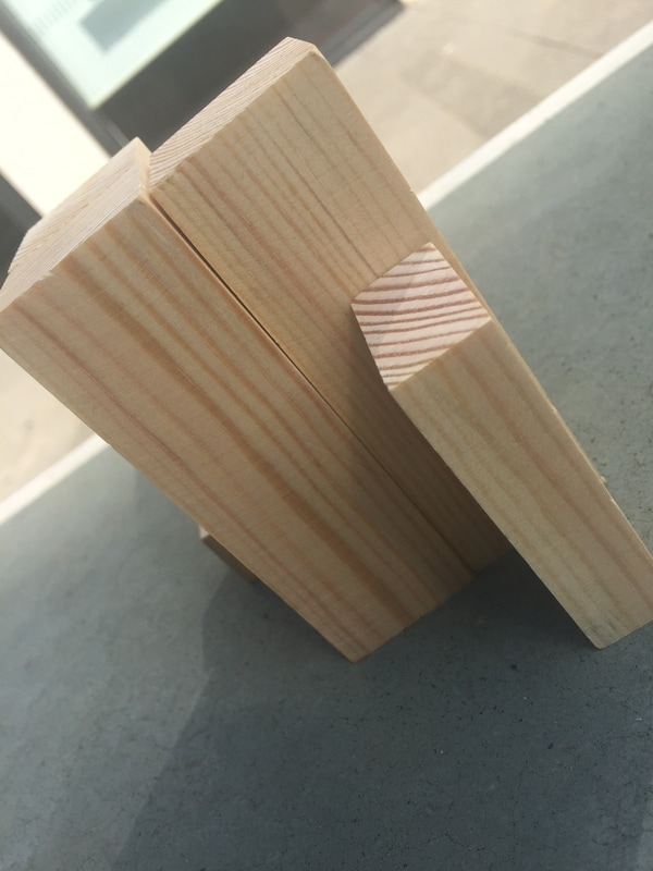
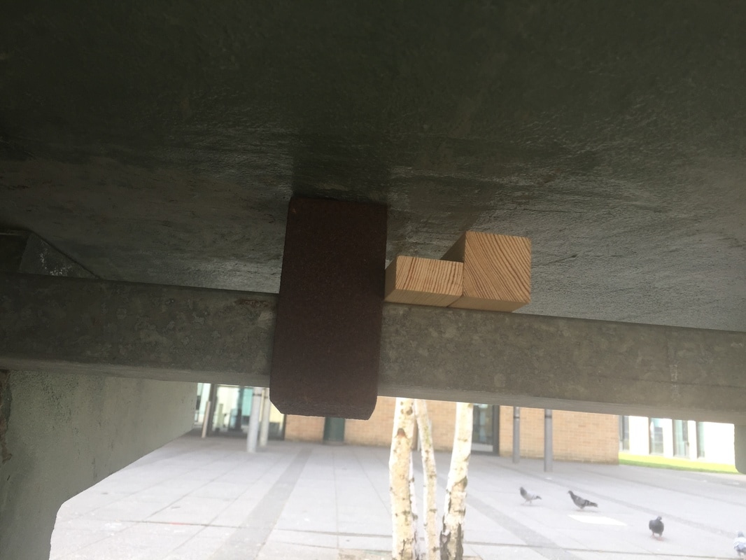
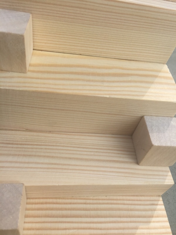
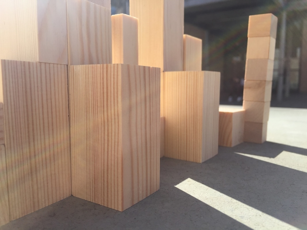
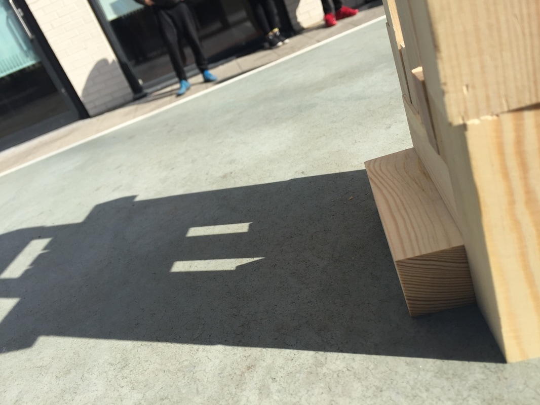
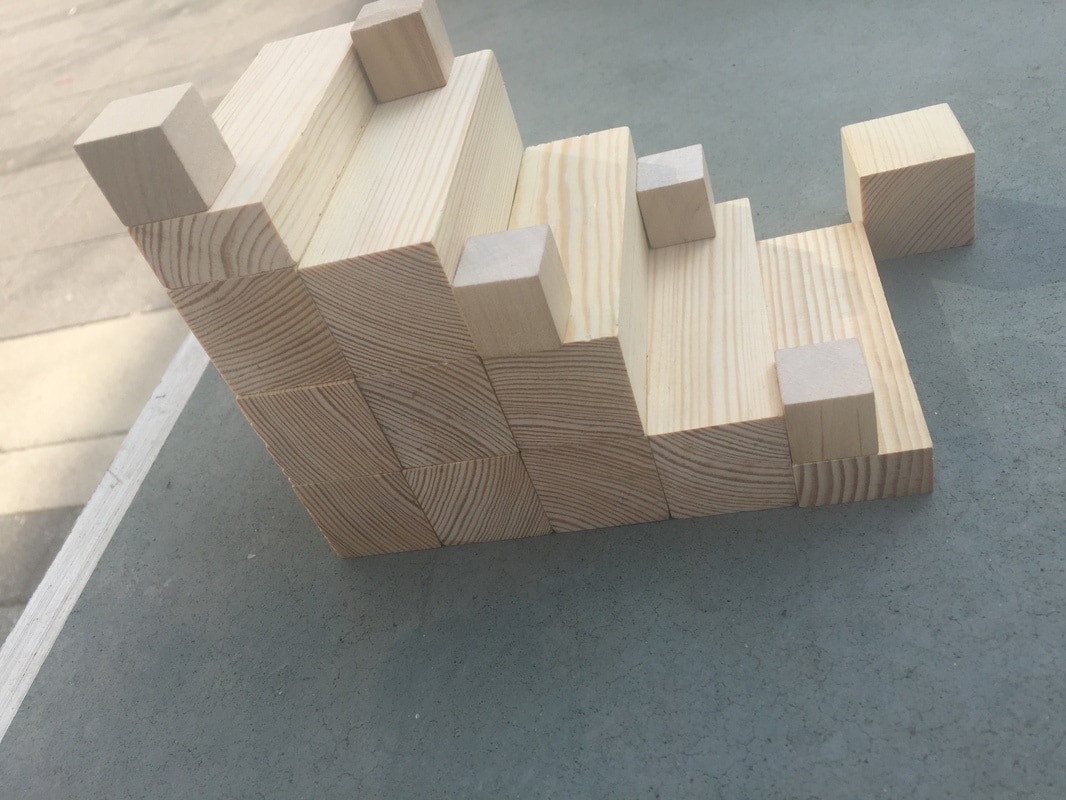
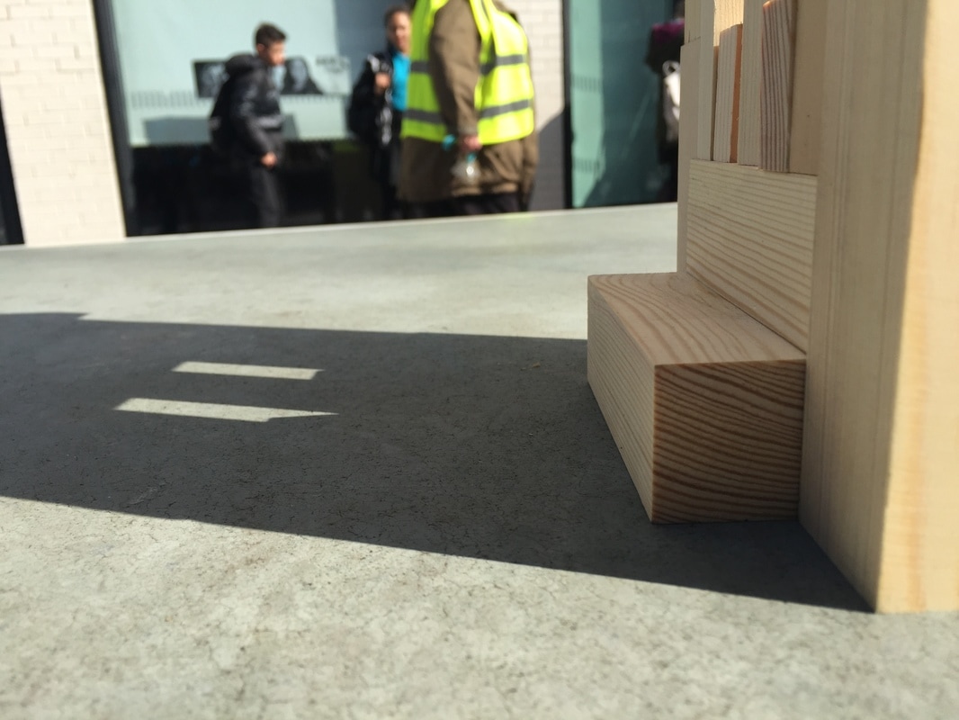
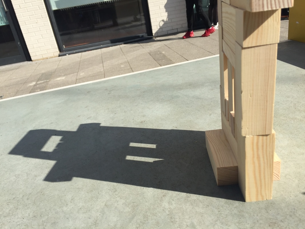
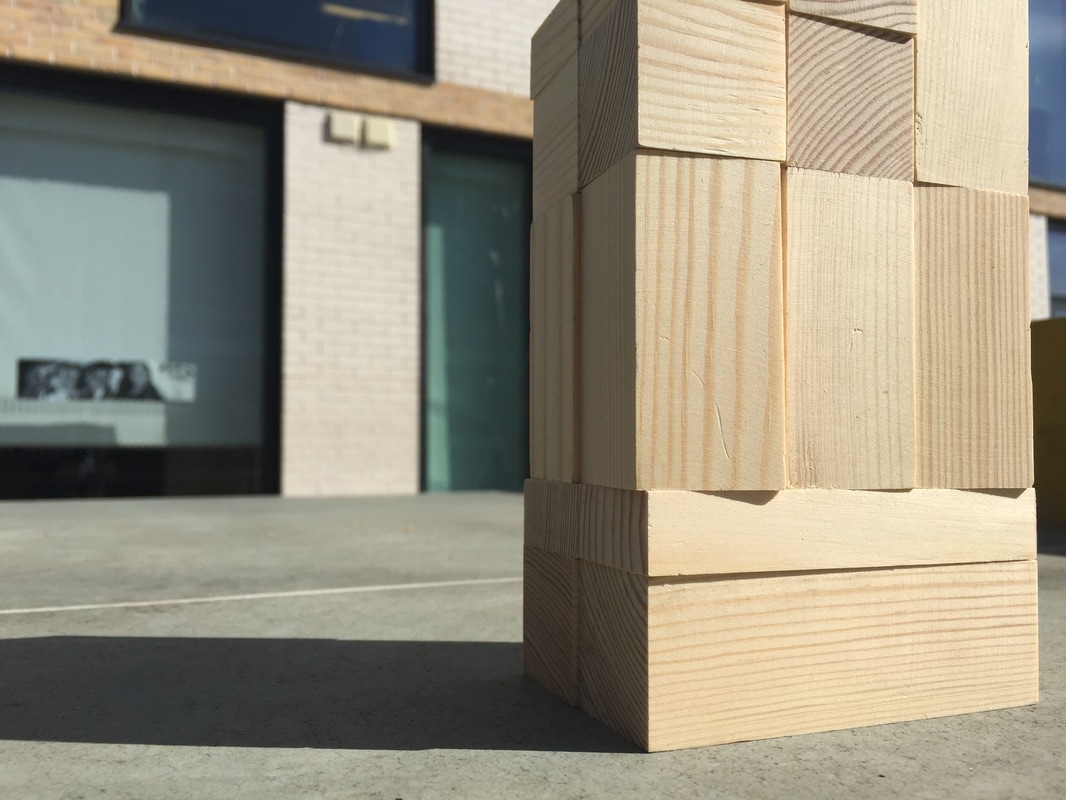
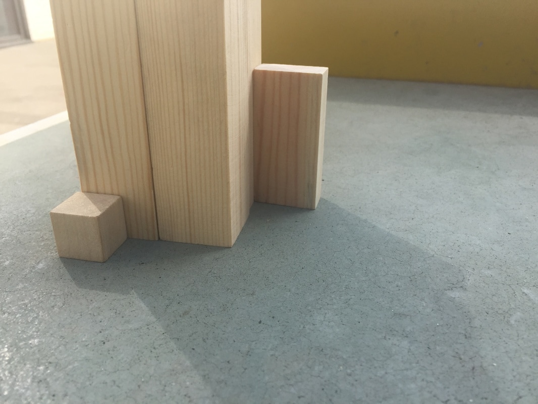
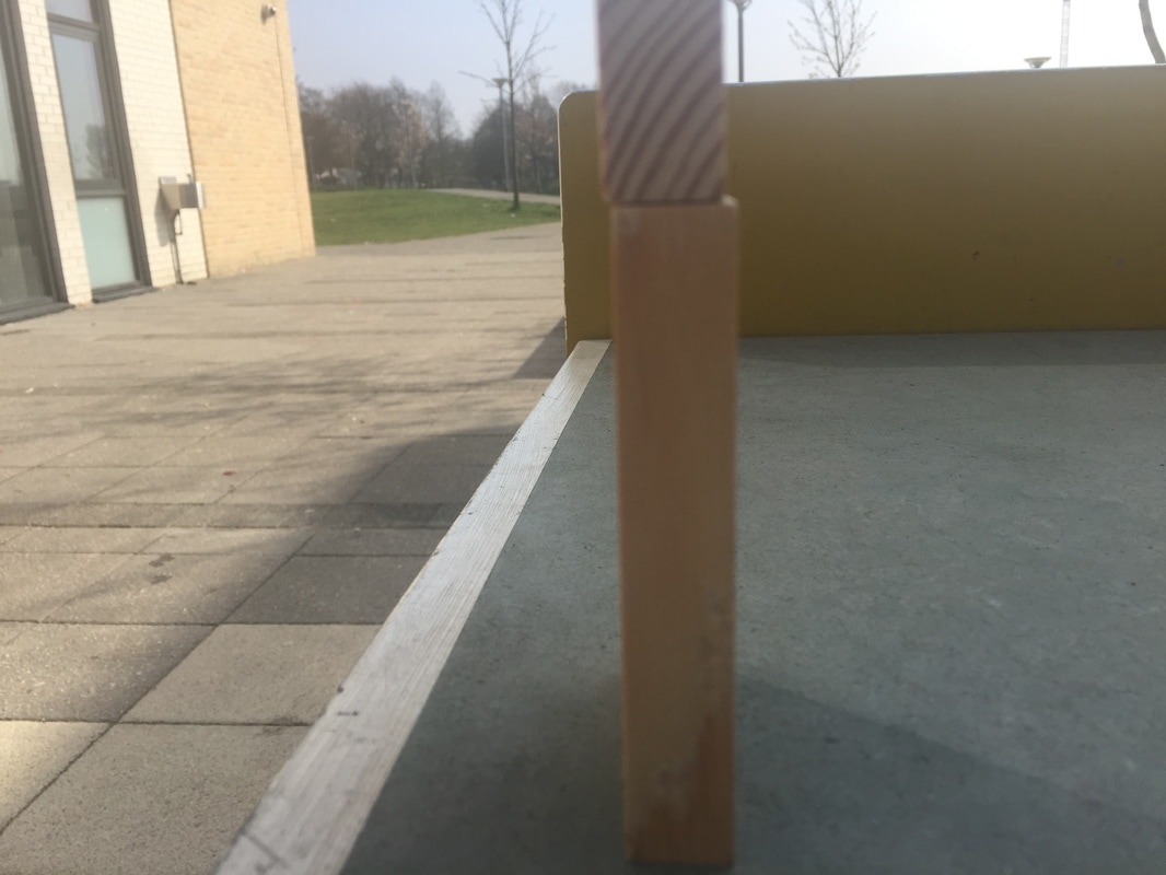
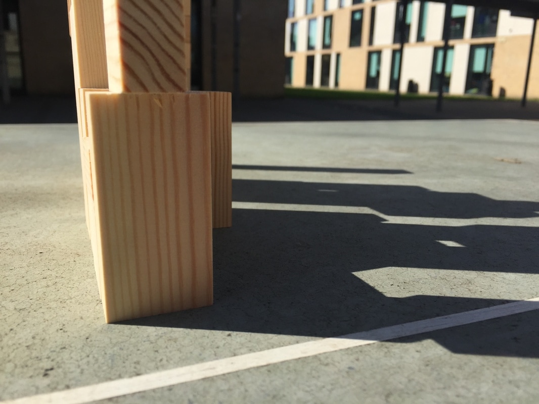
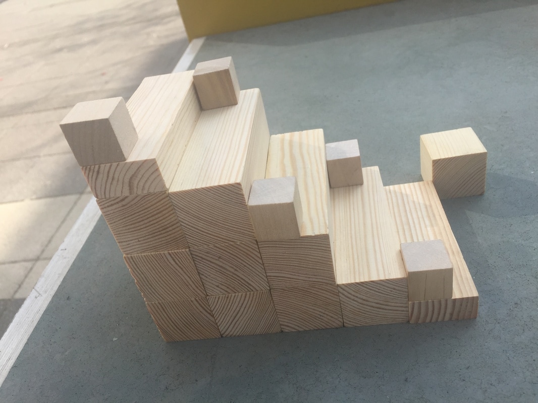
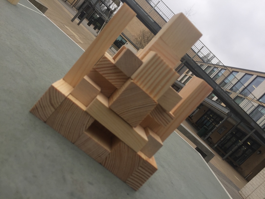
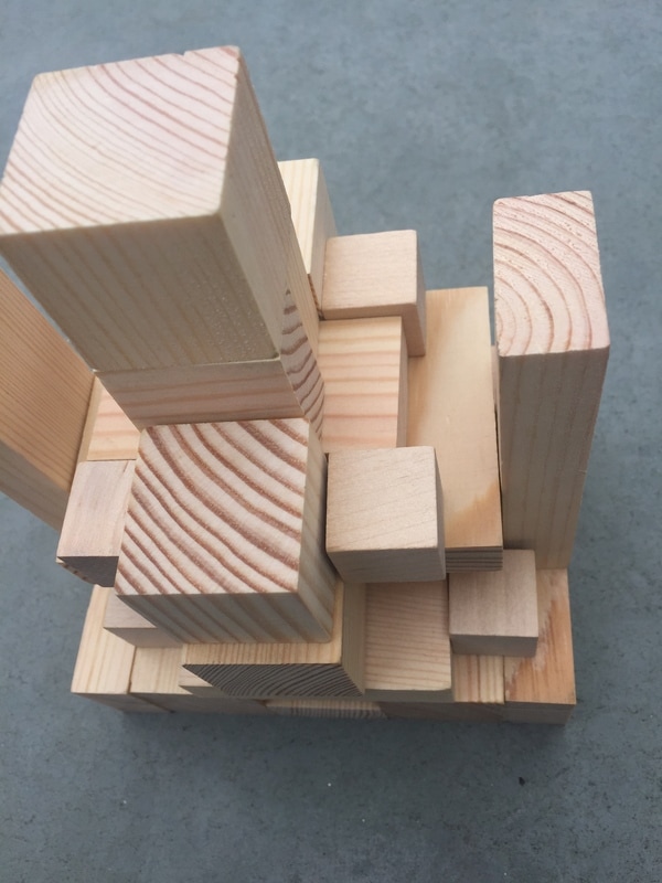
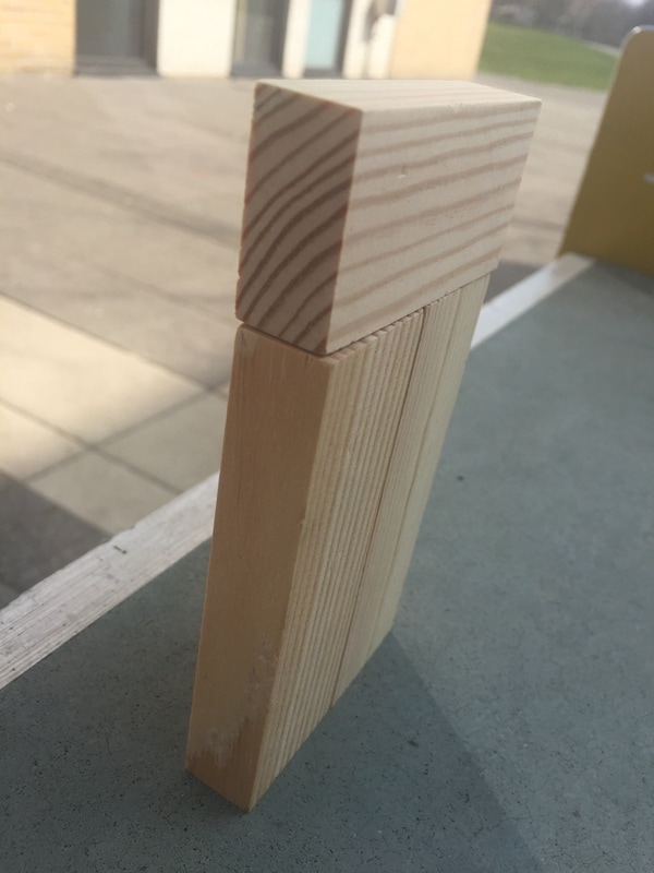
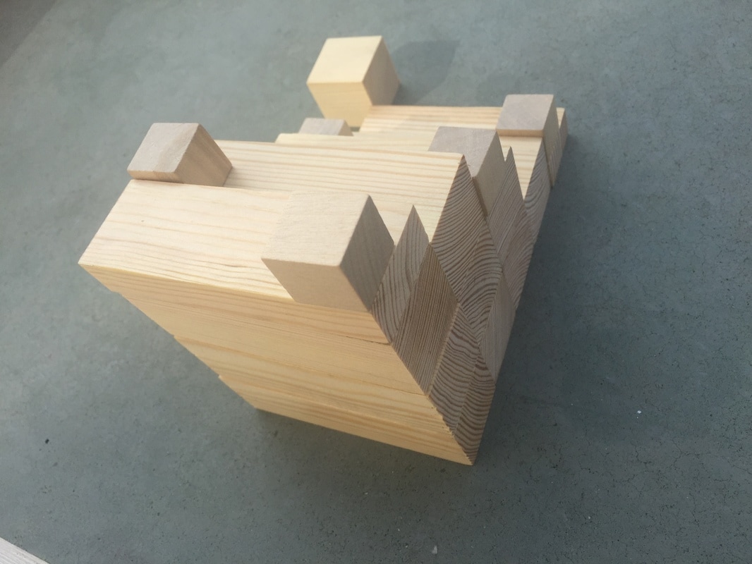
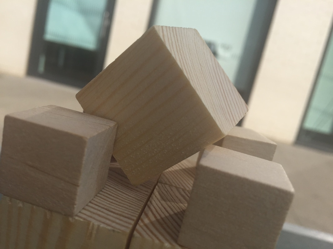
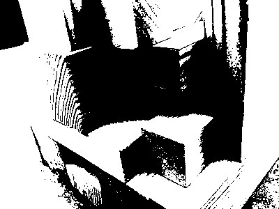
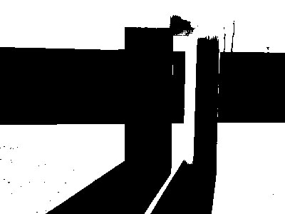
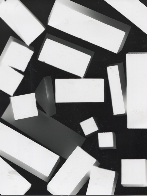
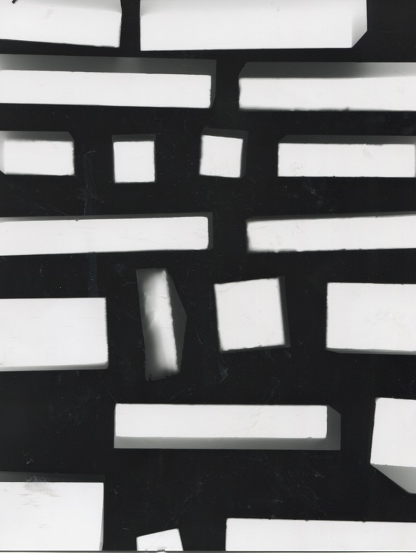
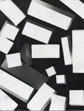
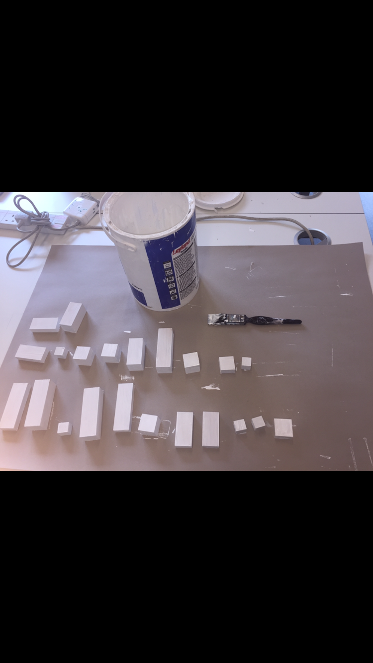
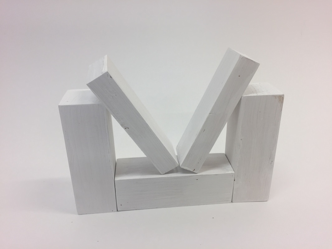
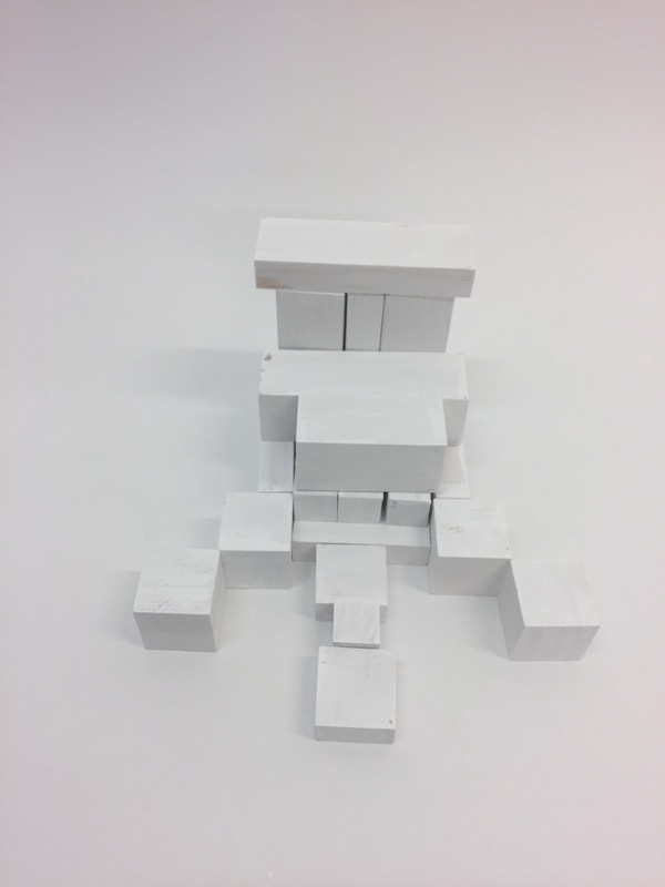
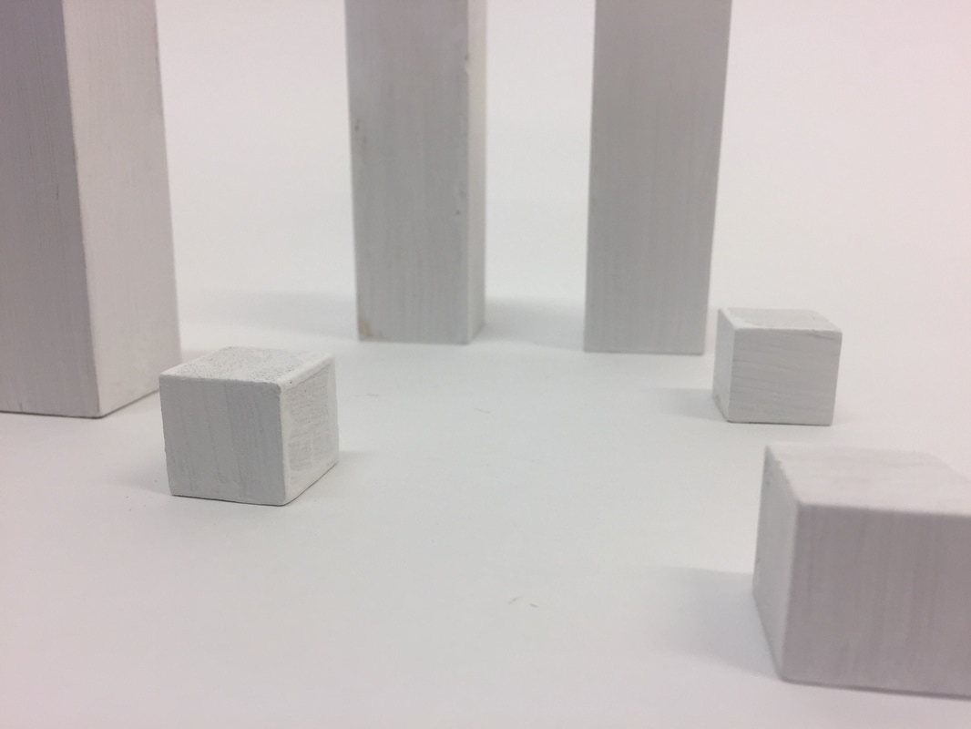
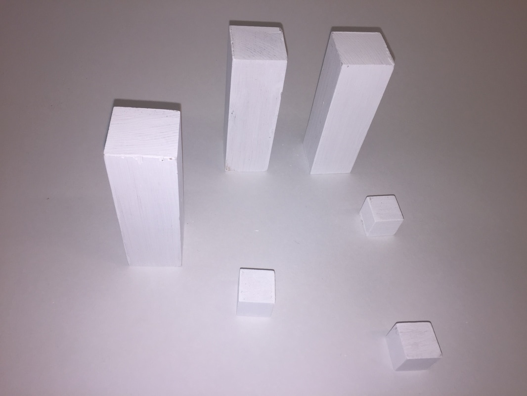
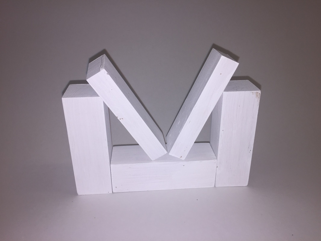
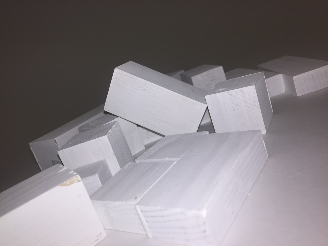
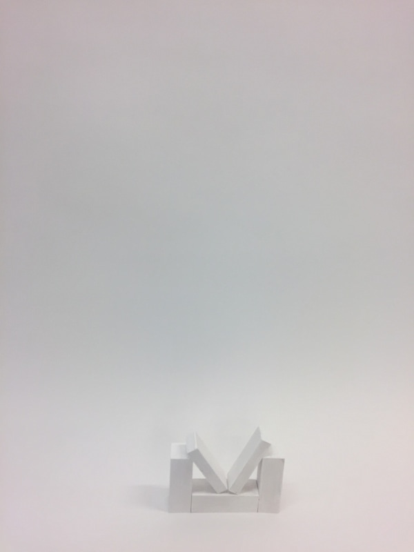
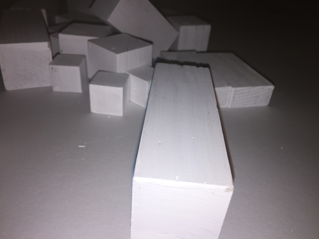
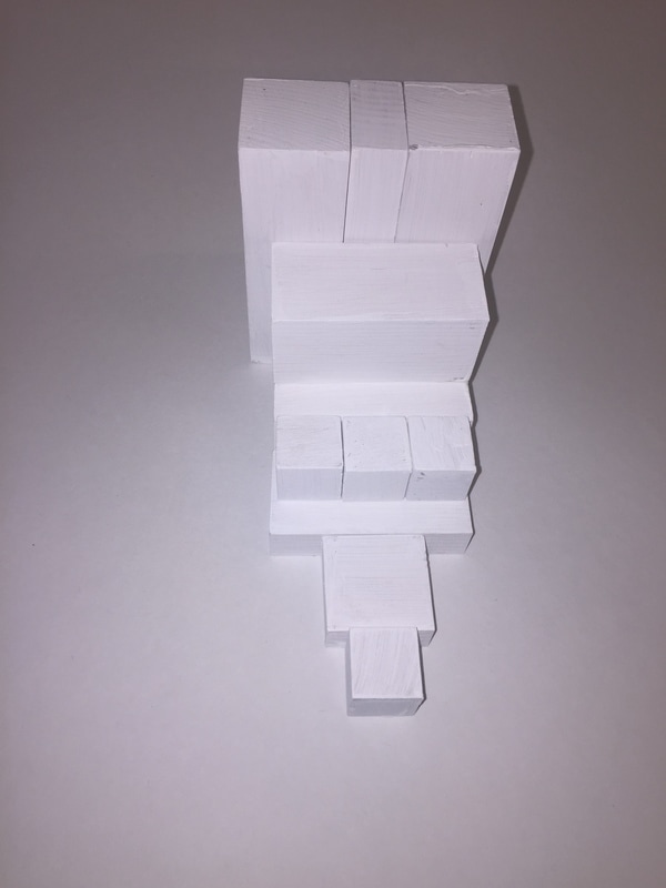
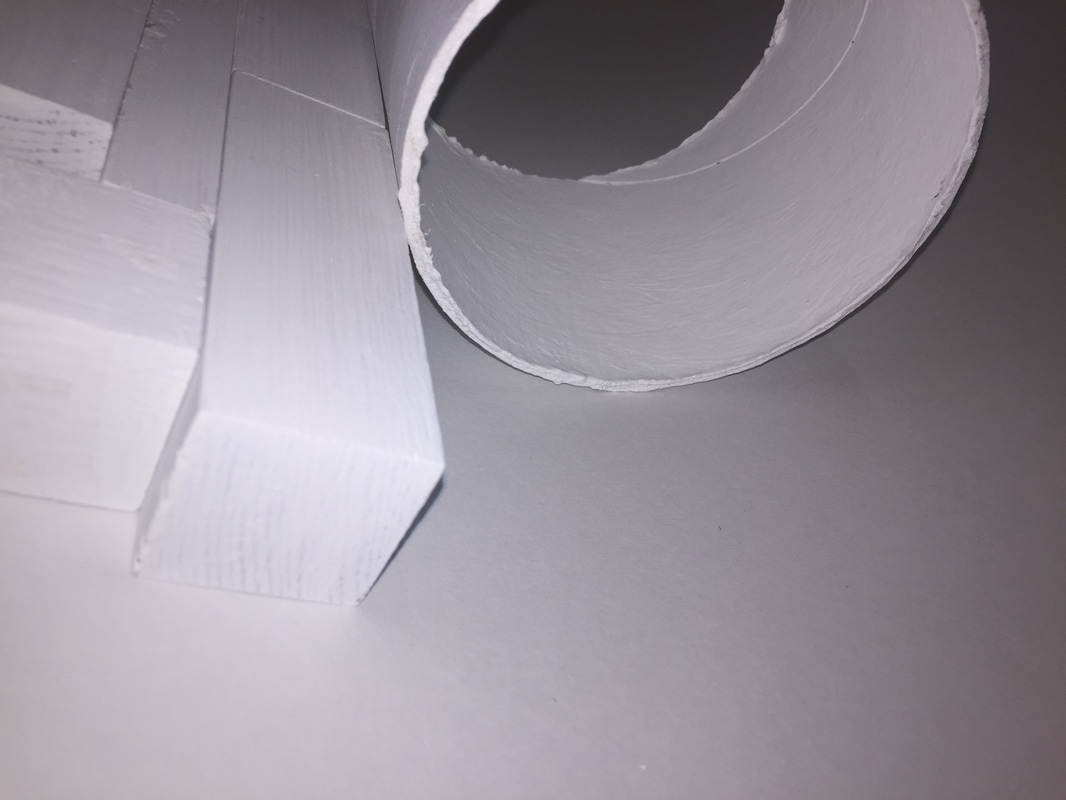
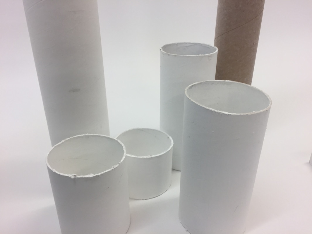
Architecture doesn't have to be a building thats already been made it can be a structure of something or for example my building blocks are something small that can be made into a real thing I choose this idea because the photographs can be taken from a lot of different angles and points of view. In these pictures I have made mini buildings using small wood cut up into different size blocks. I have done this to create an illusion because you don't know how big the blocks are. I think the shadows make the photograph more interesting and I tried to take most of the pictures when the weather was sunny to create the shadows and different types of shadows by taking the pictures from different angles. When I was taking pictures of the blocks I thought about focus and tried to focus the blocks next time I could focus the background instead. My blocks contrasted with the background to make them contrast even more I could place a black background behind the blocks.
The website which helped me think of this idea was www.photopedagogy.com/boring-things.html as most people would think of building blocks as 'boring' I wanted to create something which was 'boring' but develop it into something interesting.The next thing I'm planning to do is change the backgrounds of the bricks and maybe change what camera I use. I will think about the placement of the blocks in more detail and create something which doesn't look the same.For my next set of pictures i painted the blocks white because I wanted to make them look less like wood.
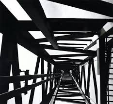
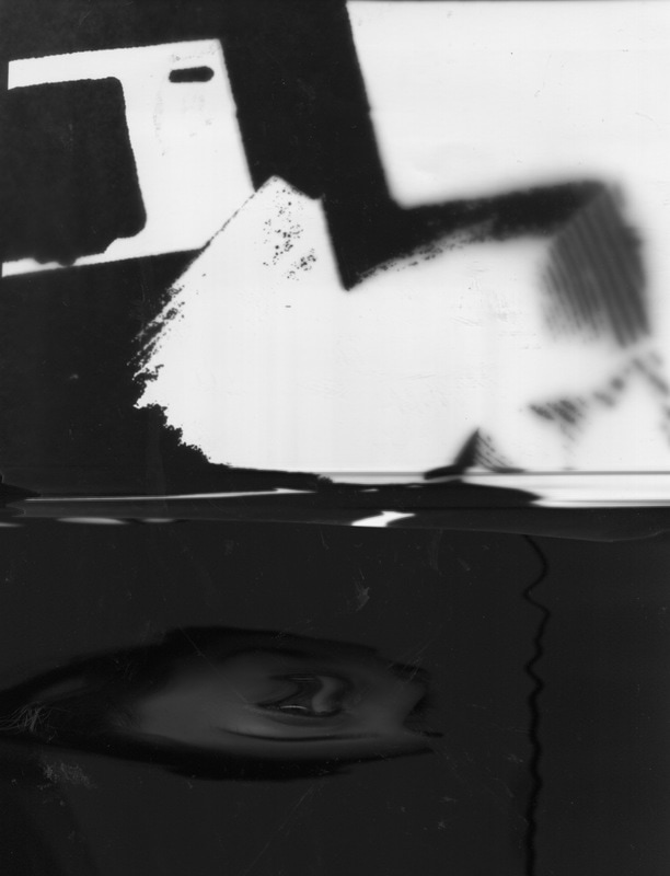
Lucian Herve experiments
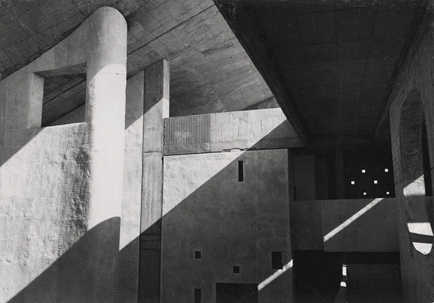
Lucien Herve was a french photographer, he was notable for his architectural photography. He was born on the 7thof august 1910 and died on the 26th june 2007.
I think his photographs are interesting because he takes pictures of architecture and he combines a humanist outlook with an architects eye this makes his work stand out from other artists because its more abstract and his photos are in black and white.
Some of his work:
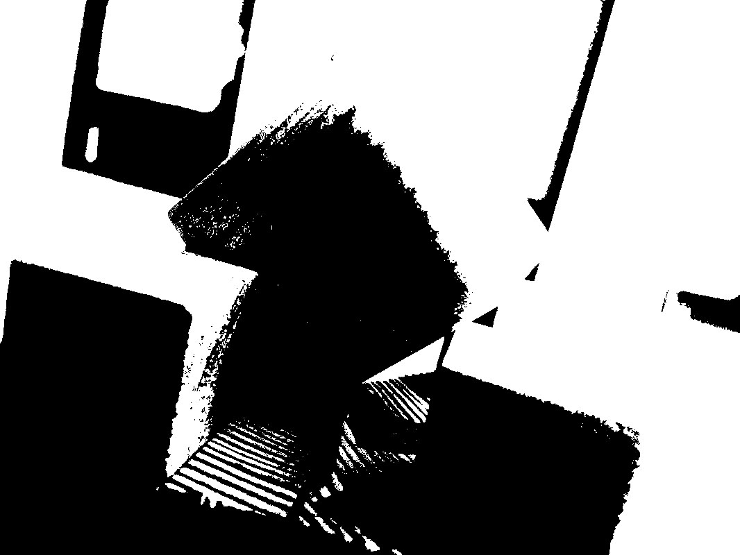
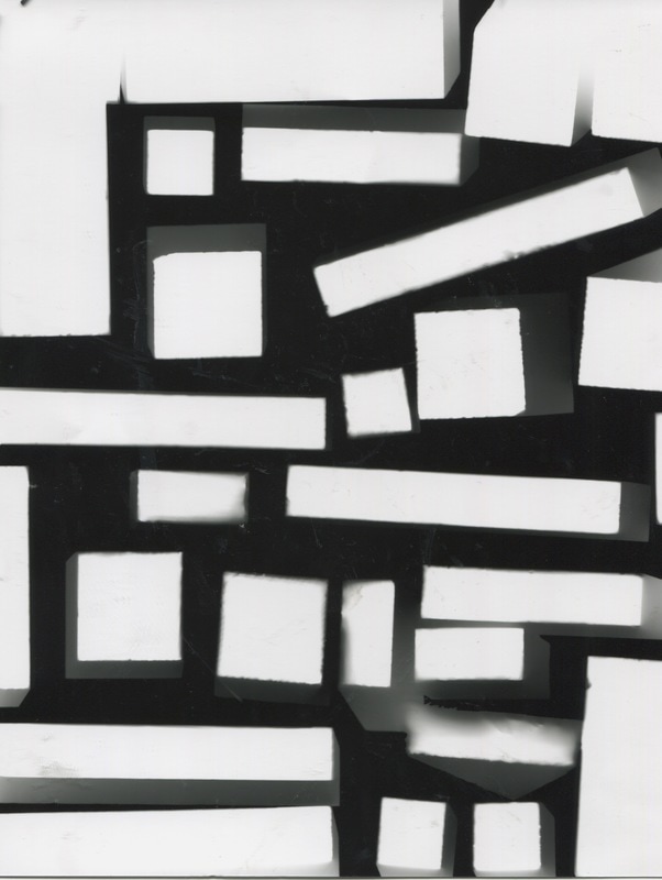
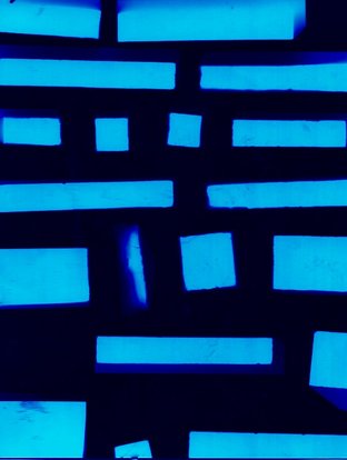
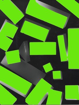
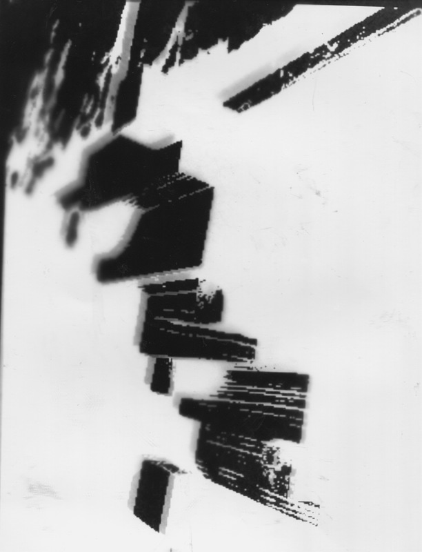
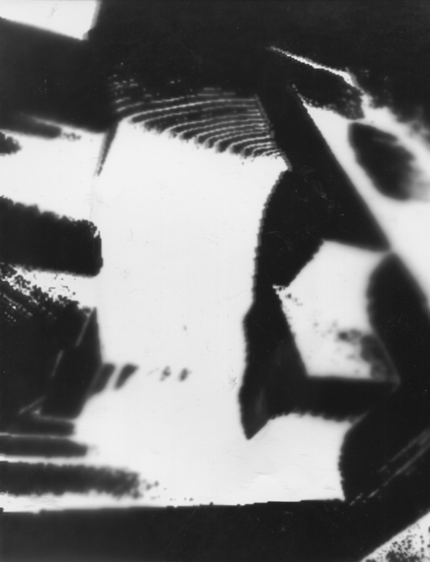
My photographs inspired by Lucian Herve made in photoshop:

|
|
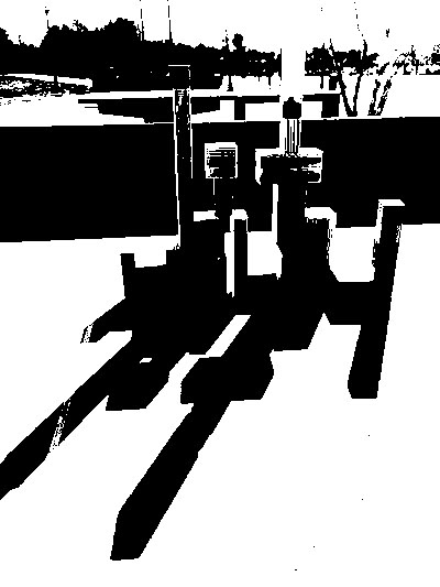
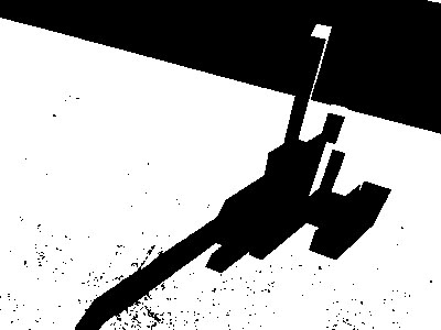
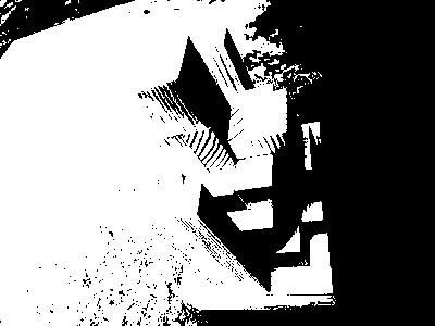
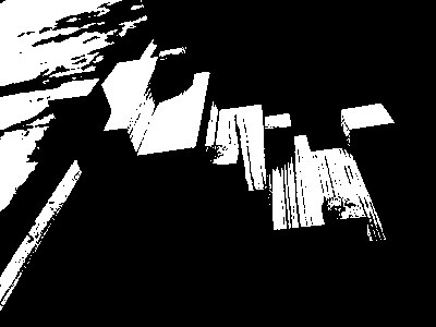
I think these images turned out well as they look like structures of something and they link to architecture. I made these images in photoshop using Threshold effect to create the same effect as Lucian Herve's photographs. I like the shadows it creates and the way you can see parts of the wood.
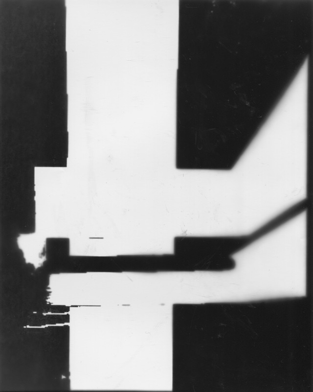
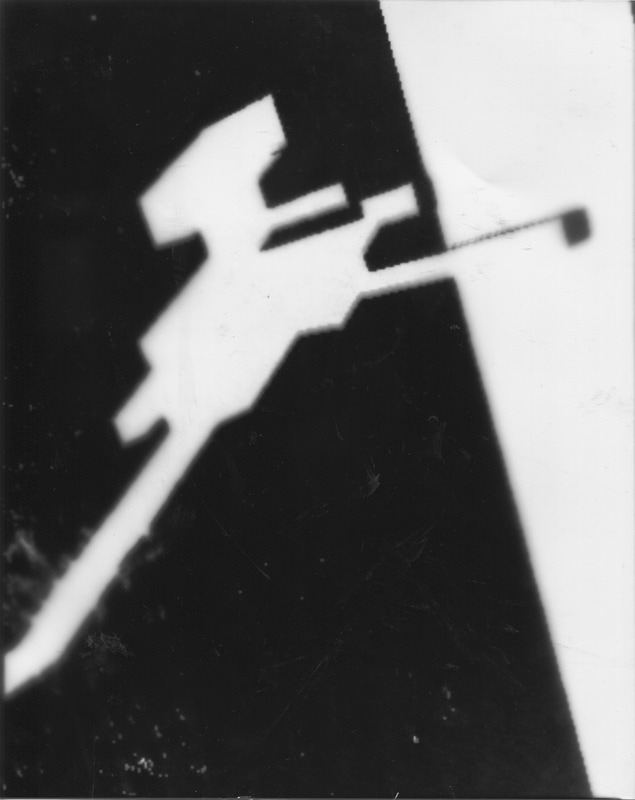
Experimenting in the dark room
I done some experimentations in the darkroom using bricks as my objects to make photograms.
The first thing I done was put the bricks on the photographic paper. Then I exposed it to light to create the images which are shown above. In some of the photograms a translucent shadow shape has been created and I think this makes the photograms more successful because it makes the image appear 3D when its actually 2D. The arrangement of the bricks were very important because it controlled how the photograms came out. I placed some of the bricks randomly to create unusual photograms. My first attempt went a bit wrong because it was under exposed so for my next photograms I left the light on for more time. The next thing I did to develop my photograms was I went into photoshop and changed the white parts of the photogram into different colours as I have done in the photogram below.
The first thing I done was put the bricks on the photographic paper. Then I exposed it to light to create the images which are shown above. In some of the photograms a translucent shadow shape has been created and I think this makes the photograms more successful because it makes the image appear 3D when its actually 2D. The arrangement of the bricks were very important because it controlled how the photograms came out. I placed some of the bricks randomly to create unusual photograms. My first attempt went a bit wrong because it was under exposed so for my next photograms I left the light on for more time. The next thing I did to develop my photograms was I went into photoshop and changed the white parts of the photogram into different colours as I have done in the photogram below.
I went into photoshop and changed the white parts to a blue colour, this makes the photograms look more fascinating as its less obvious as to what the photogram is and doesn't look like bricks.
Some more photograms I experimented with:
Orignal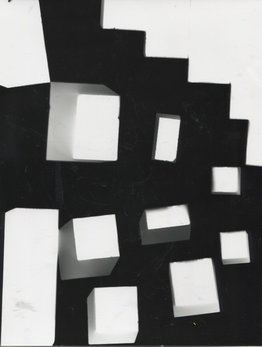
|
Photoshopped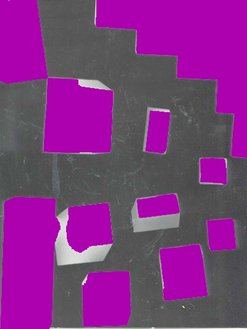
|
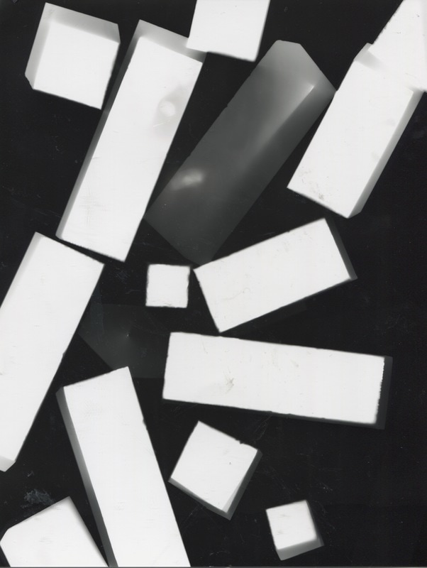
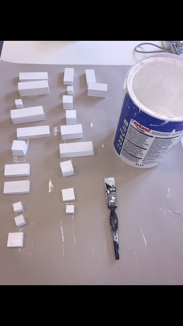
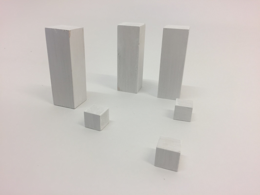
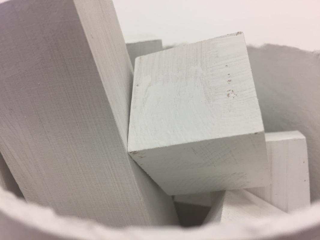
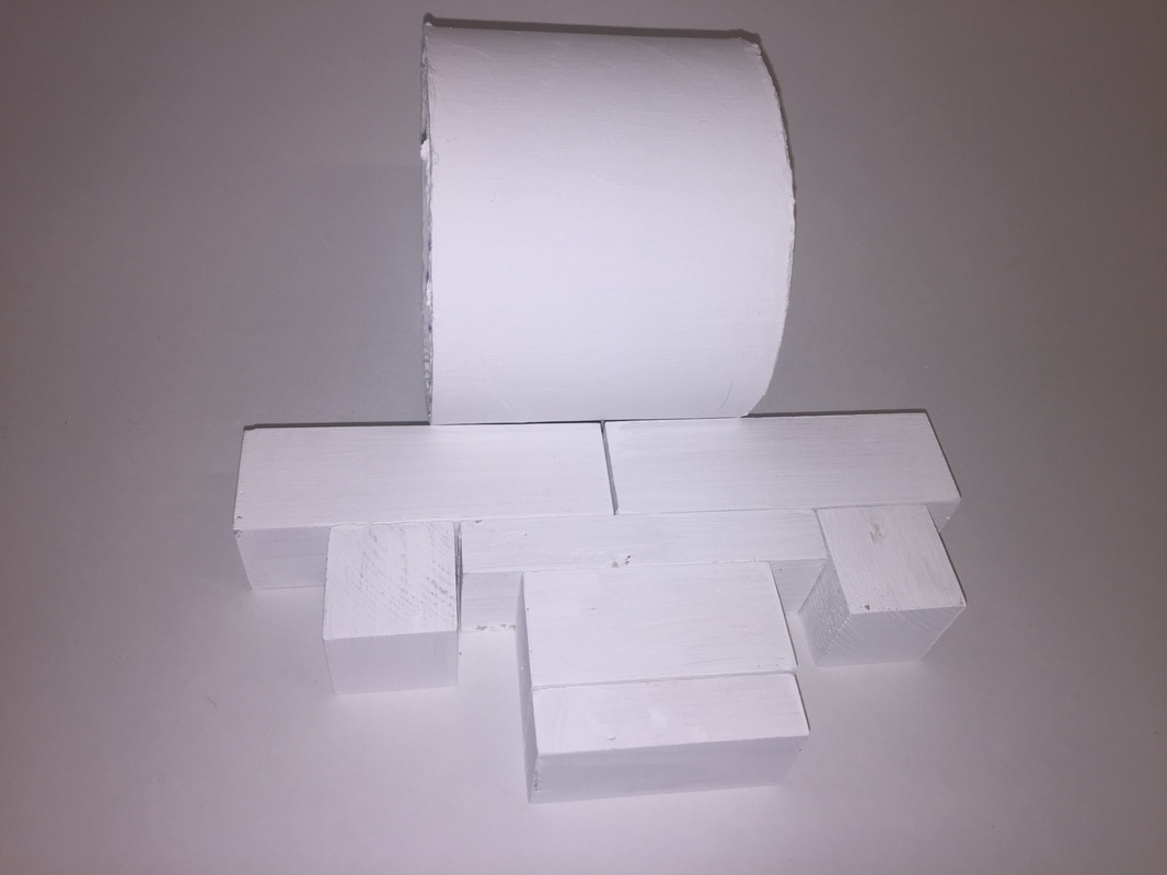
Bricks project part 2 painting the bricks
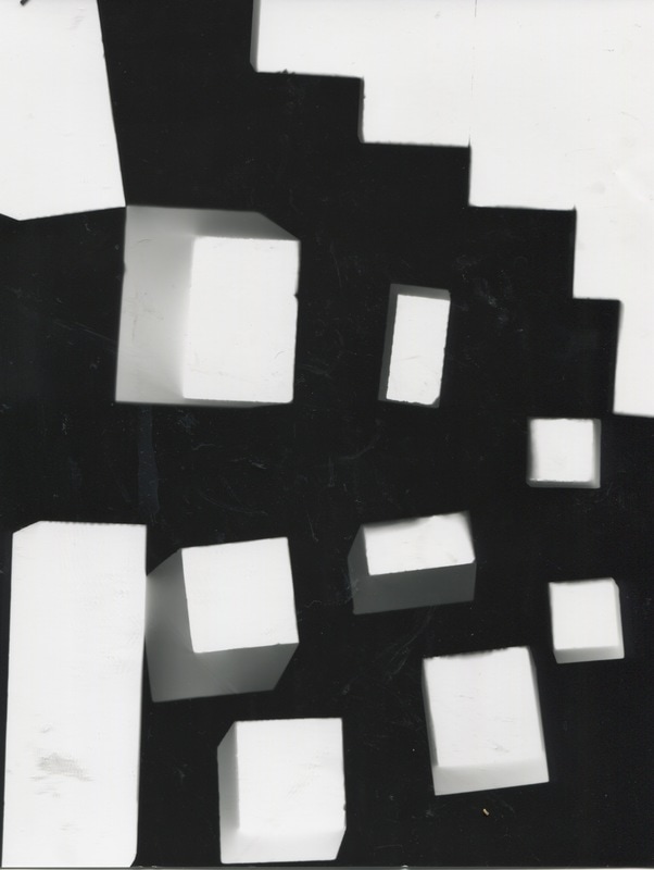
I painted some of the bricks white so that I could take pictures of them against a white background to create different shadows and see how they look. By painting the bricks with white emulsion paint I am making them more abstract as you wont be able to see the wood.
|
|
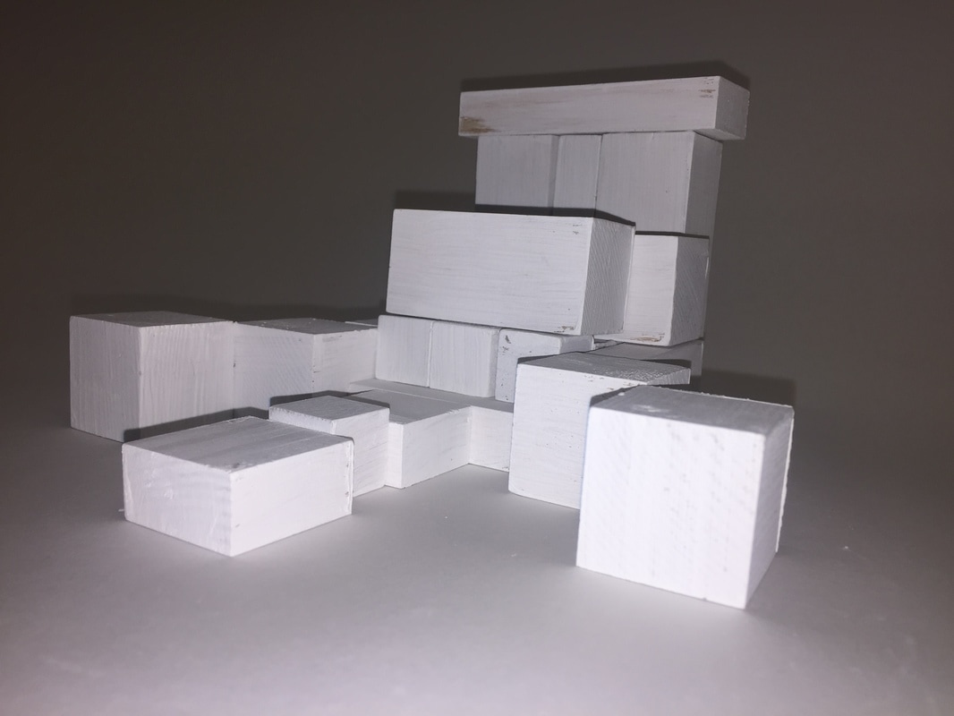
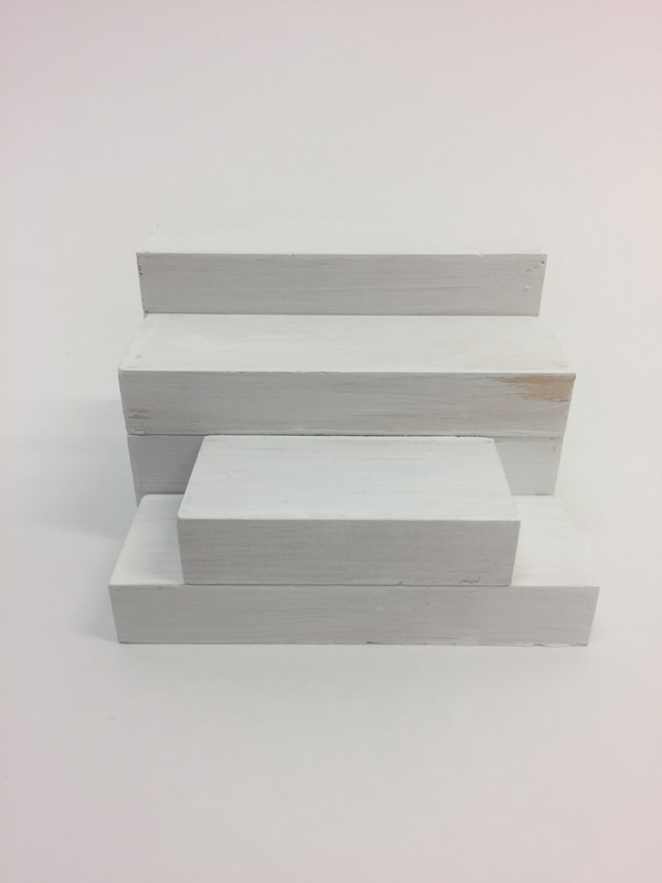
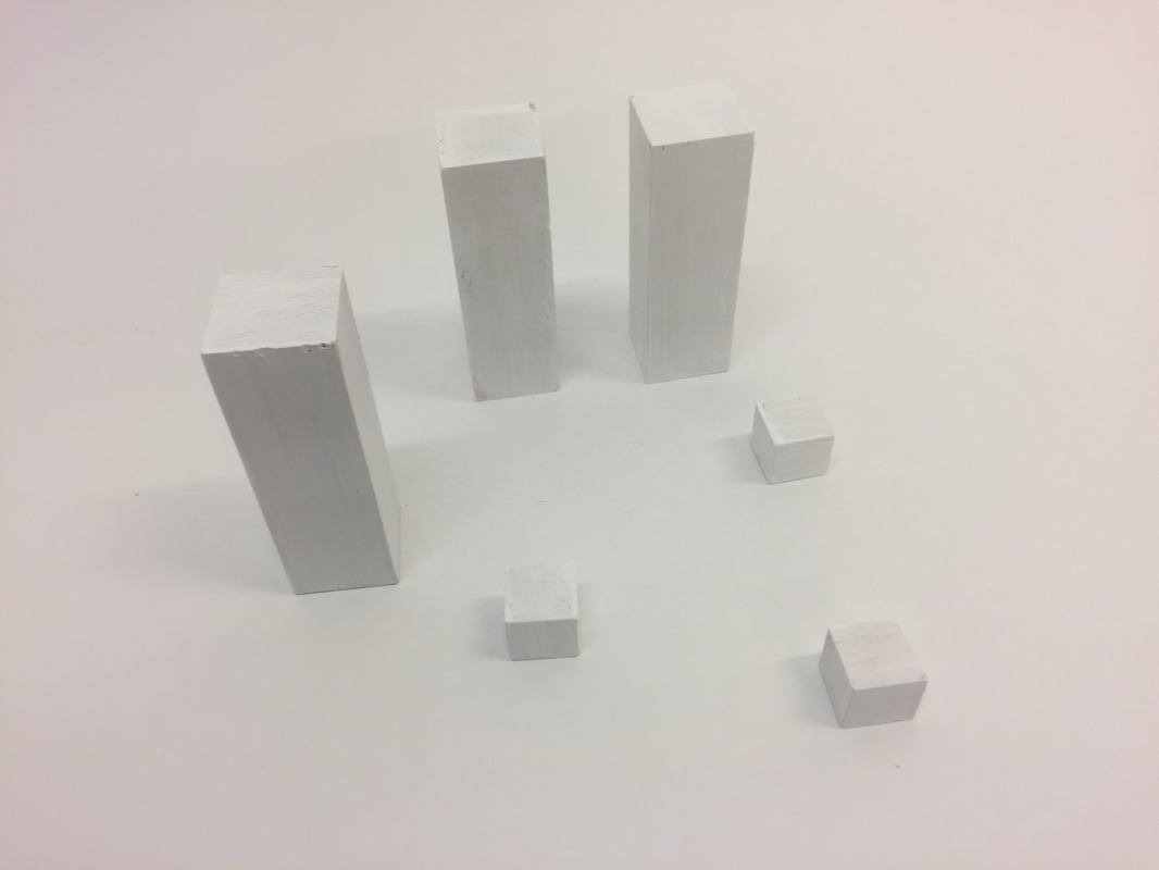
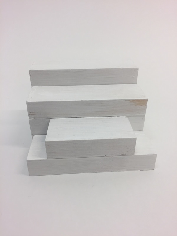
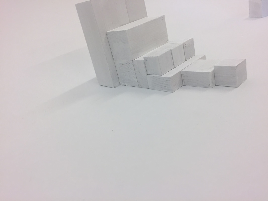
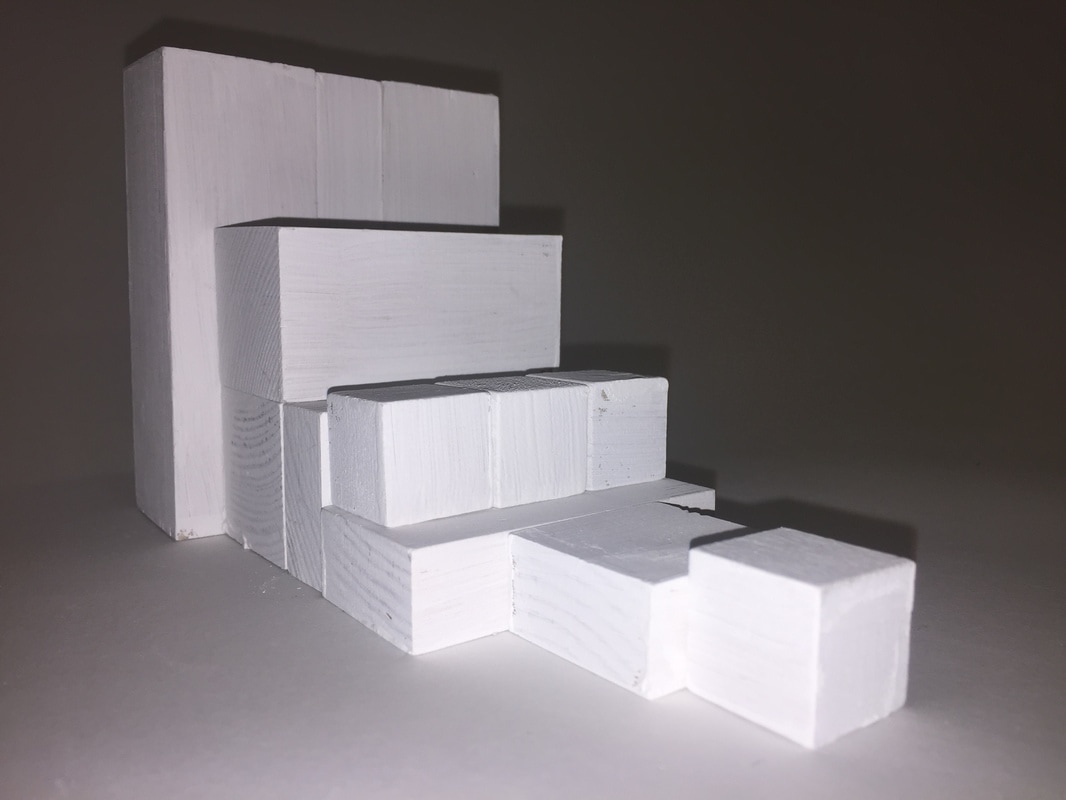
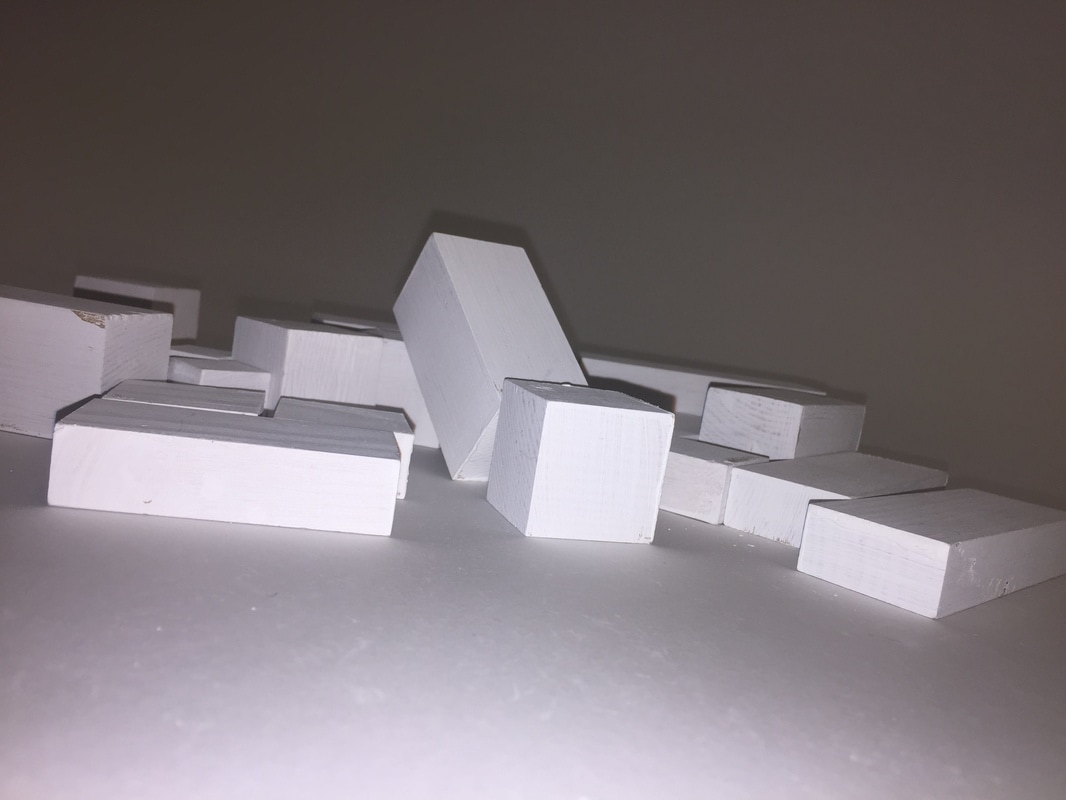
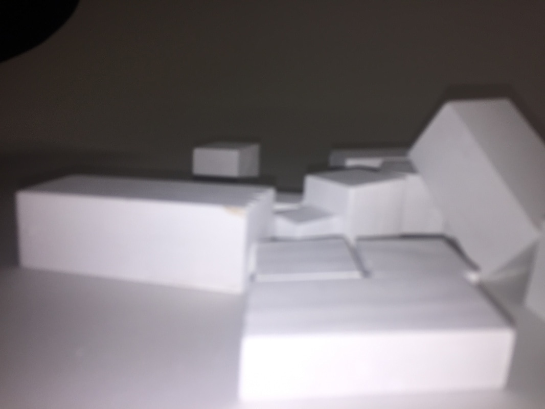
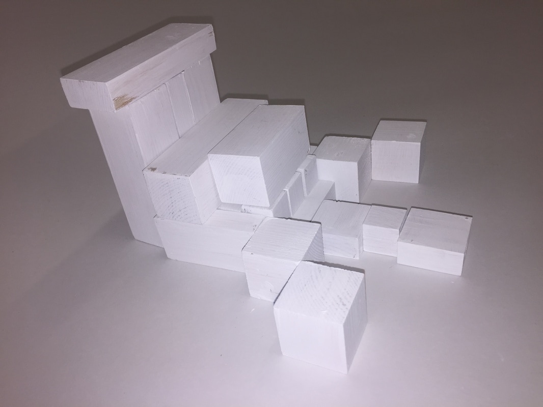
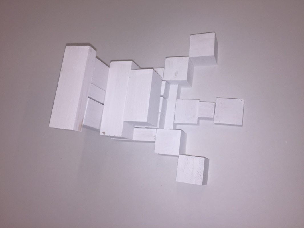
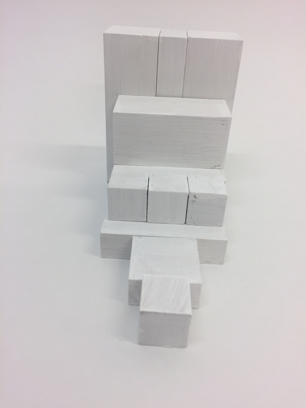
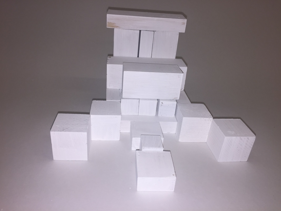
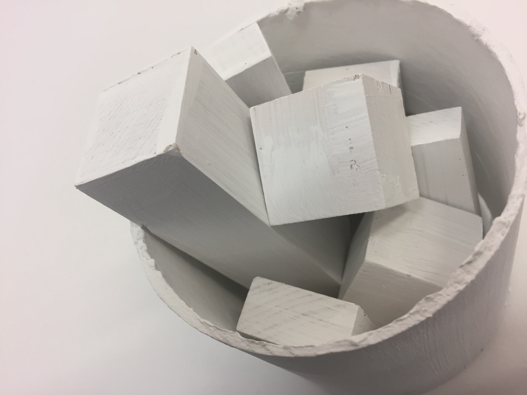
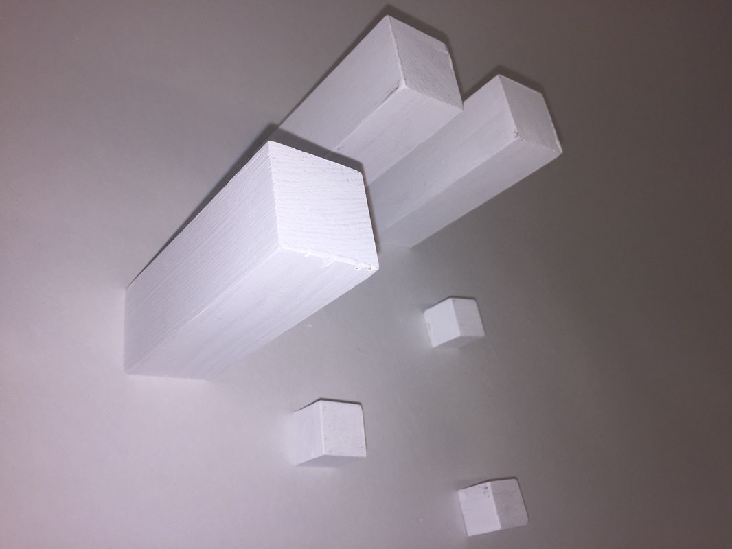
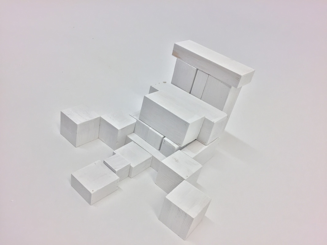
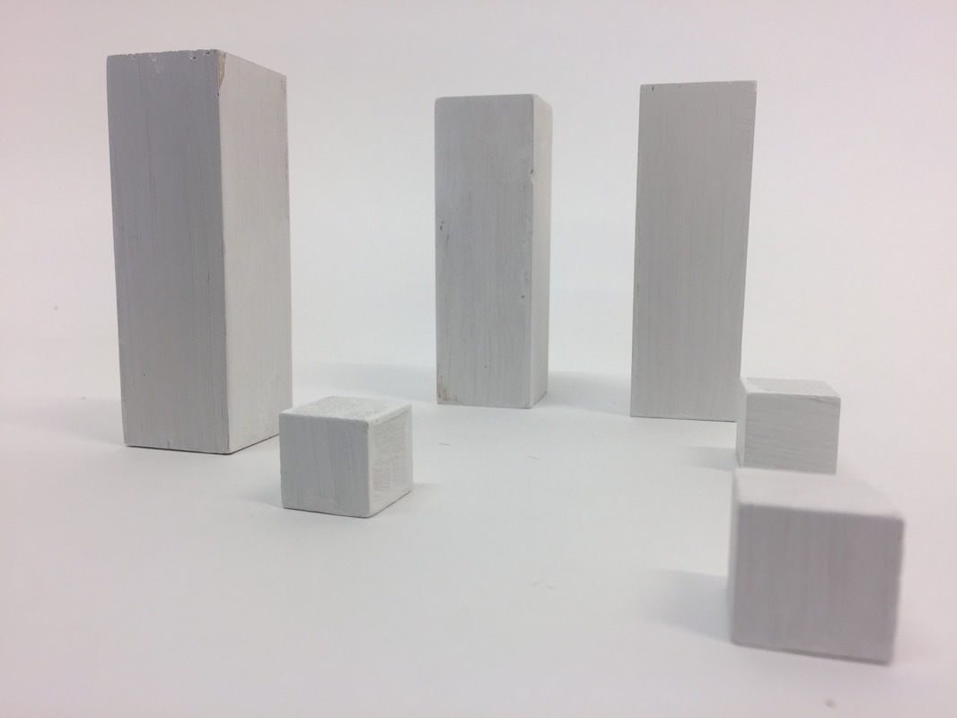
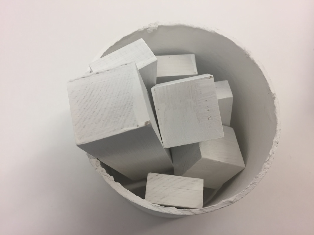
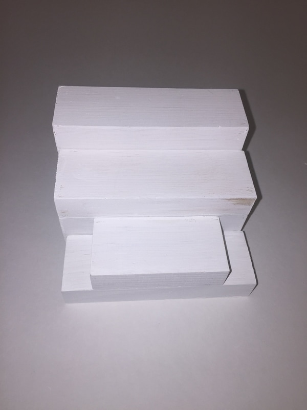
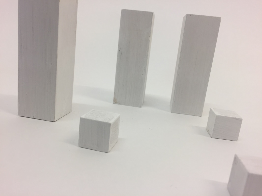
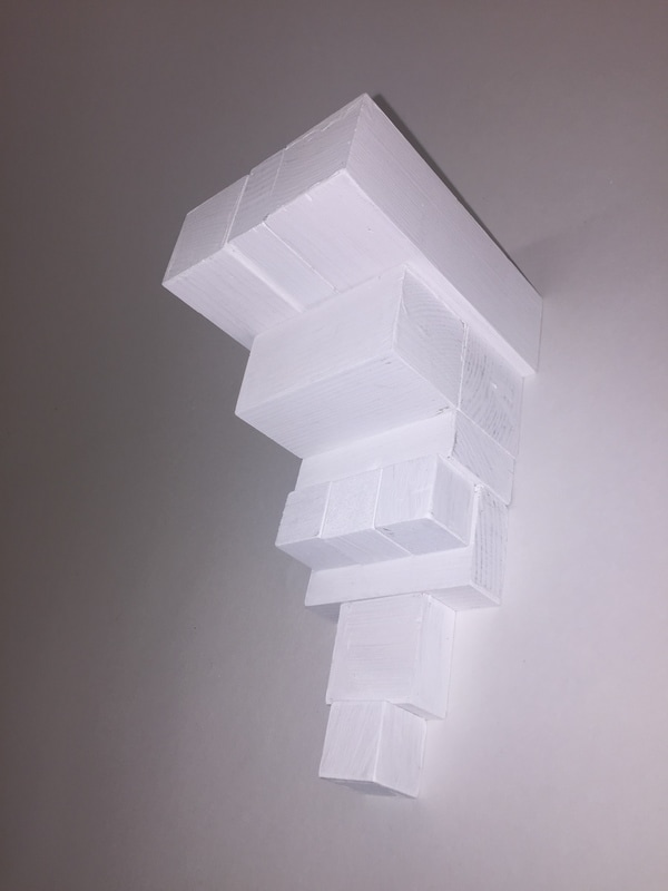
After I painted the bricks I decided to photograph them against a white screen, I took some of the photographs using flash and I think they turned out best. I think painting the bricks worked really well because they create mini structures which look nice next to a white background.
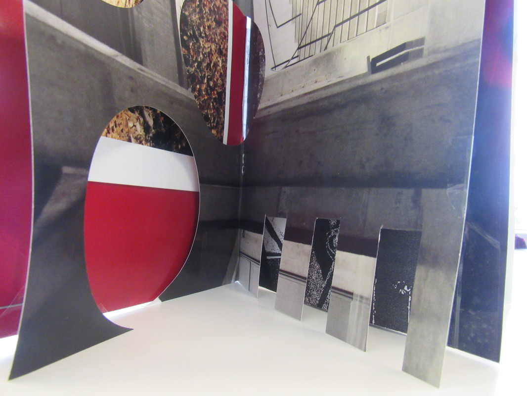
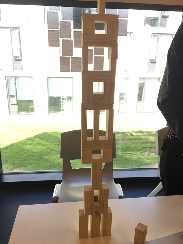
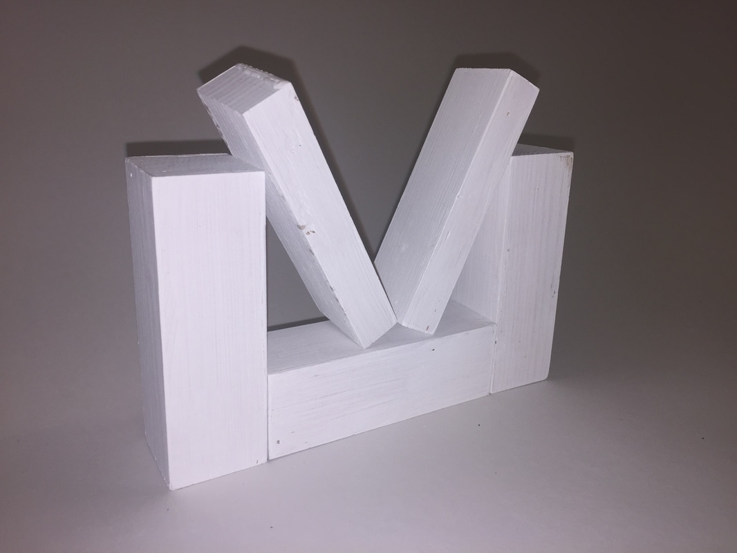
Working on my final piece
|
|
|
Final piece evaluation
I had quite a few ideas for my final piece but I decided to use the pictures that I made in photoshop using the threshold effect as these photograms suited the theme and they are my favourite.
The theme I chose was architecture because I wanted to try something new and in my previous projects I focused a lot on nature. Architecture interested me because it is around us everyday and I felt there was a lot I could explore.
My main focus for this project was to capture buildings in an unusual way and to focus on highlighting the interiors of buildings.
Margaret Stratton's work was a big inspiration to my own. I like the composition she has used as it is unusual for example she has placed some of the objects in the wrong place such as a chair on top of the table or upside down. This is something that I used in my own work because I made mini structures out of building blocks and I placed them on their sides and not just standing upright.I like the way she took most of her photographs from a front view point.In my own work I experimented with lots of different view points and camera angles because my bricks were small so by taking the photo from different angles this made them look bigger. The way Margaret Stratton captures light is unique because she creates a negative space around the light source. I also tried to play around with the lighting and how the lighting looked around my bricks for example when I made my final piece I used a positive to make a negative because I wanted to invert the colours so that the bricks are light and the background is dark. I think the way she makes lines stand out in her photographs is intriguing because she makes certain objects stand out more, she also incorporates lighting to do this as the lighter spaces stand out more and they also make the darker spaces and objects more clear. When I was making my final piece I took this into consideration as I wanted to create the same effect she did, I think I managed to do this as most of my lines stand out and create shapes.Margaret Stratton has a lot of different shapes in her photographs she has done this by placing objects in a certain way. When doing my work I also create a lot of different shapes as I had to make mini structures with the bricks.
I have carried out a range of experiments such as changing the photograph into a photogram, painting the bricks and using photoshop.I found taking the photographs easy and enjoyed it the most I struggled with using photoshop at first but once I learned the basics I had fun experimenting with it.
The first thing I did was take photographs of the bricks I then decided to develop this idea further by taking my photographs into photoshop and using the threshold effect I used this effect because I loved the way it made my photographs look. I then took the photographs I made in photoshop and printed them so that I could take them into the dark room and make negatives out of my positives.I then mounted my photograms onto mount card to create my final piece.
Throughout this project I have had lots of ideas. I have recorded them on my website and I have completed various experiments,my main idea was the bricks and I focused on them and improving them. I have tried to keep track of all of my ideas and what I have done to improve them.
I choose to develop my final piece as an idea because I think it links to my theme and looks abstract.I really like the different tones in my photograms as it makes a simple object look complex and specifically my photograms look like close ups of building structures. I think the black and white effect makes the shapes stand out more.I like the contrasts in the photogram as they bring out the different shapes.
I am satisfied with the progress that I have made in this unit I have learnt a lot and most importantly I have learned that not everything is what it looks like and that theres more to architecture than just buildings.I have enjoyed experimenting with different techniques and processes I have really enjoyed studying this topic.
